%20--%3e%3cpolygon%20points='24.7%201%200%201%200%207.6%208.5%207.6%208.5%2039.4%2016.1%2039.4%2016.1%207.6%2024.7%207.6%2024.7%201'/%3e%3cpath%20d='M34.1,32.4l-4.9-22.7h-7.9l9.1,33.1c-.4,1.7-1.1,2.9-3.7,2.9h-2.6l1.9,6.6h1.5c4,0,8-1.2,10.3-9.2,1.8-6.4,8.9-33.3,8.9-33.3h-8l-4.6,22.7Z'/%3e%3cpath%20d='M91.7,8.7c-8.7,0-12.7,6.5-12.7,16.1s3.6,15.3,13.8,15.3,7.2-.9,9-1.6l-1.2-6c-2.4.8-4.9,1.2-7,1.2-4.3,0-7-2-7.2-7.3h16v-4.8c0-7.5-2.9-13-10.7-13ZM86.5,21c0-3.3,1.7-6.4,4.7-6.4s4.1,2.7,4.1,6.4h-8.8Z'/%3e%3cpath%20d='M218,8.7c-8.7,0-12.7,6.5-12.7,16.1s3.6,15.3,13.8,15.3,7.2-.9,9-1.6l-1.2-6c-2.5.8-4.9,1.2-7,1.2-4.3,0-7-2-7.2-7.3h16v-4.8c0-7.5-2.9-13-10.7-13ZM212.9,21c0-3.3,1.7-6.4,4.7-6.4s4.1,2.7,4.1,6.4h-8.8Z'/%3e%3cpath%20d='M126,1h-10.7v38.4h7.6v-11.8h5c6,0,11.3-3.8,11.3-14.1s-5.5-12.5-13.1-12.5ZM125.9,20.9h-3.1V7.6h3c3.7,0,5.4,1.8,5.4,6.3s-1.5,7.1-5.3,7.1Z'/%3e%3cpath%20d='M150,12.9c-.2-1-.5-2.4-.8-3.2h-6.9c.5,1.9.7,4.6.7,7.9v21.8h7.4v-20.3c1.1-2.2,4.5-3,7.4-3v-6.8c-3.5,0-6.5,1.7-7.7,3.6Z'/%3e%3cpath%20d='M192.6,40.6c0,3.5-1.6,4-4.7,4h-1.5l1.9,6.6h2.3c6.3,0,9.3-3.2,9.3-9.8V9.7h-7.4v30.9Z'/%3e%3crect%20x='192.2'%20width='8.4'%20height='6.4'/%3e%3cpath%20d='M247.4,33.7c-4.8,0-6.6-2.8-6.6-9.6s1.9-8.9,6.2-8.9,3.4.4,4.9,1l1-6.4c-1.3-.5-3.7-.9-6.2-.9-10.6,0-13.4,6.7-13.4,15.9h0c0,10.7,4.6,15.3,12.4,15.3s5.9-.5,7.4-1l-.9-6.1c-2,.4-3.7.6-4.7.6Z'/%3e%3cpath%20d='M264.7,30.2v-14.2h5.4l1.4-5.8h-6.9V2.1l-7.3,1.9v26.8c0,5.3,2.4,9,8.2,9s4.9-.2,4.9-.2v-5.7h-2c-3,0-3.8-1.3-3.8-3.7Z'/%3e%3cpath%20d='M64.3,8.8c-3.3,0-5.8,1.6-7.3,3.4-.2-1.1-.5-2.1-.8-2.6h-6.6c.5,1.9.6,4.4.6,7.4v34.4h7.3v-13.8c1.5,1.5,3.8,2.4,6.2,2.4,8,0,11.2-6.6,11.2-16s-3.1-15.2-10.4-15.2ZM62.1,33.8c-1.6,0-3.1-.6-4.6-1.8-.3-1.6-.4-3.7-.4-6v-3.3c0-1.8.1-3.8.4-5.1,1.4-1.4,3-2.5,5-2.5,3.2,0,4.6,3.2,4.6,9s-.9,9.6-5,9.6Z'/%3e%3cpath%20d='M173.6,8.6c-9.5,0-13,6.7-13,15.7s3.5,16.1,13,16.1,13-6.8,13-16.2-3.3-15.7-13-15.7ZM173.6,34.2c-3.6,0-5.5-2.9-5.5-9.9s2.2-9.5,5.5-9.5,5.5,2.2,5.5,9.5-1.9,9.9-5.5,9.9Z'/%3e%3c/svg%3e)
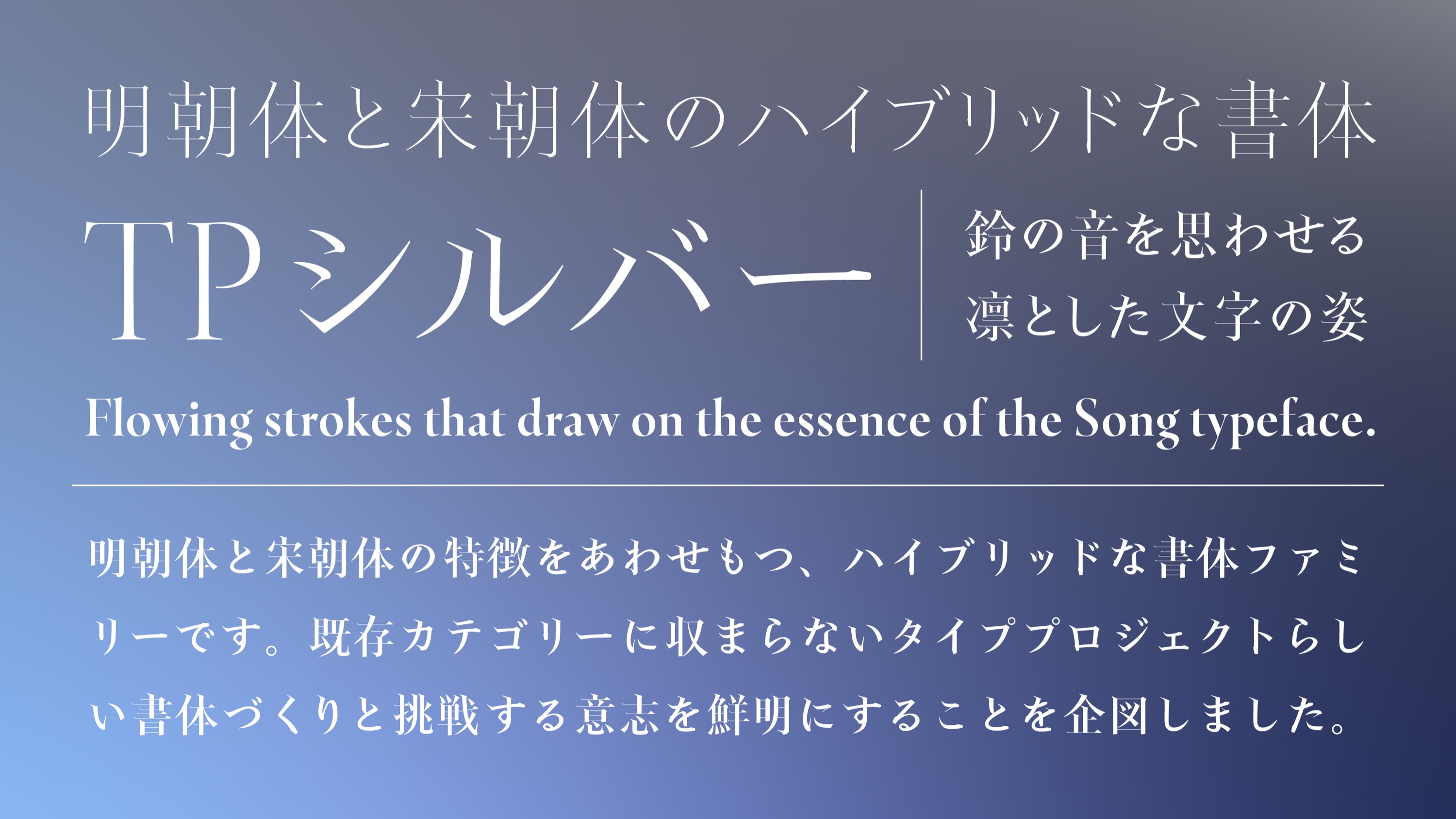
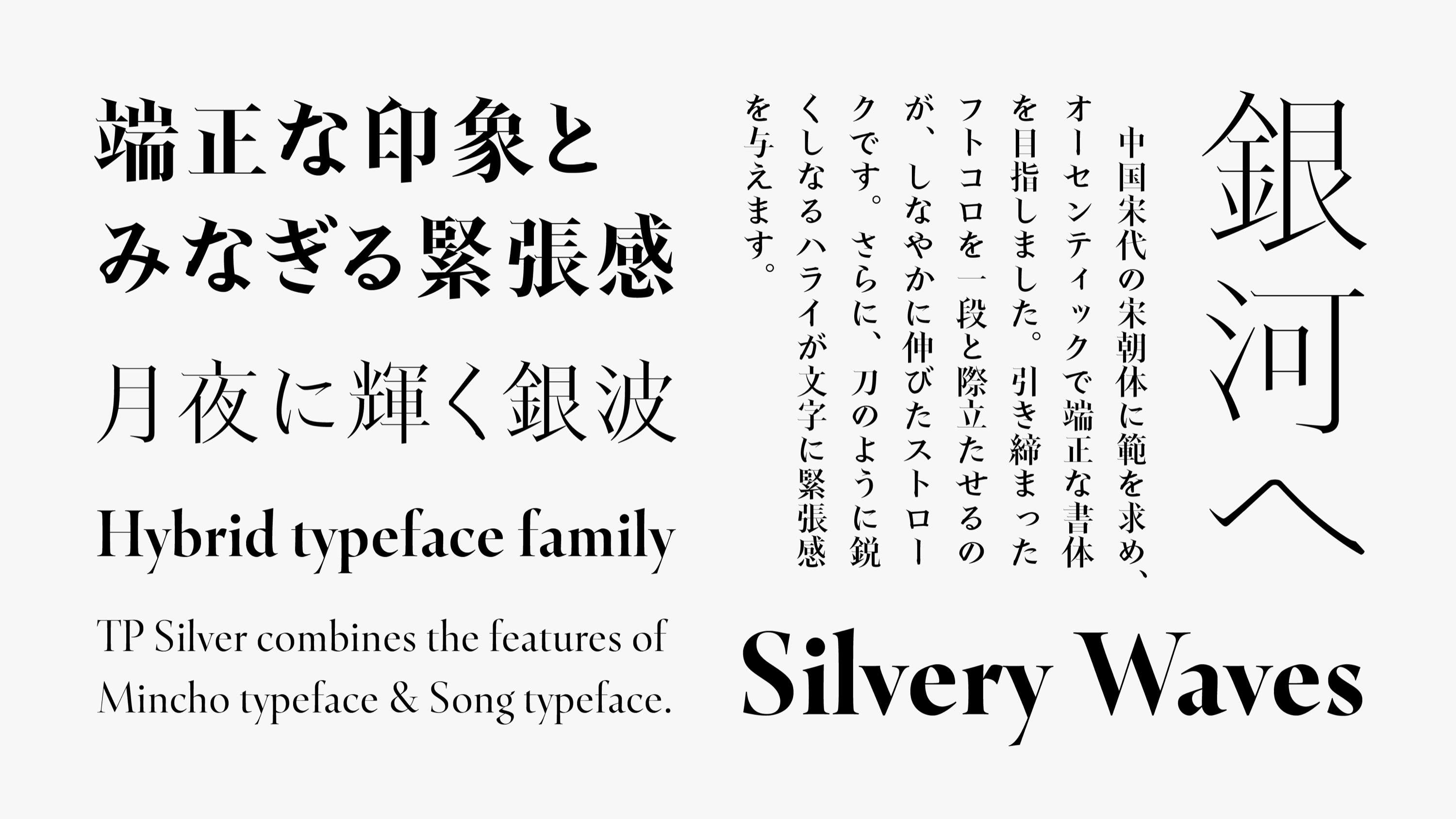
TP Silver is a hybrid typeface family that combines the features of Mincho typeface and Song typeface. The goal was to make it clear that Type Project creates typefaces that defy existing categories and is willing to take on new challenges. The name “Silver” carries our wish for the typeface to shine brightly today, as well as our thoughts on Type Project reaching its 25th anniversary. TP Silver features firm, flowing strokes that draw on the essence of the Song typeface, forceful sweeping strokes released from a taut structure, and incisive beginnings of brushstrokes that enter from the left. It has the presence of a classic, yet it also breathes a modern spirit.
Features
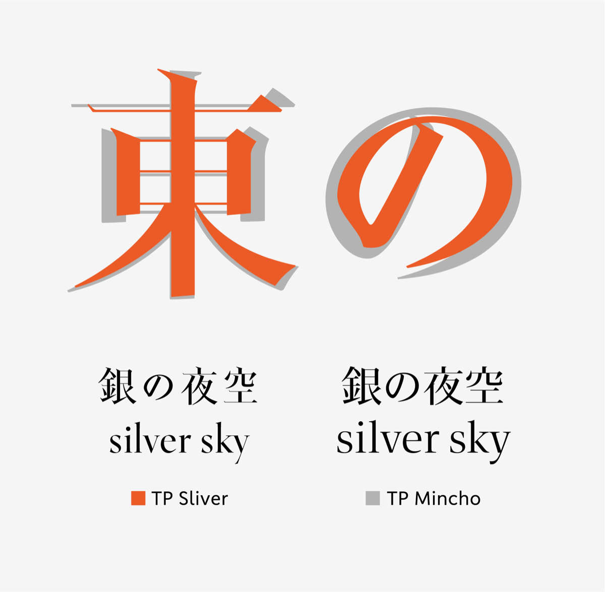
Tightened Inside Space Between Strokes
TP Silver has an especially tightly built structure, even among Type Project’s typefaces, and its dignified, crisp characters, reminiscent of the ring of a small bell, are its distinguishing charm. The kanji, with strokes that release stored-up energy with sharp, expansive sweeping strokes, are paired with small, brisk kana, which gives the whole design a crisp sense of contrast. The hiragana and katakana, designed in pursuit of a new standard, show different expressions depending on the size at which they are set. At large sizes, it delivers the vivid impact needed for a heading typeface, while at small sizes it is ideal as a conventional body-text typeface. TP Silver’s Latin typeface adopts a structure derived from a classical Roman typeface. It is an extremely aesthetically refined typeface, with horizontally compact proportions and relatively long descenders and ascenders. The tension and refined impression that pervade the typeface are supported by this design philosophy, which runs through the kanji, kana, and Latin alike.
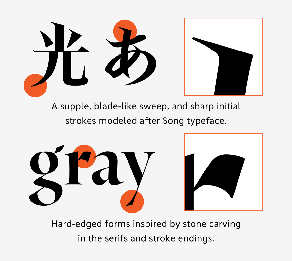
Sharp Serifs and Stretching Strokes
TP Silver takes the Song typeface of Song dynasty China as its model, with the aim of an authentic, well-composed design. The supple, extended strokes make the tightened inside space between strokes stand out even more. In addition, sweeping strokes that flex and cut as sharply as a sword blade give the characters a sense of tension. To give a contemporary freshness to a design modeled on the classics, an original interpretation is applied to the beginnings of brushstrokes. The beginnings of brushstrokes, which in standard Mincho typeface appear on the right side of kanji, are moved to the left, and their long, sharp shape characterizes the typeface. Placing the accent at the beginning of a brushstroke on the left is a convention of Song typeface, and it is also TP Silver’s flagship feature. The Latin also incorporates hard, firm shapes inspired by stone carving in its details, such as sharp serifs and cut stroke endings, creating a resonance between the Japanese and Latin. The contrast between the elegant curves and the clear, straight parts of the Latin makes the sharpness of TP Silver stand out even more.
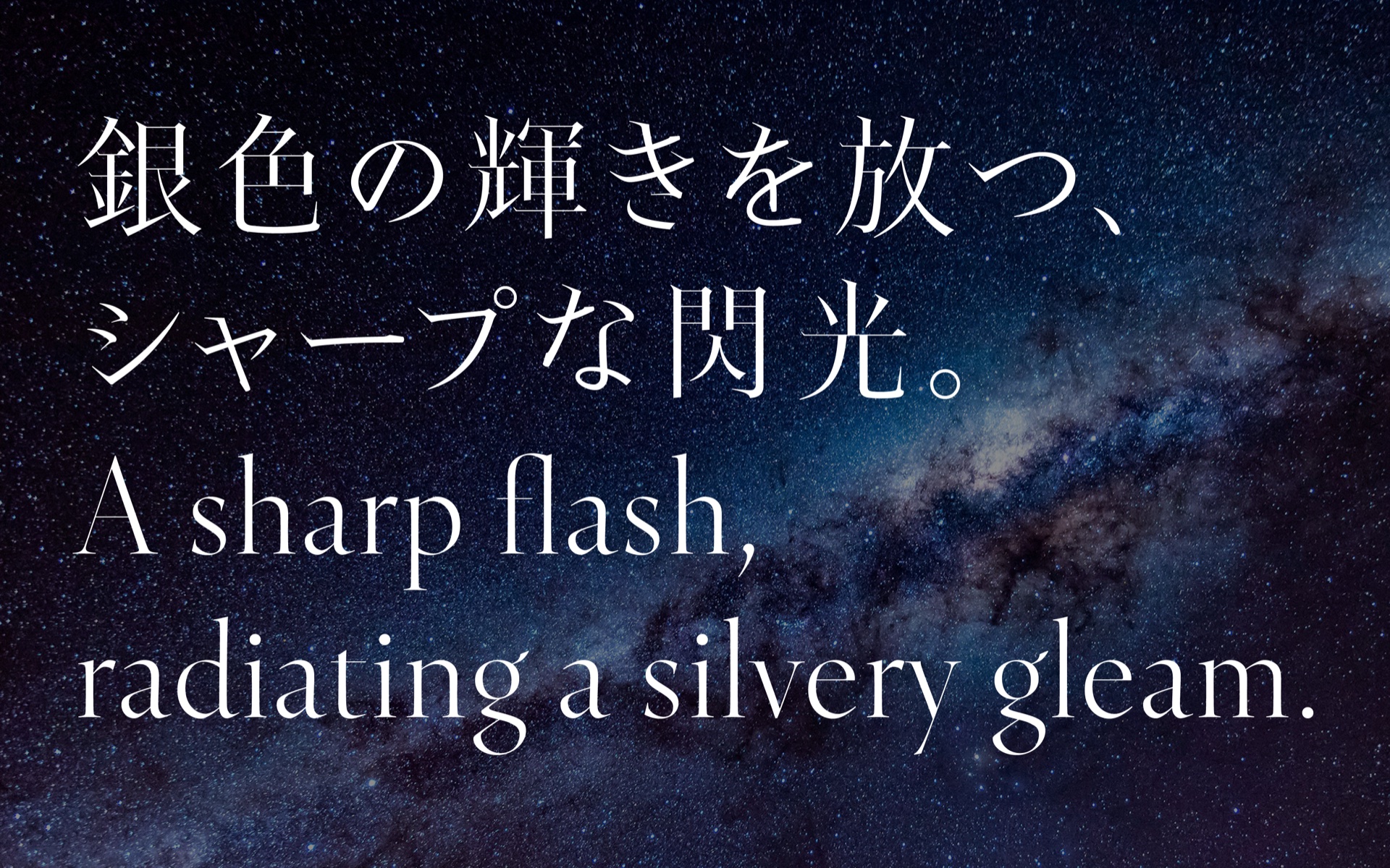
Extreme Contrast
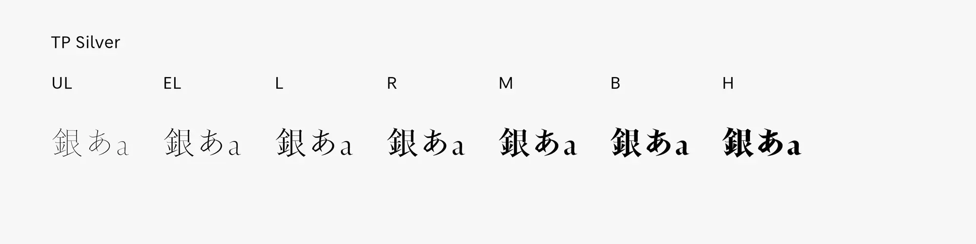
Because the tips of the sweeping strokes and the horizontal strokes in TP Silver are extremely thin, the contrast values were finely tuned to allow it to appear stable across all weights. The kanji receive detailed treatment that preserves the energy of each stroke, while the Latin emphasizes the fine nuances of every character, so that the design maximizes aesthetic refinement without sacrificing readability at target sizes. With their sharp, striking beauty, the UL and EL weights are effective for large-size headings. L, R, and M are highly practical weights with beautiful, tightly built, slender silhouettes. B and H have the power to make a strong impact while maintaining a sense of serenity. Each of TP Silver’s seven weights has its own distinctive brilliance.
- WHITE MODE
- BLACK MODE
- AHigh
Contrast
Family・Specification
Font set
Standard version (StdN)
9,539 characters (Adobe-Japan1-3, with custom glyphs added)
Buy
TP Connect
Subscription service that enables
the use of all of Type Project fonts.
TP Connect is only available in Japanese.