%20--%3e%3cpolygon%20points='24.7%201%200%201%200%207.6%208.5%207.6%208.5%2039.4%2016.1%2039.4%2016.1%207.6%2024.7%207.6%2024.7%201'/%3e%3cpath%20d='M34.1,32.4l-4.9-22.7h-7.9l9.1,33.1c-.4,1.7-1.1,2.9-3.7,2.9h-2.6l1.9,6.6h1.5c4,0,8-1.2,10.3-9.2,1.8-6.4,8.9-33.3,8.9-33.3h-8l-4.6,22.7Z'/%3e%3cpath%20d='M91.7,8.7c-8.7,0-12.7,6.5-12.7,16.1s3.6,15.3,13.8,15.3,7.2-.9,9-1.6l-1.2-6c-2.4.8-4.9,1.2-7,1.2-4.3,0-7-2-7.2-7.3h16v-4.8c0-7.5-2.9-13-10.7-13ZM86.5,21c0-3.3,1.7-6.4,4.7-6.4s4.1,2.7,4.1,6.4h-8.8Z'/%3e%3cpath%20d='M218,8.7c-8.7,0-12.7,6.5-12.7,16.1s3.6,15.3,13.8,15.3,7.2-.9,9-1.6l-1.2-6c-2.5.8-4.9,1.2-7,1.2-4.3,0-7-2-7.2-7.3h16v-4.8c0-7.5-2.9-13-10.7-13ZM212.9,21c0-3.3,1.7-6.4,4.7-6.4s4.1,2.7,4.1,6.4h-8.8Z'/%3e%3cpath%20d='M126,1h-10.7v38.4h7.6v-11.8h5c6,0,11.3-3.8,11.3-14.1s-5.5-12.5-13.1-12.5ZM125.9,20.9h-3.1V7.6h3c3.7,0,5.4,1.8,5.4,6.3s-1.5,7.1-5.3,7.1Z'/%3e%3cpath%20d='M150,12.9c-.2-1-.5-2.4-.8-3.2h-6.9c.5,1.9.7,4.6.7,7.9v21.8h7.4v-20.3c1.1-2.2,4.5-3,7.4-3v-6.8c-3.5,0-6.5,1.7-7.7,3.6Z'/%3e%3cpath%20d='M192.6,40.6c0,3.5-1.6,4-4.7,4h-1.5l1.9,6.6h2.3c6.3,0,9.3-3.2,9.3-9.8V9.7h-7.4v30.9Z'/%3e%3crect%20x='192.2'%20width='8.4'%20height='6.4'/%3e%3cpath%20d='M247.4,33.7c-4.8,0-6.6-2.8-6.6-9.6s1.9-8.9,6.2-8.9,3.4.4,4.9,1l1-6.4c-1.3-.5-3.7-.9-6.2-.9-10.6,0-13.4,6.7-13.4,15.9h0c0,10.7,4.6,15.3,12.4,15.3s5.9-.5,7.4-1l-.9-6.1c-2,.4-3.7.6-4.7.6Z'/%3e%3cpath%20d='M264.7,30.2v-14.2h5.4l1.4-5.8h-6.9V2.1l-7.3,1.9v26.8c0,5.3,2.4,9,8.2,9s4.9-.2,4.9-.2v-5.7h-2c-3,0-3.8-1.3-3.8-3.7Z'/%3e%3cpath%20d='M64.3,8.8c-3.3,0-5.8,1.6-7.3,3.4-.2-1.1-.5-2.1-.8-2.6h-6.6c.5,1.9.6,4.4.6,7.4v34.4h7.3v-13.8c1.5,1.5,3.8,2.4,6.2,2.4,8,0,11.2-6.6,11.2-16s-3.1-15.2-10.4-15.2ZM62.1,33.8c-1.6,0-3.1-.6-4.6-1.8-.3-1.6-.4-3.7-.4-6v-3.3c0-1.8.1-3.8.4-5.1,1.4-1.4,3-2.5,5-2.5,3.2,0,4.6,3.2,4.6,9s-.9,9.6-5,9.6Z'/%3e%3cpath%20d='M173.6,8.6c-9.5,0-13,6.7-13,15.7s3.5,16.1,13,16.1,13-6.8,13-16.2-3.3-15.7-13-15.7ZM173.6,34.2c-3.6,0-5.5-2.9-5.5-9.9s2.2-9.5,5.5-9.5,5.5,2.2,5.5,9.5-1.9,9.9-5.5,9.9Z'/%3e%3c/svg%3e)
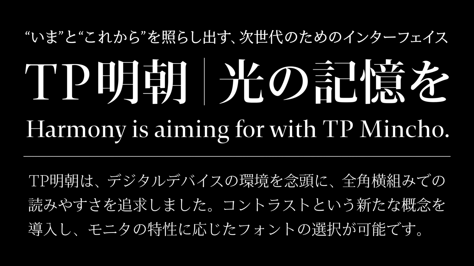
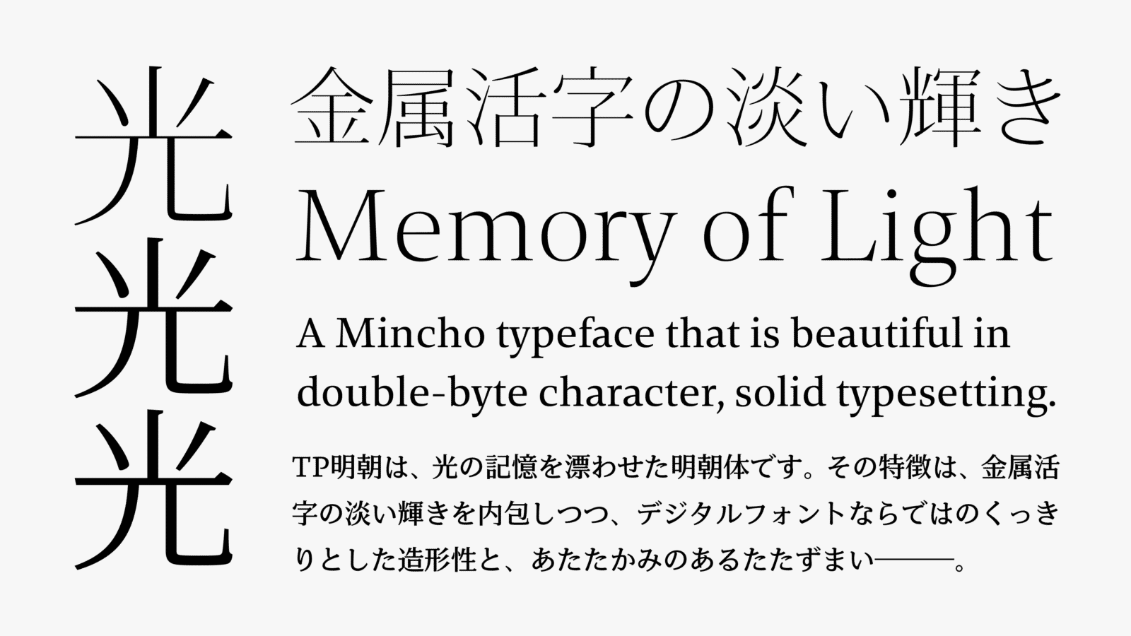
TP Mincho is implemented with the concept of using contrast to freely change the ratio of thickness of the horizontal strokes and the vertical strokes. Easy to read in horizontal typesetting, beautiful in full-width solid typesetting, and further satisfying the conditions in which it can be used in various devices with different resolutions, it has a charm special to Mincho typeface. We aimed for TP Mincho to be a font suitable for formal text.
Features
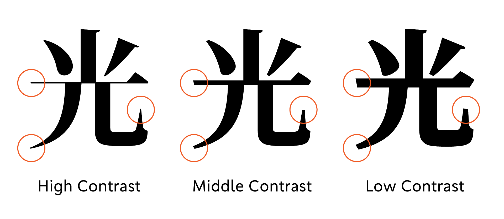
Three Contrast
TP Mincho is a next-generation Japanese font that has innovated the concept of using contrast to control character readability. High Contrast possesses a sophisticated, polished look, with the remarkable sharpness of its horizontal strokes and the tips of its harai (downward sweeping strokes); and the vivid impression created at thinner weights is truly exceptional. High Contrast is particularly suited for use in digital signage, website headers, posters and banners, and other situations where large characters are needed.
By carrying out a typeface design that is optimized for double-byte characters in horizontal layouts, we are aiming to maximize usability and legibility in digital environments.

Kado-uroko, characteristic of TP Mincho.
Have a look at the kado-uroko of TP Mincho – the right corner part where the horizontal stroke connects to the vertical stroke. The form of this stroke, which slopes gently down from the right end-tip of the kado-uroko to meet the vertical stroke, is characteristic of TP Mincho. By making the uroko 20-30 percent smaller than those in typical Mincho typefaces, we have succeeded in creating a feeling of lightness. While seeking to realize simple character shapes, we have endeavored in various ways to maintain a balance and contrast of sharpness and softness, for example, by giving the uroko a mild curve on the top right, and by rounding off the angles of rightward harai strokes. Latin characters, which have been completely realized to stand on their own, and have a uniqueness of design that transcends the standard treatment of foreign letters used within Japanese text.

Superior readability in horizontal layout
During the development of TP Mincho, the typeface’s orientation was set, and a thorough examination of character form and alignment was carried Character size and alignment have been standardized, horizontal layout stability improved, and superior readability at small font sizes has been realized by giving the counters a fair amount of space. To arrive at a kind of compatibility when setting a text, rather than trying to attain some perfect harmony of Japanese and Latin characters. That is what we are aiming for with TP Mincho. We have focused on elements that are not essential to either of their basic systems, such as size, thickness, alignment, form and details, and in effect, we have brought Japanese and Latin characters closer together and overcome the various difficult issues that arise between them.
- WHITE MODE
- BLACK MODE
- ALow
Contrast - AMiddle
Contrast - AHigh
Contrast
Family・Specification
Font set
Standard(StdN)
9,498 characters (Adobe-Japan1-3)
Buy
TP Connect
Subscription service that enables
the use of all of Type Project fonts.
TP Connect is only available in Japanese.