%20--%3e%3cpolygon%20points='24.7%201%200%201%200%207.6%208.5%207.6%208.5%2039.4%2016.1%2039.4%2016.1%207.6%2024.7%207.6%2024.7%201'/%3e%3cpath%20d='M34.1,32.4l-4.9-22.7h-7.9l9.1,33.1c-.4,1.7-1.1,2.9-3.7,2.9h-2.6l1.9,6.6h1.5c4,0,8-1.2,10.3-9.2,1.8-6.4,8.9-33.3,8.9-33.3h-8l-4.6,22.7Z'/%3e%3cpath%20d='M91.7,8.7c-8.7,0-12.7,6.5-12.7,16.1s3.6,15.3,13.8,15.3,7.2-.9,9-1.6l-1.2-6c-2.4.8-4.9,1.2-7,1.2-4.3,0-7-2-7.2-7.3h16v-4.8c0-7.5-2.9-13-10.7-13ZM86.5,21c0-3.3,1.7-6.4,4.7-6.4s4.1,2.7,4.1,6.4h-8.8Z'/%3e%3cpath%20d='M218,8.7c-8.7,0-12.7,6.5-12.7,16.1s3.6,15.3,13.8,15.3,7.2-.9,9-1.6l-1.2-6c-2.5.8-4.9,1.2-7,1.2-4.3,0-7-2-7.2-7.3h16v-4.8c0-7.5-2.9-13-10.7-13ZM212.9,21c0-3.3,1.7-6.4,4.7-6.4s4.1,2.7,4.1,6.4h-8.8Z'/%3e%3cpath%20d='M126,1h-10.7v38.4h7.6v-11.8h5c6,0,11.3-3.8,11.3-14.1s-5.5-12.5-13.1-12.5ZM125.9,20.9h-3.1V7.6h3c3.7,0,5.4,1.8,5.4,6.3s-1.5,7.1-5.3,7.1Z'/%3e%3cpath%20d='M150,12.9c-.2-1-.5-2.4-.8-3.2h-6.9c.5,1.9.7,4.6.7,7.9v21.8h7.4v-20.3c1.1-2.2,4.5-3,7.4-3v-6.8c-3.5,0-6.5,1.7-7.7,3.6Z'/%3e%3cpath%20d='M192.6,40.6c0,3.5-1.6,4-4.7,4h-1.5l1.9,6.6h2.3c6.3,0,9.3-3.2,9.3-9.8V9.7h-7.4v30.9Z'/%3e%3crect%20x='192.2'%20width='8.4'%20height='6.4'/%3e%3cpath%20d='M247.4,33.7c-4.8,0-6.6-2.8-6.6-9.6s1.9-8.9,6.2-8.9,3.4.4,4.9,1l1-6.4c-1.3-.5-3.7-.9-6.2-.9-10.6,0-13.4,6.7-13.4,15.9h0c0,10.7,4.6,15.3,12.4,15.3s5.9-.5,7.4-1l-.9-6.1c-2,.4-3.7.6-4.7.6Z'/%3e%3cpath%20d='M264.7,30.2v-14.2h5.4l1.4-5.8h-6.9V2.1l-7.3,1.9v26.8c0,5.3,2.4,9,8.2,9s4.9-.2,4.9-.2v-5.7h-2c-3,0-3.8-1.3-3.8-3.7Z'/%3e%3cpath%20d='M64.3,8.8c-3.3,0-5.8,1.6-7.3,3.4-.2-1.1-.5-2.1-.8-2.6h-6.6c.5,1.9.6,4.4.6,7.4v34.4h7.3v-13.8c1.5,1.5,3.8,2.4,6.2,2.4,8,0,11.2-6.6,11.2-16s-3.1-15.2-10.4-15.2ZM62.1,33.8c-1.6,0-3.1-.6-4.6-1.8-.3-1.6-.4-3.7-.4-6v-3.3c0-1.8.1-3.8.4-5.1,1.4-1.4,3-2.5,5-2.5,3.2,0,4.6,3.2,4.6,9s-.9,9.6-5,9.6Z'/%3e%3cpath%20d='M173.6,8.6c-9.5,0-13,6.7-13,15.7s3.5,16.1,13,16.1,13-6.8,13-16.2-3.3-15.7-13-15.7ZM173.6,34.2c-3.6,0-5.5-2.9-5.5-9.9s2.2-9.5,5.5-9.5,5.5,2.2,5.5,9.5-1.9,9.9-5.5,9.9Z'/%3e%3c/svg%3e)
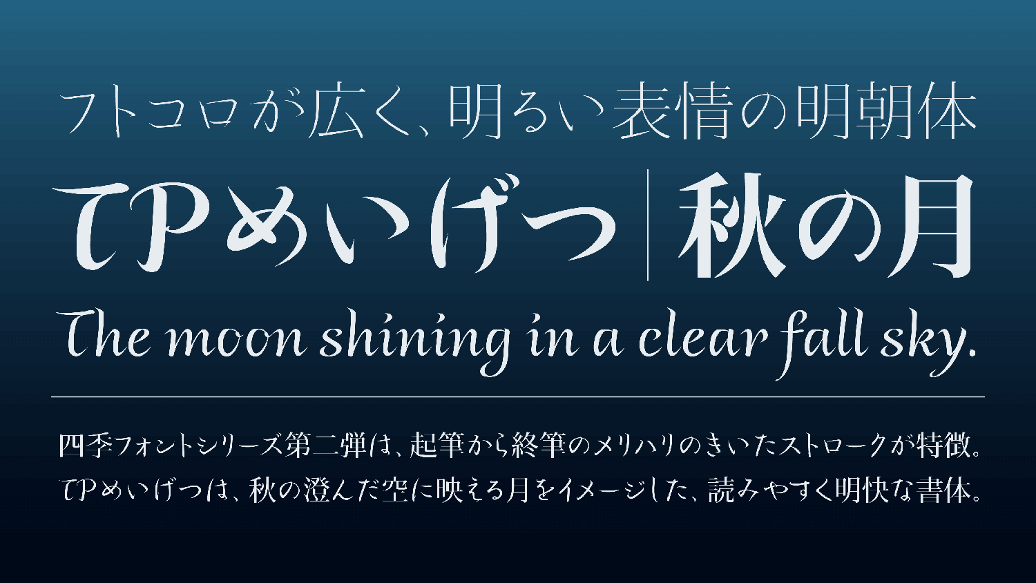
TP Meigetsu is the second release of the Seasonal Font Project. It is a Mincho typeface with the fall moon as a theme. Kana have wide inside space between strokes with a bright expression. Latin is matched with Kana where the inside space between strokes is widened. While designing the overall characters with slightly wide character shapes, the typeface brings a pleasant reading rhythm with its lightweight strokes.
Feature

Widened inside space between strokes
In TP Meigetsu, the unique *Fujiwara no Teika handwriting is arranged in the modern style. Teika characters, which stand out among refined old forms of writing, have the features of a noticeably large type face and wide inside space between strokes. Incorporating these features, Kana also have wide inside space between strokes with a bright expression. Kanji is matched with the TP Mincho High Contrast. Latin is matched with Kana where the inside space between strokes is widened. While designing the overall characters with slightly wide character shapes, the typeface brings a pleasant reading rhythm with its lightweight strokes.

Highly practical typeface
The name “Meigetsu” is taken from “Meigetsuki” diary written by Fujiwara no Teika for 56 years. Absorbing the essence of Master Teika, TP Meigetsu has a clarity that is still applicable to the present Modeled in Teika’s handwriting, which values differentiation between each character, TP Meigetsu is a highly practical typeface providing ease of reading applicable to the present.
*Fujiwara no Teika: A court noble and poet from the late Heian and early Kamakura periods. He wrote many treatises on poetry apart from editing the “Shin Kokin Wakashu” and “Ogura Hyakunin Isshu.” The style of calligraphy called “Master Teika” has the feature of writing pressure quality with extreme intensity, using a great deal of ink with the brush.
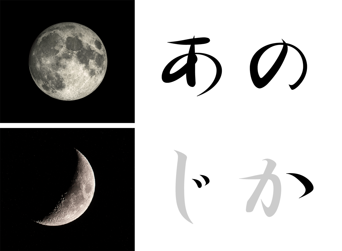
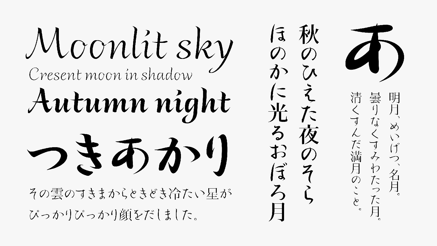
Image of a bright moon
The primary feature of TP Meigetsu is its well-modulated stroke, from the sharp beginning of each brushstroke to the thick ending. Among old forms of writing, which tend to have vertically long proportions in many cases, a unique form with a sense of flatness is also a major feature of Master Teika’s writing. In TP Meigetsu hiragana, these 2 features are clearly expressed. To draw theccloser, the moon shape is incorporated in parts of characters to give an atmosphere of moonlight to the design. Latin typeface is designed with cursive script that does not write in successive characters, beating out a light rhythm while maintaining ease of reading.
- WHITE MODE
- BLACK MODE
- A
Family・Specification
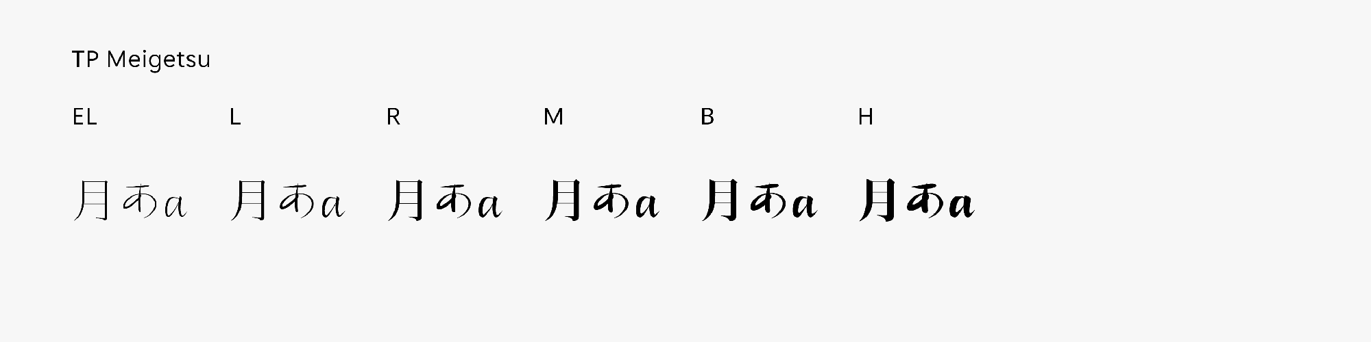
Font set
Standard(StdN)
9,498 characters (Adobe-Japan1-3, with custom glyphs added)
Buy
TP Connect
Subscription service that enables
the use of all of Type Project fonts.
TP Connect is only available in Japanese.