-
A Low Contrast
-
A Middle Contrast
-
A High Contrast
-
TP IrisLow Contrast
EL
四季フォントプロジェクト第一弾のTPアイリス 初夏を代表する花「あやめ」「かきつばた」をイメージした書体 While modeling a transitional typeface, it is an easy-to-use sans-serif typeface.
-
TP IrisLow Contrast
L
四季フォントプロジェクト第一弾のTPアイリス 初夏を代表する花「あやめ」「かきつばた」をイメージした書体 While modeling a transitional typeface, it is an easy-to-use sans-serif typeface.
-
TP IrisLow Contrast
R
四季フォントプロジェクト第一弾のTPアイリス 初夏を代表する花「あやめ」「かきつばた」をイメージした書体 While modeling a transitional typeface, it is an easy-to-use sans-serif typeface.
-
TP IrisLow Contrast
M
四季フォントプロジェクト第一弾のTPアイリス 初夏を代表する花「あやめ」「かきつばた」をイメージした書体 While modeling a transitional typeface, it is an easy-to-use sans-serif typeface.
-
TP IrisLow Contrast
B
四季フォントプロジェクト第一弾のTPアイリス 初夏を代表する花「あやめ」「かきつばた」をイメージした書体 While modeling a transitional typeface, it is an easy-to-use sans-serif typeface.
-
TP IrisMiddle Contrast
EL
四季フォントプロジェクト第一弾のTPアイリス 初夏を代表する花「あやめ」「かきつばた」をイメージした書体 While modeling a transitional typeface, it is an easy-to-use sans-serif typeface.
-
TP IrisMiddle Contrast
L
四季フォントプロジェクト第一弾のTPアイリス 初夏を代表する花「あやめ」「かきつばた」をイメージした書体 While modeling a transitional typeface, it is an easy-to-use sans-serif typeface.
-
TP IrisMiddle Contrast
R
四季フォントプロジェクト第一弾のTPアイリス 初夏を代表する花「あやめ」「かきつばた」をイメージした書体 While modeling a transitional typeface, it is an easy-to-use sans-serif typeface.
-
TP IrisMiddle Contrast
M
四季フォントプロジェクト第一弾のTPアイリス 初夏を代表する花「あやめ」「かきつばた」をイメージした書体 While modeling a transitional typeface, it is an easy-to-use sans-serif typeface.
-
TP IrisMiddle Contrast
B
四季フォントプロジェクト第一弾のTPアイリス 初夏を代表する花「あやめ」「かきつばた」をイメージした書体 While modeling a transitional typeface, it is an easy-to-use sans-serif typeface.
-
TP IrisHigh Contrast
EL
四季フォントプロジェクト第一弾のTPアイリス 初夏を代表する花「あやめ」「かきつばた」をイメージした書体 While modeling a transitional typeface, it is an easy-to-use sans-serif typeface.
-
TP IrisHigh Contrast
L
四季フォントプロジェクト第一弾のTPアイリス 初夏を代表する花「あやめ」「かきつばた」をイメージした書体 While modeling a transitional typeface, it is an easy-to-use sans-serif typeface.
-
TP IrisHigh Contrast
R
四季フォントプロジェクト第一弾のTPアイリス 初夏を代表する花「あやめ」「かきつばた」をイメージした書体 While modeling a transitional typeface, it is an easy-to-use sans-serif typeface.
-
TP IrisHigh Contrast
M
四季フォントプロジェクト第一弾のTPアイリス 初夏を代表する花「あやめ」「かきつばた」をイメージした書体 While modeling a transitional typeface, it is an easy-to-use sans-serif typeface.
-
TP IrisHigh Contrast
B
四季フォントプロジェクト第一弾のTPアイリス 初夏を代表する花「あやめ」「かきつばた」をイメージした書体 While modeling a transitional typeface, it is an easy-to-use sans-serif typeface.
About Product
Overview
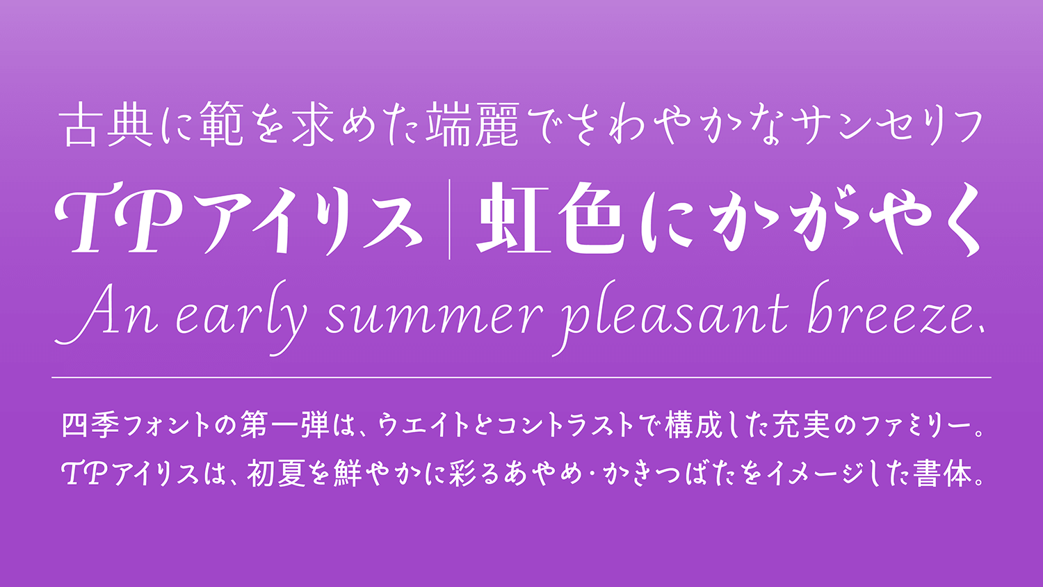
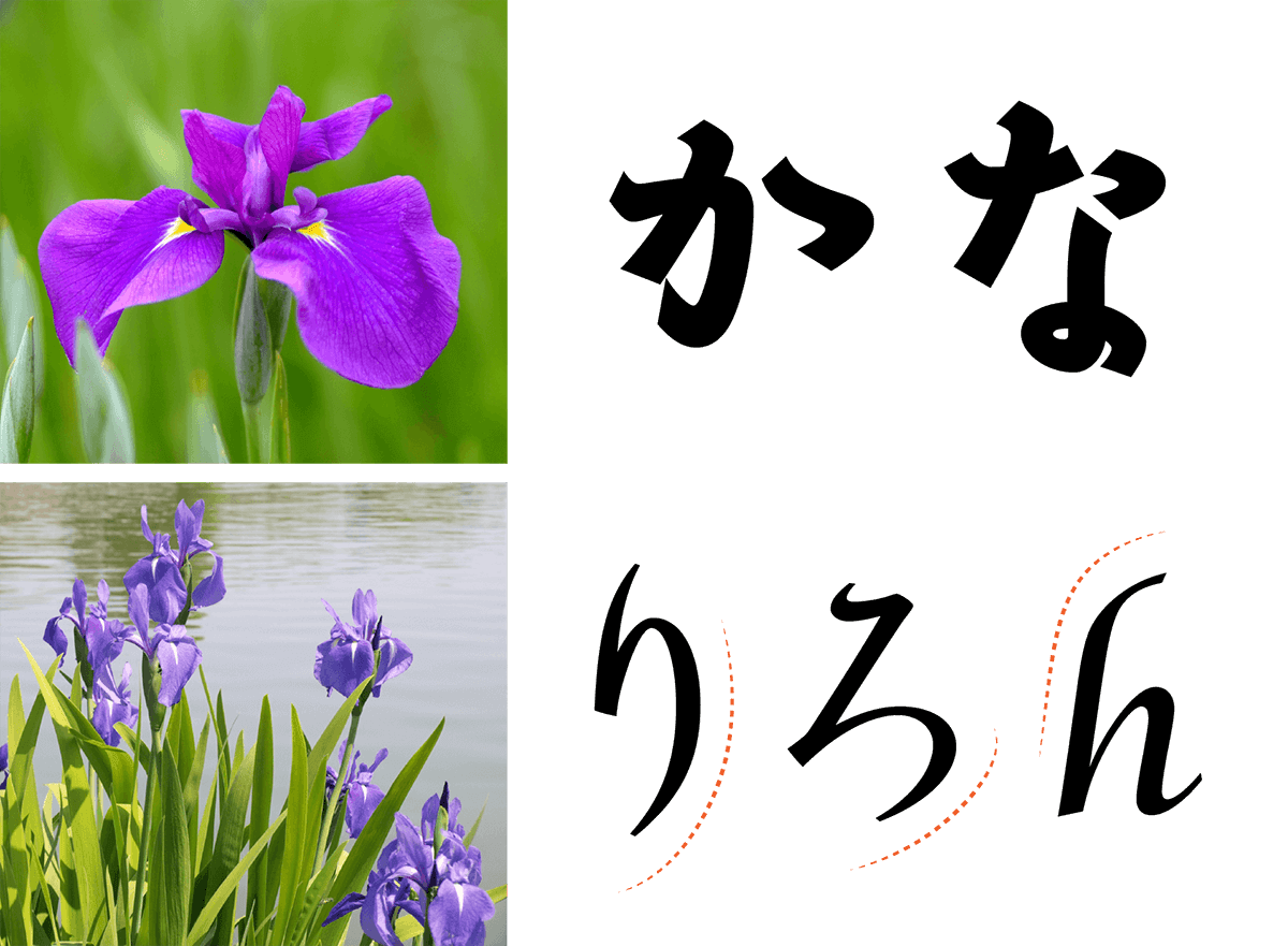
Type Project has launched the Seasonal Font Project as an attempt to enrich and express the Japanese language more delicately by designing a typeface reflecting seasonal features and putting the air of each season into the characters. The first release is TP Iris, a fine-looking typeface with in the image of the flowers “iris” and “Japanese iris,” representing early summer. While modeling a transitional typeface, it is an easy-to-use sans-serif typeface that conforms to modern applications. Its Kana is based on refined Kana in the Heian dynasty (A.D. 794 to 1185); an elegant cursive script developed in Latin around the 16th century as a model. TP Sky Classic, in which the block style structure is modernized, is adopted for Kanji.
In the series of each season, the classics in different eras are learned, and essence from culture and art of the world are widely absorbed to develop new fonts that are suitable for modern times. By incorporating today’s sensibilities in the classics used as a foundation, TP Iris is a typeface with both aesthetics and practicality. Certainly for poetry and literature, as well as children’s stories, lyrics, etc., it can be strongly expressive in poetry and prose where the rhythm matters.
High contrast has boldly innovated detail with classics as a core. Middle contrast can be used with confidence in a wide variety of applications. Low contrast is fresh with a modern expression. Using high quality culture as food for creation, TP Iris is a font family that represents something new in the combination of Japanese and Latin while valuing the original Japanese.
Concept
Inheriting the high quality cultures of all eras and countries, and delivering it all to the future through characters and typefaces – this is the concept of the Seasonal Font Project. TP Iris is a font that is reminiscent of sharp sword grass with its high contrast stroke shape, a thick weight that gives an impression of glamorous purple petals, and its thin weight conveys an early summer pleasant breeze.
Iris is a generic term for irises, including iris, Japanese iris, and iris ensata. German iris, Dutch iris, and other irises can also be widely seen in Europe. The origin of iris is the rainbow goddess Iris who appears in Greek mythology. Iris ensata in particular has many varieties and colors, the flower most suitable for the metaphor of rainbow.
One approach of TP Iris, in which the appearance of shifting nature is projected on typeface design, is the application technique to take in cultural resources cultivated in City Font Project to typeface. Taking in seasonal features to typeface, and adding color to the category of sans-serif typeface – this is one of the objectives in the background of TP Iris.
Features
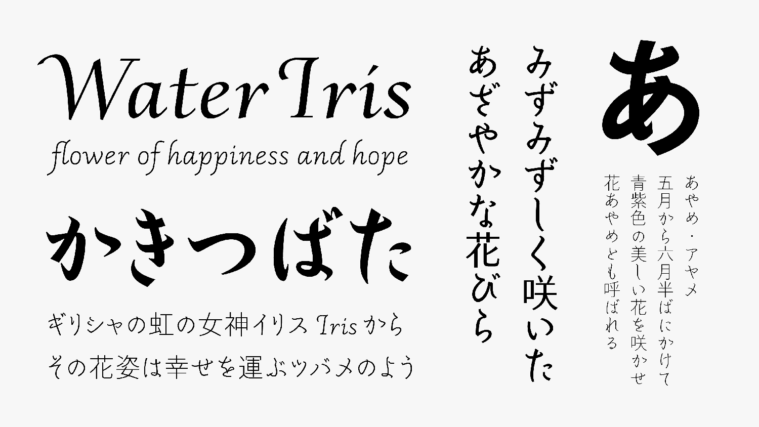
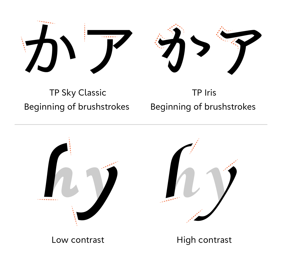
The uniqueness of TP Iris appears characteristically in the beginning of a Kana brushstroke. In the common Japanese sans-serif, the shape of the beginning of a brushstroke is cut down. TP Iris, however, handles the beginning of a brushstroke as an important element to indicate the atmosphere of Japanese style.
Kana, in which *onnade (characters written by women) in the Heian dynasty is present, demonstrates its true value in vertical typesetting. In particular, the thin weight in high contrast is close to the appearance of *Kana in Yukinari’s style, used as the source of design.
Poems by Yumeji Takehisa
*onnade: To originate from the fact that women, who were restricted from using kanji, used hiragana in writing songs and diaries in the Heian period.
*Kana in Yukinari’s style: One of the calligraphy styles Fujiwara no Yukinari.
In Latin, the shape and angle of the beginning and ending of a brushstroke is changed according to the features of each contrast. In low contrast, the sense of unity with Kana is improved. To give an elegant atmosphere, the tips are slightly at an acute angle. In high contrast, the angle and shape with the features of flat pen writing material are kept and adopted.
To harmonize the Japanese and Latin of TP Iris, each root for Japanese and Latin is valued, and we tried to achieve a design that enhances the individuality of both, instead of just getting their appearance closer to each other. In horizontal typesetting, amplitude of the Latin ascender and descender and the modulation of the vertical/horizontal proportion of Kana resonate with each other.
Excerpt from “Spring and Asura” by Kenji Miyazawa
To improve compatibility with Latin’s calligraphic design, old style numbers are included in the character set in addition to the default lining numbers. Old style numbers with different height by number can create an up-and-down rhythm in typesetting, and blend naturally with Latin texts with a lot of lowercase letters.
Family
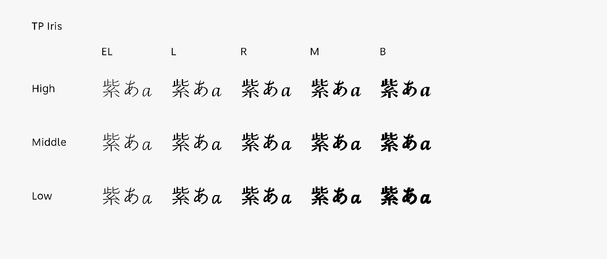
TP Iris is a family of 15 fonts configured with three contrasts of High, Middle, Low, and five weights. High contrast has the outstanding scant of modeled classics, and its delicate beauty is shown in the weight of L and R in particular. Middle contrast is easy to read even in small sizes, and displayability is high. The R of Middle contrast is particularly close to *Arrighi’s style of calligraphy, which is one of the typefaces referred to as a model for Latin. Low contrast can fit well with modern texts. Its unique rhythm created at the time of horizontal typesetting has a different attractiveness apart from vertical typesetting.
*Arrighi’s style of calligraphy: Calligraphy used by Ludovico degli Arrighi in his own calligraphy textbooks, etc., Arrighi was an Italian calligrapher and type designer. It developed from calligraphy used for stenography by the secretary in the Vatican from the 15th to 16th century, and it is also called Chancery Cursive (cursive script in the Vatican).
Specification
Main feature |
OpenType font Cross platform Extractable outlines PDF embedded Kerning information Dynamic download No resolution restrictions |
Supported operating system |
macOS Windows 10/11 |
Font set |
Standard(StdN) 9,530 characters (Adobe-Japan 1-3, with custom glyphs added) |
Languages | Japanese font (Std/StdN) almost fully covers 30 languages shown below. Japanese font based on Adobe Japan 1.3 covers all ISO-8859-1 proportional characters and Š, š, Ž, ž, Œ, œ, Ÿ. Then AXIS Font Japanese version can be used as multilingual font when you compose text using proportional characters. However, not all corresponding half-width characters are included, only Latin font is covered by half-width characters. Japanese (main script and covers JIS X 0208:1997) / English/ Icelandic (íslenska) / Irish (Gaelige) / Afrikaans (Afrikaans) / Albanian (Gjuha Shqipe) / Italian (Italiano) / Indonesian (Bahasa Indonesia) / Estonian (Eesti keel) / Occitan (lenga d’òc) / Dutch (Nederlands : U+0132 “IJ” and U+0133 “ij” shall be divided into I/i and J/j) / Oromo (Oromiffa) / Galician (Galego) / Swedish (Svenska) / Scottish Gaelic (Gàidhlig) / Spanish (Español) / Swahili (Kiswahili) / Danish (Dansk) / German (Deutsch) / Norwegian (Bokmål) / Norwegian (Nynorsk) / Finnish (Suomi) / Faroese (Føroyskt) / French (Française) / Brasilian Portuguese (Português Brasileiro) / Breton (Brezhoneg) / Portuguese (Português) / Latin (Latina : Classical orthography, without vowels with macron) / Luxembourg (Lëtzebuergesch) / Rhaeto-Romance languages (Rhaetian) / Walon (Walloon) *Full width version of Greek uppercase/lowercase (24 characters for each, excluding ending form of sigma) and Cyrillic (Russian) uppercase/lowercase (33 characters for each) are included as JIS Row6 and Row 7 (These characters are defined as full width in JIS spec) |