%20--%3e%3cpolygon%20points='24.7%201%200%201%200%207.6%208.5%207.6%208.5%2039.4%2016.1%2039.4%2016.1%207.6%2024.7%207.6%2024.7%201'/%3e%3cpath%20d='M34.1,32.4l-4.9-22.7h-7.9l9.1,33.1c-.4,1.7-1.1,2.9-3.7,2.9h-2.6l1.9,6.6h1.5c4,0,8-1.2,10.3-9.2,1.8-6.4,8.9-33.3,8.9-33.3h-8l-4.6,22.7Z'/%3e%3cpath%20d='M91.7,8.7c-8.7,0-12.7,6.5-12.7,16.1s3.6,15.3,13.8,15.3,7.2-.9,9-1.6l-1.2-6c-2.4.8-4.9,1.2-7,1.2-4.3,0-7-2-7.2-7.3h16v-4.8c0-7.5-2.9-13-10.7-13ZM86.5,21c0-3.3,1.7-6.4,4.7-6.4s4.1,2.7,4.1,6.4h-8.8Z'/%3e%3cpath%20d='M218,8.7c-8.7,0-12.7,6.5-12.7,16.1s3.6,15.3,13.8,15.3,7.2-.9,9-1.6l-1.2-6c-2.5.8-4.9,1.2-7,1.2-4.3,0-7-2-7.2-7.3h16v-4.8c0-7.5-2.9-13-10.7-13ZM212.9,21c0-3.3,1.7-6.4,4.7-6.4s4.1,2.7,4.1,6.4h-8.8Z'/%3e%3cpath%20d='M126,1h-10.7v38.4h7.6v-11.8h5c6,0,11.3-3.8,11.3-14.1s-5.5-12.5-13.1-12.5ZM125.9,20.9h-3.1V7.6h3c3.7,0,5.4,1.8,5.4,6.3s-1.5,7.1-5.3,7.1Z'/%3e%3cpath%20d='M150,12.9c-.2-1-.5-2.4-.8-3.2h-6.9c.5,1.9.7,4.6.7,7.9v21.8h7.4v-20.3c1.1-2.2,4.5-3,7.4-3v-6.8c-3.5,0-6.5,1.7-7.7,3.6Z'/%3e%3cpath%20d='M192.6,40.6c0,3.5-1.6,4-4.7,4h-1.5l1.9,6.6h2.3c6.3,0,9.3-3.2,9.3-9.8V9.7h-7.4v30.9Z'/%3e%3crect%20x='192.2'%20width='8.4'%20height='6.4'/%3e%3cpath%20d='M247.4,33.7c-4.8,0-6.6-2.8-6.6-9.6s1.9-8.9,6.2-8.9,3.4.4,4.9,1l1-6.4c-1.3-.5-3.7-.9-6.2-.9-10.6,0-13.4,6.7-13.4,15.9h0c0,10.7,4.6,15.3,12.4,15.3s5.9-.5,7.4-1l-.9-6.1c-2,.4-3.7.6-4.7.6Z'/%3e%3cpath%20d='M264.7,30.2v-14.2h5.4l1.4-5.8h-6.9V2.1l-7.3,1.9v26.8c0,5.3,2.4,9,8.2,9s4.9-.2,4.9-.2v-5.7h-2c-3,0-3.8-1.3-3.8-3.7Z'/%3e%3cpath%20d='M64.3,8.8c-3.3,0-5.8,1.6-7.3,3.4-.2-1.1-.5-2.1-.8-2.6h-6.6c.5,1.9.6,4.4.6,7.4v34.4h7.3v-13.8c1.5,1.5,3.8,2.4,6.2,2.4,8,0,11.2-6.6,11.2-16s-3.1-15.2-10.4-15.2ZM62.1,33.8c-1.6,0-3.1-.6-4.6-1.8-.3-1.6-.4-3.7-.4-6v-3.3c0-1.8.1-3.8.4-5.1,1.4-1.4,3-2.5,5-2.5,3.2,0,4.6,3.2,4.6,9s-.9,9.6-5,9.6Z'/%3e%3cpath%20d='M173.6,8.6c-9.5,0-13,6.7-13,15.7s3.5,16.1,13,16.1,13-6.8,13-16.2-3.3-15.7-13-15.7ZM173.6,34.2c-3.6,0-5.5-2.9-5.5-9.9s2.2-9.5,5.5-9.5,5.5,2.2,5.5,9.5-1.9,9.9-5.5,9.9Z'/%3e%3c/svg%3e)
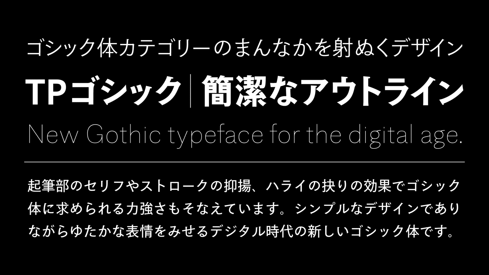
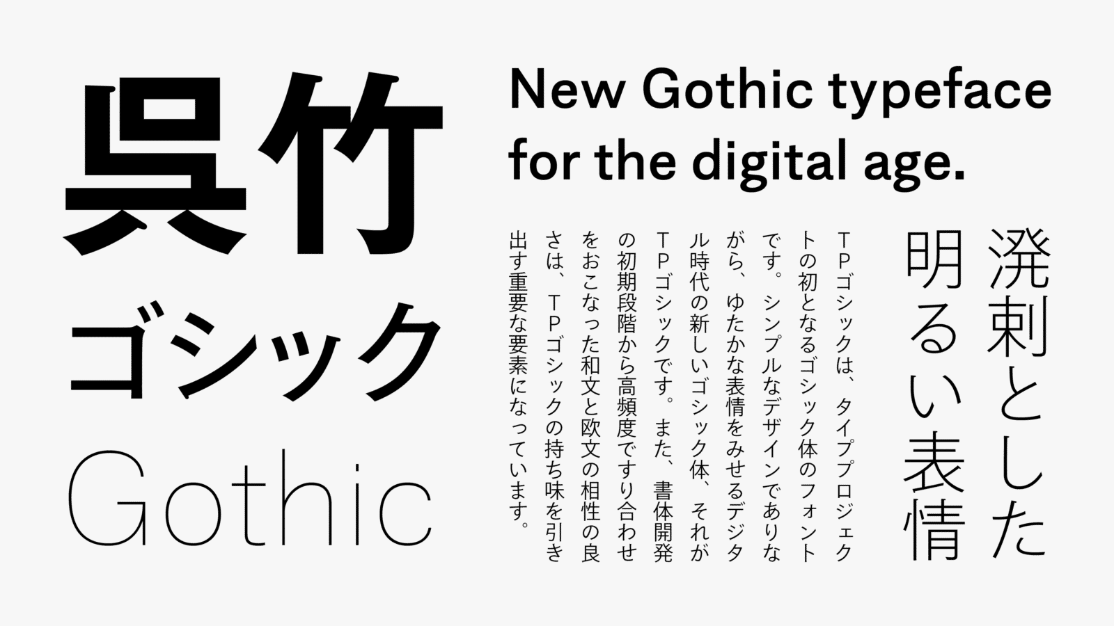
TP Gothic is the first Gothic typeface font by Type Project. TP Gothic is a dependable Gothic typeface with high multiplicity that can be used in both vertical typesetting and horizontal typesetting; it has a lively bright expression that does not come too near Modern, with a line quality that is close to TP Mincho’s kana.
Features
New Gothic for the digital environment
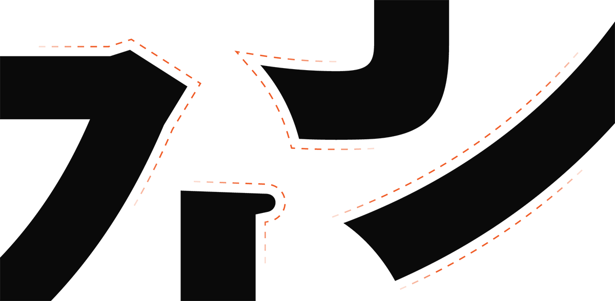
As strokes of TP Gothic are expressed with simple outlines, stable display results can be obtained in a variety of resolutions. The theme that is connected to Type Project fonts at a fundamental level – “The most suitable font family for the digital environment” – is achieved in the category of Gothic typeface. TP Mincho’s kana has a modern shape as a Mincho typeface. TP Gothic, which followed the structure of TP Mincho’s kana to some extent, is a typeface with an impression that is more orthodox than AXIS Font and TP Sky. Also, TP Gothic’s kanji is designed with a narrowed tendency in the inside space between strokes. This creates an atmosphere that comes slightly near Classic.

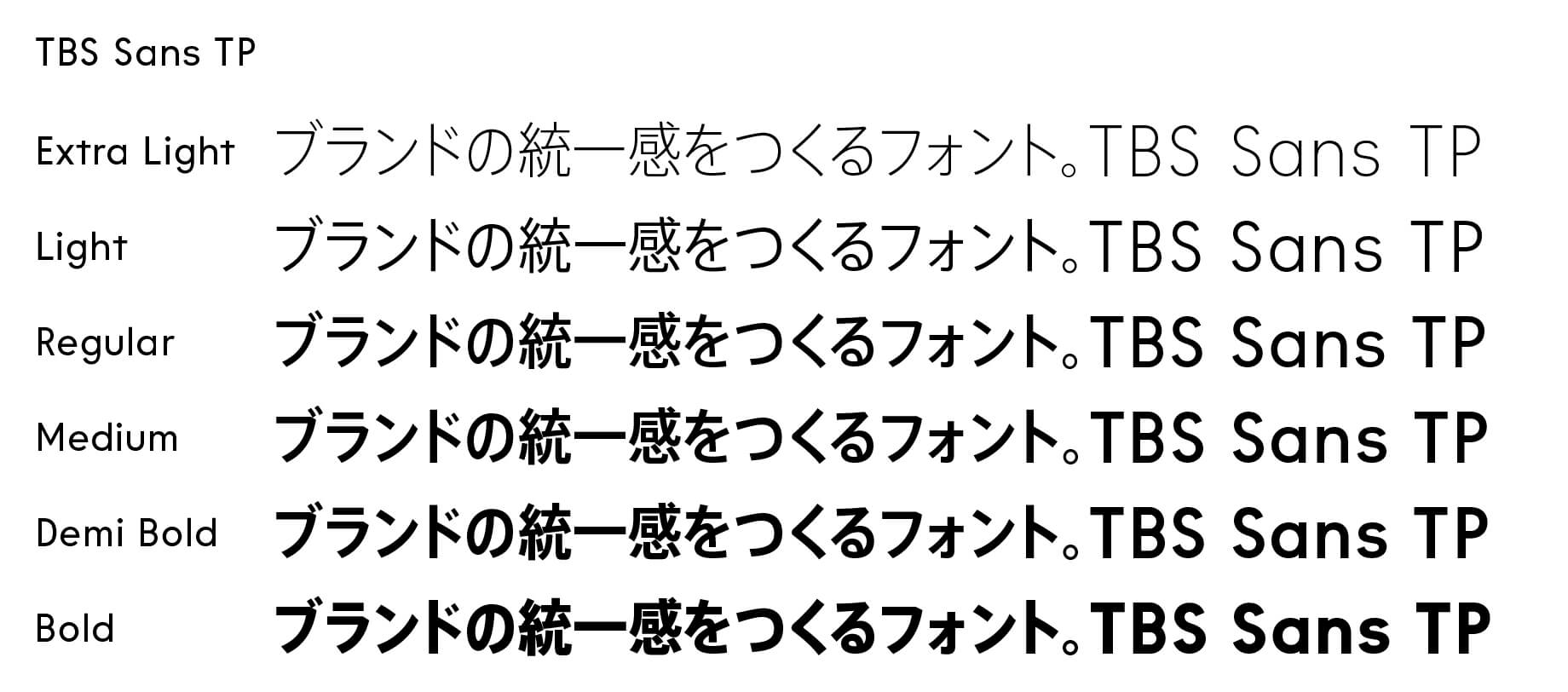
Natural modulation and intensity
TP Gothic’s kanji gives a proper and relaxed impression due to the effect of the slightly tightened inside space between strokes. Kana that match kanji are overall smallish typefaces with emphasis on the flow of characters at the time of typesetting vertically. In horizontal typesetting, which Type Project focuses on, verification has been made to accommodate both the kana brushstrokes and stable character alignment.Without overelaborating the expression of stroke details and maintaining only natural modulation and intensity, the nuance that leads to the texture of typeface is valued. Excellent compatibility between Japanese and Latin, in which frequent fittings had been conducted from the early stage of the typeface development, is an important element that maximizes the features of TP Gothic.

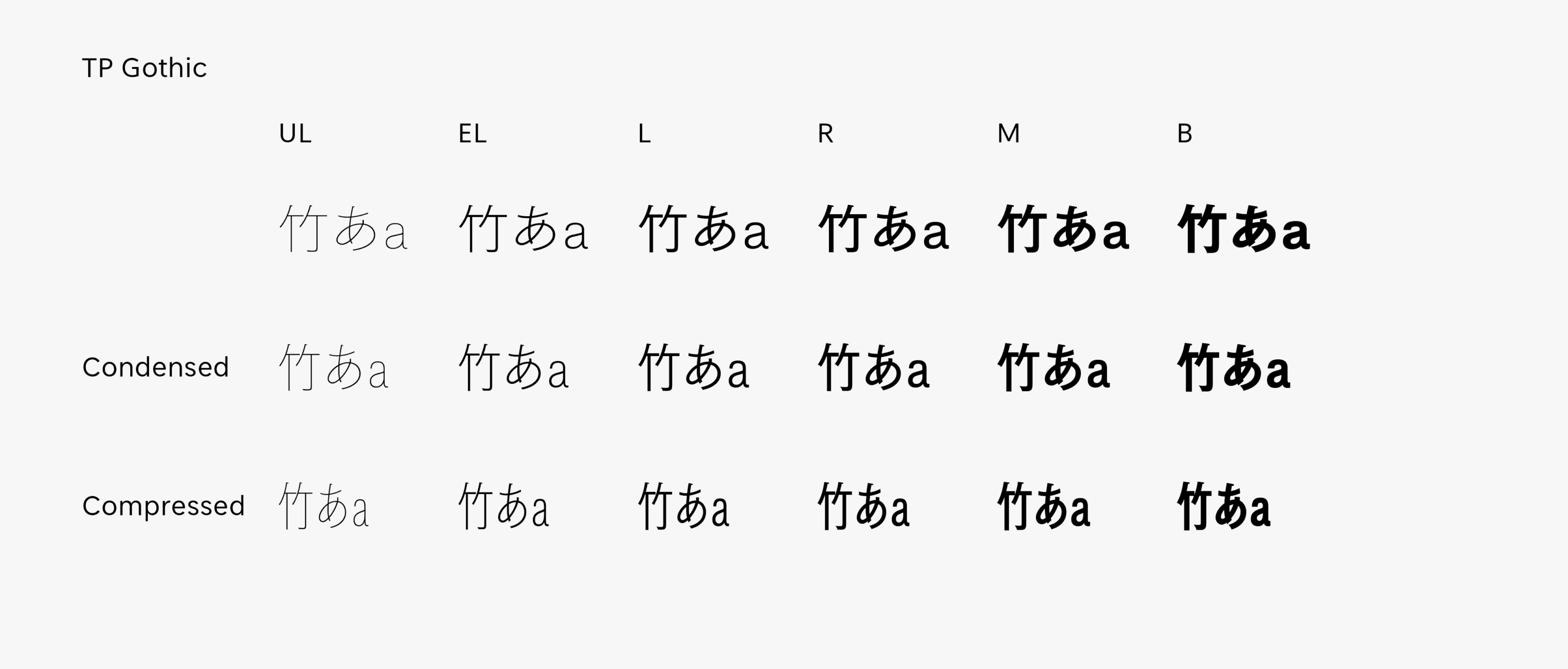
Modulation and stronger the impression
The thicker the weight, the larger the stroke’s modulation and stronger the impression it gives.
For Latin, it is a relaxed, orthodox grotesque sans-serif typeface (the earliest stage of linear sans-serif typeface, with strong regularity). By including nuances of hand writing in the structure to generate more space, it gives an impression of familiarity. By setting the x-height slightly higher and the character width slightly narrower, readability is clearly provided as individual Latin characters. It is designed with the awareness of excellent compatibility with Japanese, with tightened inside space between strokes. As the character width is set narrower even in Basic, compatibility is also excellent when used along with Condensed and Compressed. It brings out functional space saving effects, and is an easy-to-use typeface with natural development in the font family.
- WHITE MODE
- BLACK MODE
- ABasic
- ACondensed
- ACompressed
Family・Specification
Font set
Standard (StdN)
9,490 characters (Adobe-Japan1-3)
Buy
TP Connect
Subscription service that enables
the use of all of Type Project fonts.
TP Connect is only available in Japanese.