%20--%3e%3cpolygon%20points='24.7%201%200%201%200%207.6%208.5%207.6%208.5%2039.4%2016.1%2039.4%2016.1%207.6%2024.7%207.6%2024.7%201'/%3e%3cpath%20d='M34.1,32.4l-4.9-22.7h-7.9l9.1,33.1c-.4,1.7-1.1,2.9-3.7,2.9h-2.6l1.9,6.6h1.5c4,0,8-1.2,10.3-9.2,1.8-6.4,8.9-33.3,8.9-33.3h-8l-4.6,22.7Z'/%3e%3cpath%20d='M91.7,8.7c-8.7,0-12.7,6.5-12.7,16.1s3.6,15.3,13.8,15.3,7.2-.9,9-1.6l-1.2-6c-2.4.8-4.9,1.2-7,1.2-4.3,0-7-2-7.2-7.3h16v-4.8c0-7.5-2.9-13-10.7-13ZM86.5,21c0-3.3,1.7-6.4,4.7-6.4s4.1,2.7,4.1,6.4h-8.8Z'/%3e%3cpath%20d='M218,8.7c-8.7,0-12.7,6.5-12.7,16.1s3.6,15.3,13.8,15.3,7.2-.9,9-1.6l-1.2-6c-2.5.8-4.9,1.2-7,1.2-4.3,0-7-2-7.2-7.3h16v-4.8c0-7.5-2.9-13-10.7-13ZM212.9,21c0-3.3,1.7-6.4,4.7-6.4s4.1,2.7,4.1,6.4h-8.8Z'/%3e%3cpath%20d='M126,1h-10.7v38.4h7.6v-11.8h5c6,0,11.3-3.8,11.3-14.1s-5.5-12.5-13.1-12.5ZM125.9,20.9h-3.1V7.6h3c3.7,0,5.4,1.8,5.4,6.3s-1.5,7.1-5.3,7.1Z'/%3e%3cpath%20d='M150,12.9c-.2-1-.5-2.4-.8-3.2h-6.9c.5,1.9.7,4.6.7,7.9v21.8h7.4v-20.3c1.1-2.2,4.5-3,7.4-3v-6.8c-3.5,0-6.5,1.7-7.7,3.6Z'/%3e%3cpath%20d='M192.6,40.6c0,3.5-1.6,4-4.7,4h-1.5l1.9,6.6h2.3c6.3,0,9.3-3.2,9.3-9.8V9.7h-7.4v30.9Z'/%3e%3crect%20x='192.2'%20width='8.4'%20height='6.4'/%3e%3cpath%20d='M247.4,33.7c-4.8,0-6.6-2.8-6.6-9.6s1.9-8.9,6.2-8.9,3.4.4,4.9,1l1-6.4c-1.3-.5-3.7-.9-6.2-.9-10.6,0-13.4,6.7-13.4,15.9h0c0,10.7,4.6,15.3,12.4,15.3s5.9-.5,7.4-1l-.9-6.1c-2,.4-3.7.6-4.7.6Z'/%3e%3cpath%20d='M264.7,30.2v-14.2h5.4l1.4-5.8h-6.9V2.1l-7.3,1.9v26.8c0,5.3,2.4,9,8.2,9s4.9-.2,4.9-.2v-5.7h-2c-3,0-3.8-1.3-3.8-3.7Z'/%3e%3cpath%20d='M64.3,8.8c-3.3,0-5.8,1.6-7.3,3.4-.2-1.1-.5-2.1-.8-2.6h-6.6c.5,1.9.6,4.4.6,7.4v34.4h7.3v-13.8c1.5,1.5,3.8,2.4,6.2,2.4,8,0,11.2-6.6,11.2-16s-3.1-15.2-10.4-15.2ZM62.1,33.8c-1.6,0-3.1-.6-4.6-1.8-.3-1.6-.4-3.7-.4-6v-3.3c0-1.8.1-3.8.4-5.1,1.4-1.4,3-2.5,5-2.5,3.2,0,4.6,3.2,4.6,9s-.9,9.6-5,9.6Z'/%3e%3cpath%20d='M173.6,8.6c-9.5,0-13,6.7-13,15.7s3.5,16.1,13,16.1,13-6.8,13-16.2-3.3-15.7-13-15.7ZM173.6,34.2c-3.6,0-5.5-2.9-5.5-9.9s2.2-9.5,5.5-9.5,5.5,2.2,5.5,9.5-1.9,9.9-5.5,9.9Z'/%3e%3c/svg%3e)
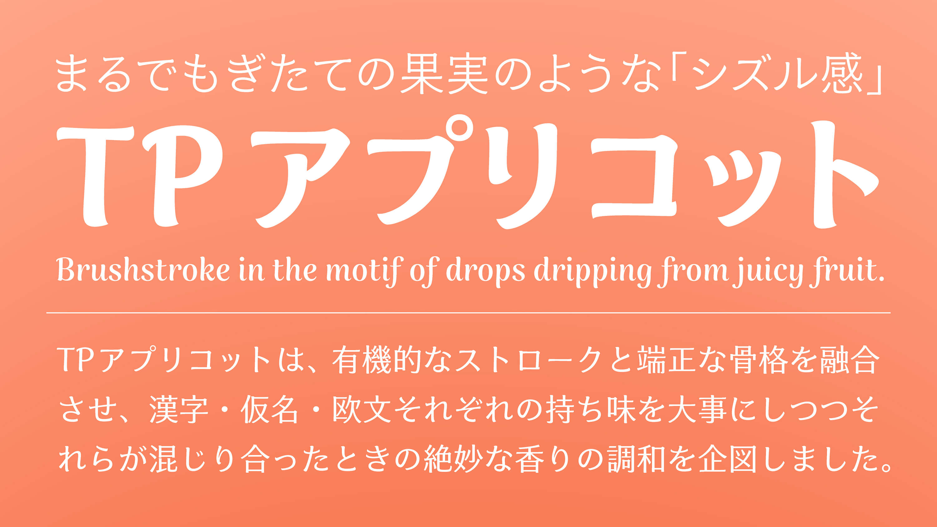
TP Apricot is a typeface with a “sizzle feel” that may make you think of freshly picked fruit. By incorporating the texture of handwriting, we aimed for design balancing individuality and ease of reading. The soft and rounded line quality with a thicker beginning and ending brushstroke create familiarity and give a juicy impression.
Features
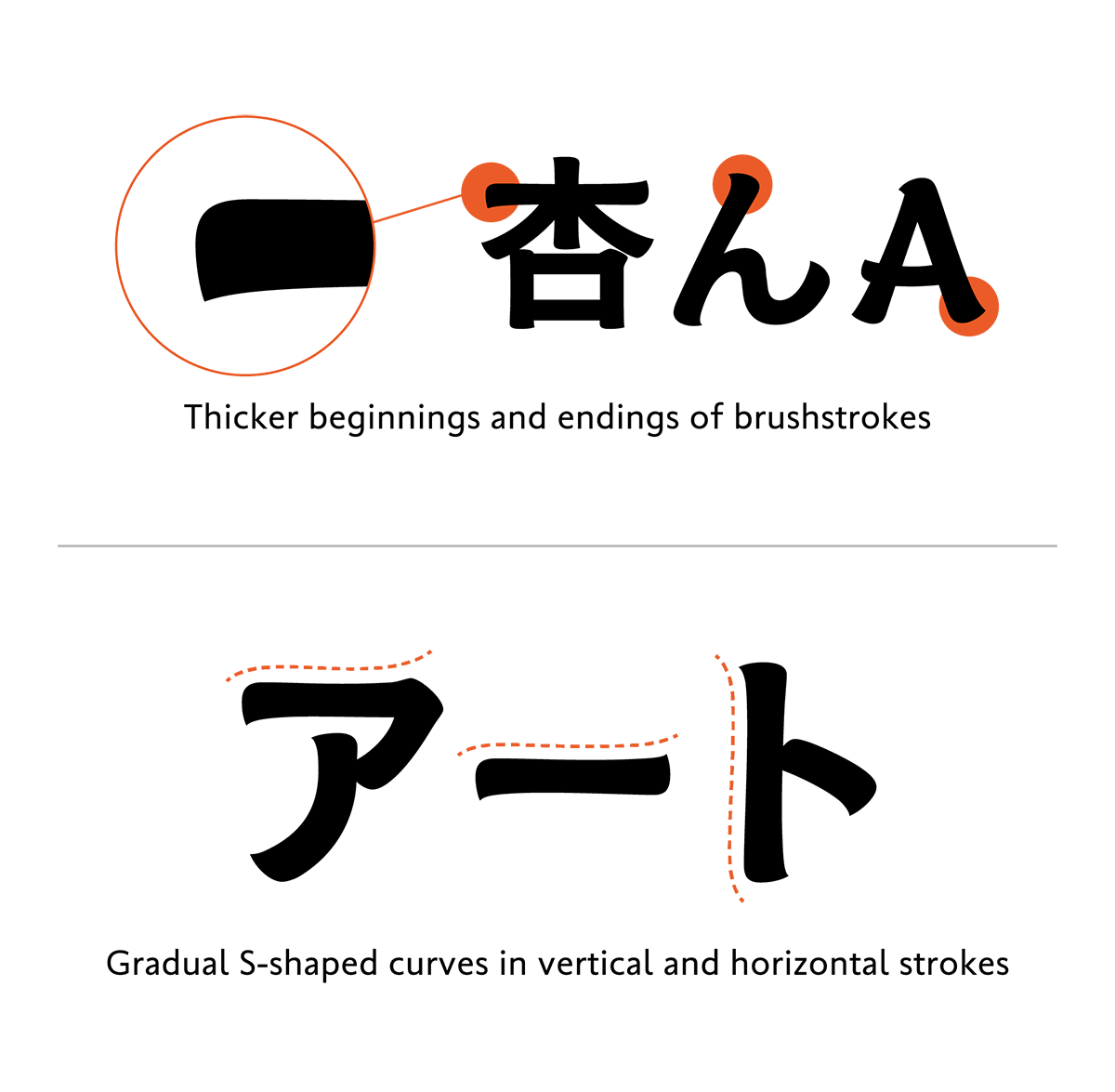
Line Modulation Utilizing a Nuance of Handwriting
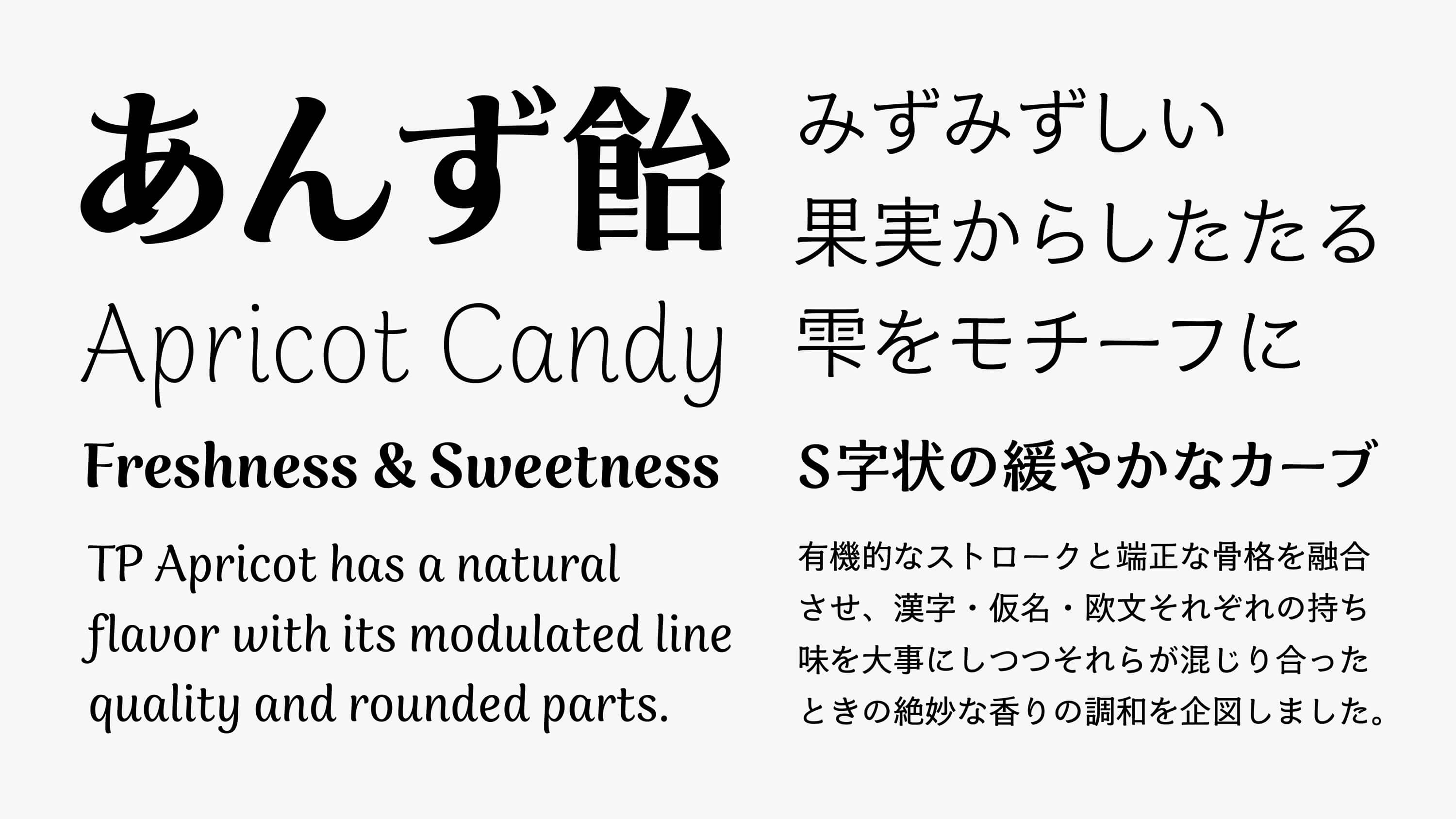
TP Apricot has a natural flavor with its modulated line quality and rounded parts. Incorporating the shape that reminds us of lines drawn with writing instruments here and there such as a brush, felt-tip pen, etc., finishing the characters with familiarity. The line width and ink flow due to changes in brush pressure are reflected in the design with thick, wide beginnings and endings of each brushstroke in the motif of drops dripping from juicy fruit. The vertical and horizontal strokes have an S-shaped gradual curve that expresses the smooth movement of a hand and a writing instrument when drawing a line slowly. In Latin, with its few strokes and in kana, the contrast of swelling of the beginning and ending of a brushstroke are strengthened; in Kanji, crowded with lines, the overall typeface balance is maintained by restraining modulation.

Variations in contrast reflect the texture of writing instruments
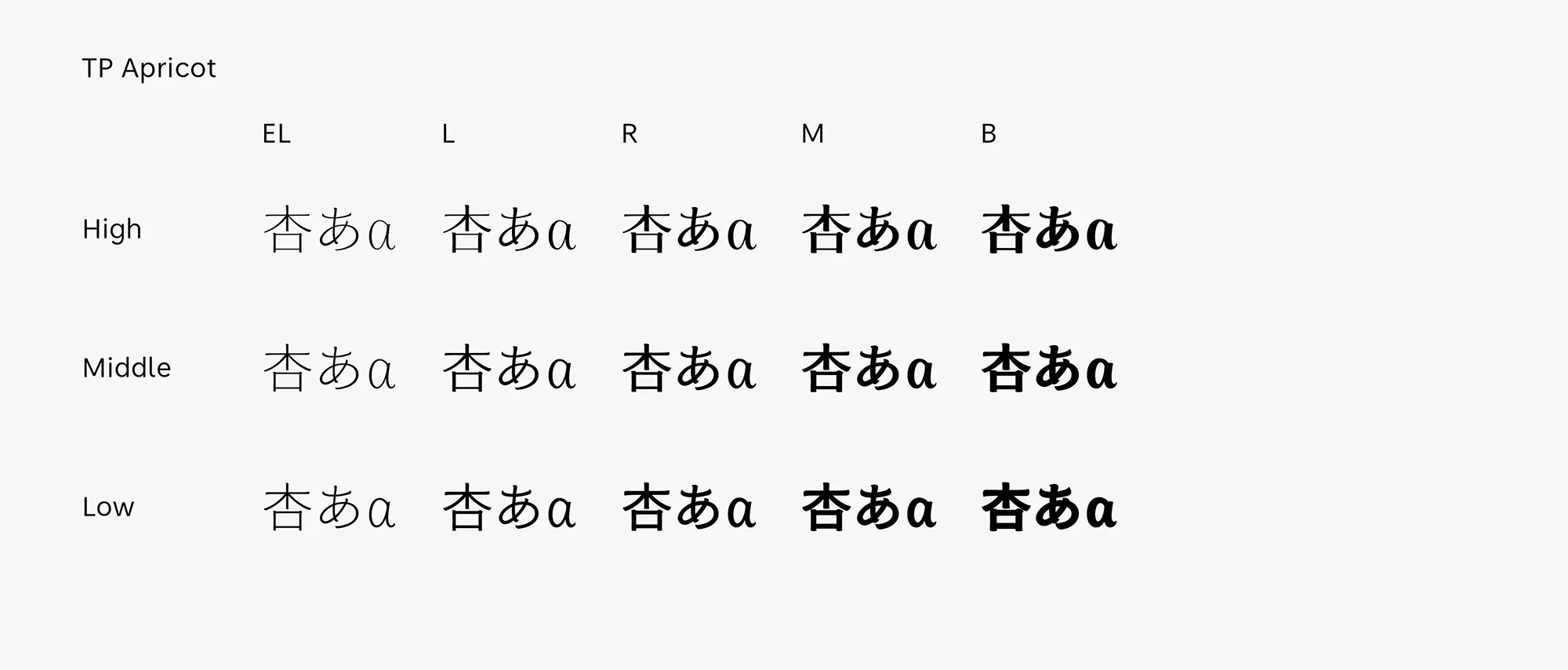
The three contrasts of TP Apricot all feature the texture of handwriting, but writing instruments used as the motif and design nuances differ in each contrast. Low Contrast, inspired by lines drawn with a felt tip pen or round brush, creates an impression of familiarity. High Contrast, in which the nuance of a flat brush is incorporated, has an elegant atmosphere even in its softness. Low Contrast and Medium Contrast offer unique designs that remain easy to read even in small sizes, while High Contrast can provide a sense of glamour when used in larger sizes.
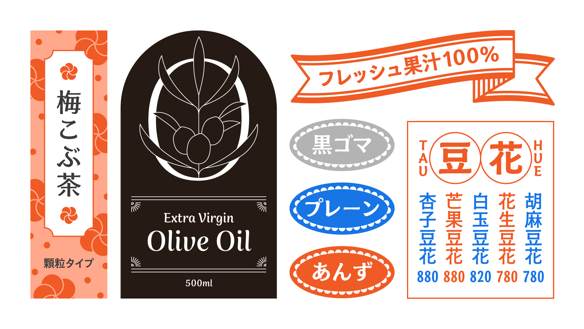
A “Sizzle Feel” Compatible with Food and Beverages
TP Apricot is developed with use for packages for food and beverages in mind. It expresses a feeling of deliciousness, including freshness, juiciness, smoothness, creaminess, sweetness, and mellowness. Incorporating these nuances in the detailed design, a standard balance is maintained in the character base, including the structure, type face, etc. Therefore, stable typesetting is possible even in limited spaces, such as in packaging and advertisement images. From logos to catch phrases, it is a typeface that can richly express various texts related to food.
- WHITE MODE
- BLACK MODE
- ALow
Contrast - AMiddle
Contrast - AHigh
Contrast
Family・Specification
Font set
Standard version (StdN)
9,561 characters (Adobe-Japan1-3, with custom glyphs added))
Buy
TP Connect
Subscription service that enables
the use of all of Type Project fonts.
TP Connect is only available in Japanese.