%20--%3e%3cpolygon%20points='24.7%201%200%201%200%207.6%208.5%207.6%208.5%2039.4%2016.1%2039.4%2016.1%207.6%2024.7%207.6%2024.7%201'/%3e%3cpath%20d='M34.1,32.4l-4.9-22.7h-7.9l9.1,33.1c-.4,1.7-1.1,2.9-3.7,2.9h-2.6l1.9,6.6h1.5c4,0,8-1.2,10.3-9.2,1.8-6.4,8.9-33.3,8.9-33.3h-8l-4.6,22.7Z'/%3e%3cpath%20d='M91.7,8.7c-8.7,0-12.7,6.5-12.7,16.1s3.6,15.3,13.8,15.3,7.2-.9,9-1.6l-1.2-6c-2.4.8-4.9,1.2-7,1.2-4.3,0-7-2-7.2-7.3h16v-4.8c0-7.5-2.9-13-10.7-13ZM86.5,21c0-3.3,1.7-6.4,4.7-6.4s4.1,2.7,4.1,6.4h-8.8Z'/%3e%3cpath%20d='M218,8.7c-8.7,0-12.7,6.5-12.7,16.1s3.6,15.3,13.8,15.3,7.2-.9,9-1.6l-1.2-6c-2.5.8-4.9,1.2-7,1.2-4.3,0-7-2-7.2-7.3h16v-4.8c0-7.5-2.9-13-10.7-13ZM212.9,21c0-3.3,1.7-6.4,4.7-6.4s4.1,2.7,4.1,6.4h-8.8Z'/%3e%3cpath%20d='M126,1h-10.7v38.4h7.6v-11.8h5c6,0,11.3-3.8,11.3-14.1s-5.5-12.5-13.1-12.5ZM125.9,20.9h-3.1V7.6h3c3.7,0,5.4,1.8,5.4,6.3s-1.5,7.1-5.3,7.1Z'/%3e%3cpath%20d='M150,12.9c-.2-1-.5-2.4-.8-3.2h-6.9c.5,1.9.7,4.6.7,7.9v21.8h7.4v-20.3c1.1-2.2,4.5-3,7.4-3v-6.8c-3.5,0-6.5,1.7-7.7,3.6Z'/%3e%3cpath%20d='M192.6,40.6c0,3.5-1.6,4-4.7,4h-1.5l1.9,6.6h2.3c6.3,0,9.3-3.2,9.3-9.8V9.7h-7.4v30.9Z'/%3e%3crect%20x='192.2'%20width='8.4'%20height='6.4'/%3e%3cpath%20d='M247.4,33.7c-4.8,0-6.6-2.8-6.6-9.6s1.9-8.9,6.2-8.9,3.4.4,4.9,1l1-6.4c-1.3-.5-3.7-.9-6.2-.9-10.6,0-13.4,6.7-13.4,15.9h0c0,10.7,4.6,15.3,12.4,15.3s5.9-.5,7.4-1l-.9-6.1c-2,.4-3.7.6-4.7.6Z'/%3e%3cpath%20d='M264.7,30.2v-14.2h5.4l1.4-5.8h-6.9V2.1l-7.3,1.9v26.8c0,5.3,2.4,9,8.2,9s4.9-.2,4.9-.2v-5.7h-2c-3,0-3.8-1.3-3.8-3.7Z'/%3e%3cpath%20d='M64.3,8.8c-3.3,0-5.8,1.6-7.3,3.4-.2-1.1-.5-2.1-.8-2.6h-6.6c.5,1.9.6,4.4.6,7.4v34.4h7.3v-13.8c1.5,1.5,3.8,2.4,6.2,2.4,8,0,11.2-6.6,11.2-16s-3.1-15.2-10.4-15.2ZM62.1,33.8c-1.6,0-3.1-.6-4.6-1.8-.3-1.6-.4-3.7-.4-6v-3.3c0-1.8.1-3.8.4-5.1,1.4-1.4,3-2.5,5-2.5,3.2,0,4.6,3.2,4.6,9s-.9,9.6-5,9.6Z'/%3e%3cpath%20d='M173.6,8.6c-9.5,0-13,6.7-13,15.7s3.5,16.1,13,16.1,13-6.8,13-16.2-3.3-15.7-13-15.7ZM173.6,34.2c-3.6,0-5.5-2.9-5.5-9.9s2.2-9.5,5.5-9.5,5.5,2.2,5.5,9.5-1.9,9.9-5.5,9.9Z'/%3e%3c/svg%3e)
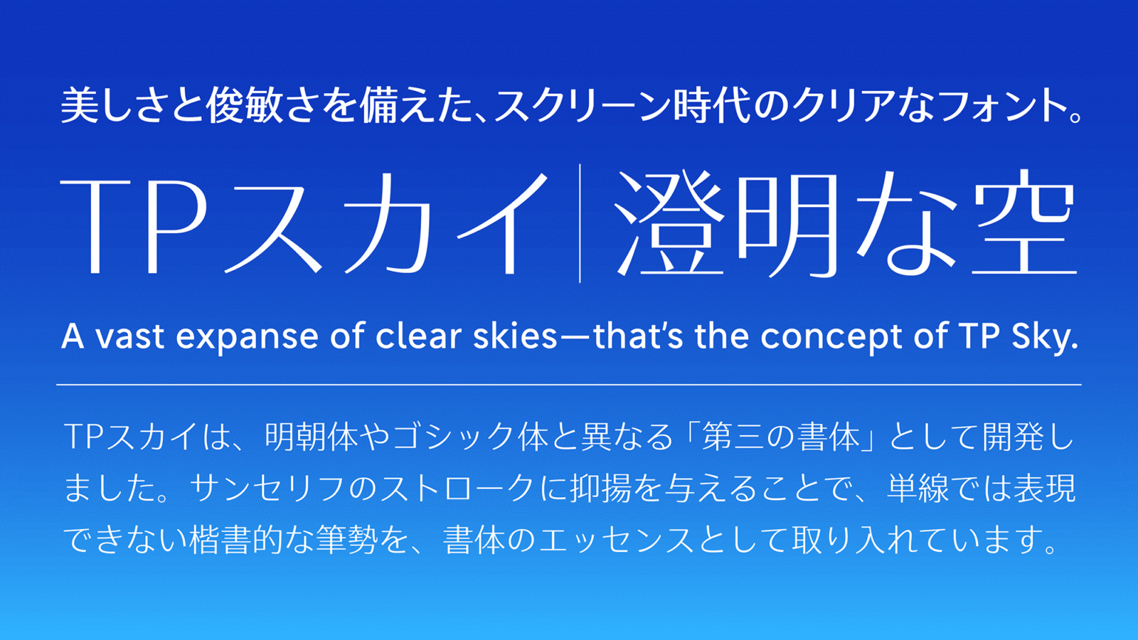
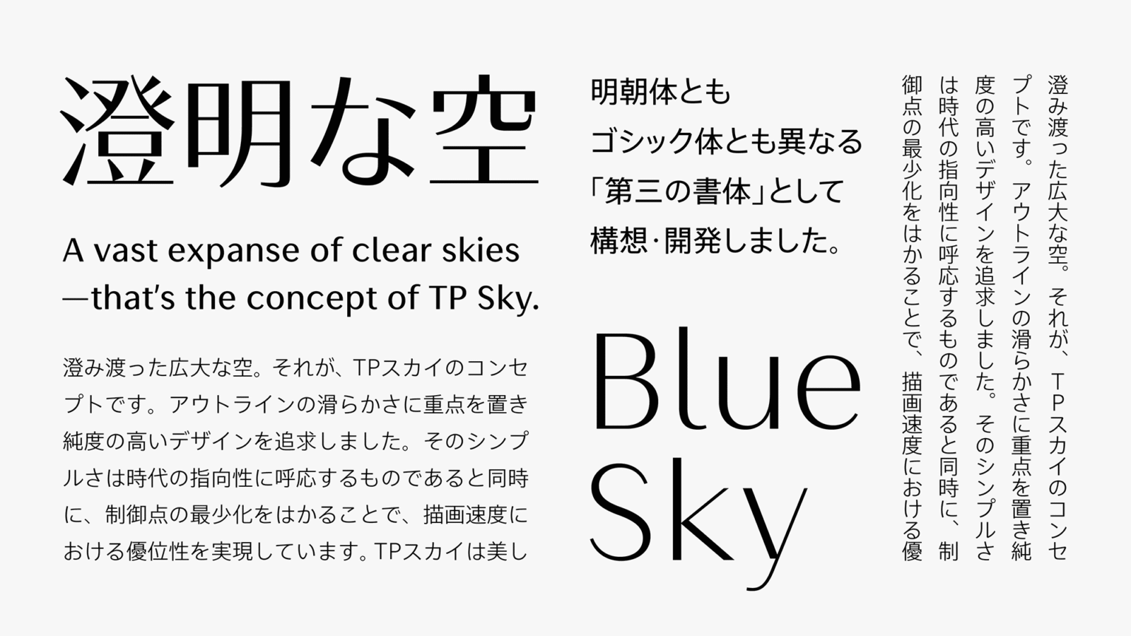
TP Sky is a clean and crisp character design that has made it possible to lighten the amount of font data, and visibility and displayability have been enhanced as well. It is the first Japanese font family to have the three attributes of weight, contrast, and character width.
Features
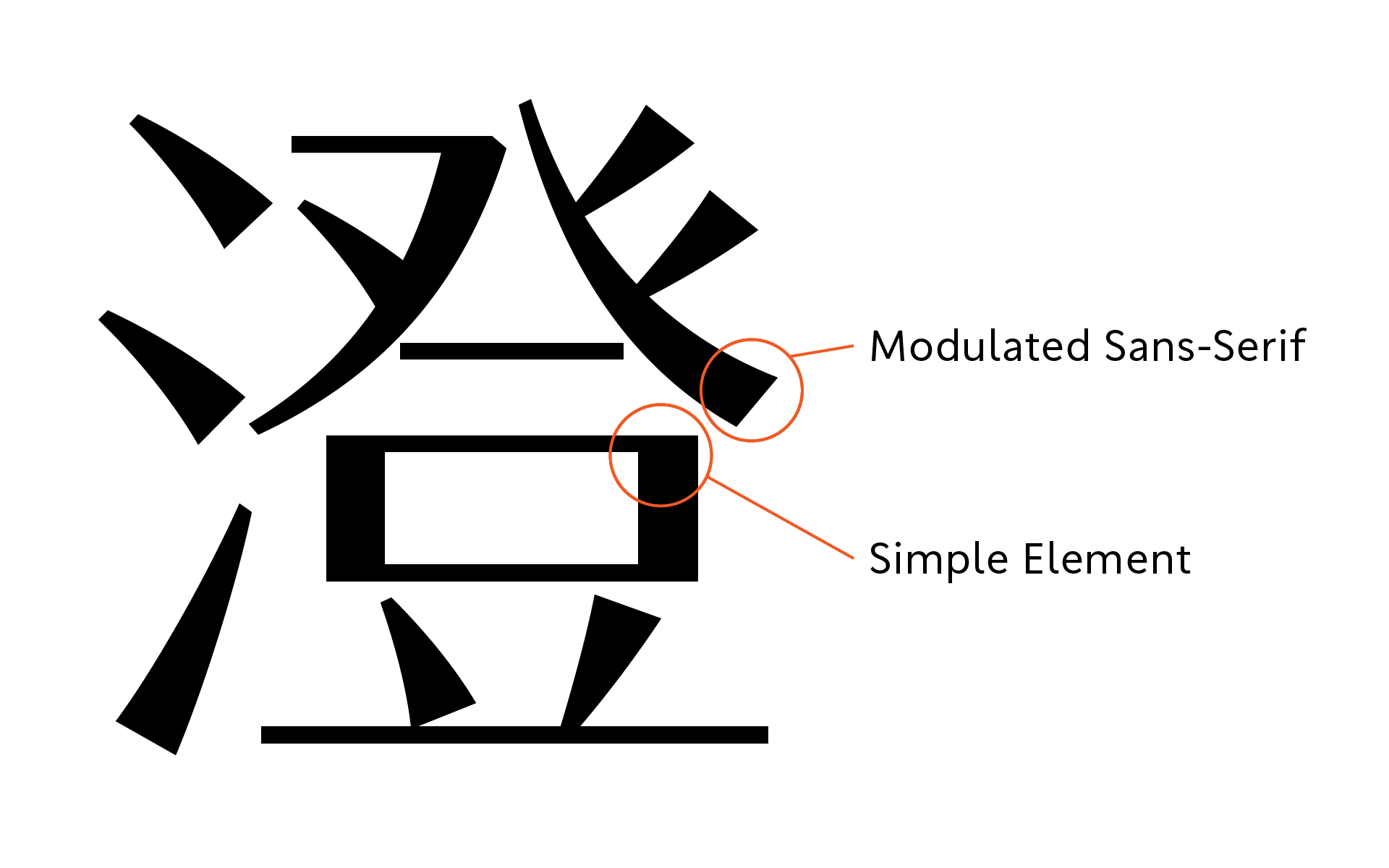
With the attribute of “modulation”
TP Sky is a font family designed with the attribute of “modulation” incorporated into a sans-serif typeface so as to improve its effectiveness on digital device screens. By modulating the sans-serif strokes, a traditional brushstroke style that cannot be expressed with single lines has been incorporated as an essential feature of the typeface. TP Sky was conceived and developed with an awareness of this trend, as a “third typeface” distinct from Mincho and Gothic that would be able to respond to the needs of the coming age.
Design explores simplicity
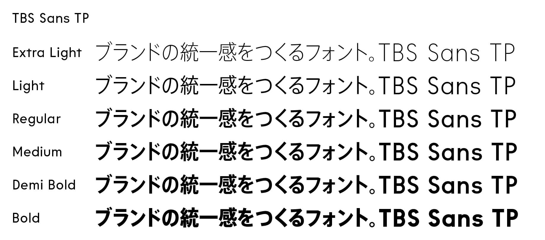
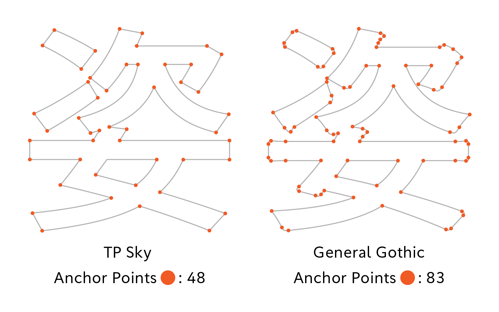
With TP Sky, a Clean, Crisp character design has made it possible to lighten the amount of font data. The design explores simplicity, there is nothing ornamental in the tips and corners. Aspiring to a high degree of purity, its design lays emphasis on smoothness of outline. Due to its simplicity, which suits the orientation of society while also minimizing the number of control points, TP Sky demonstrates superior imaging speed. Endowed with exceptional beauty and agility, this is a font with a plain sans-serif base that nevertheless yields a great richness of expression.
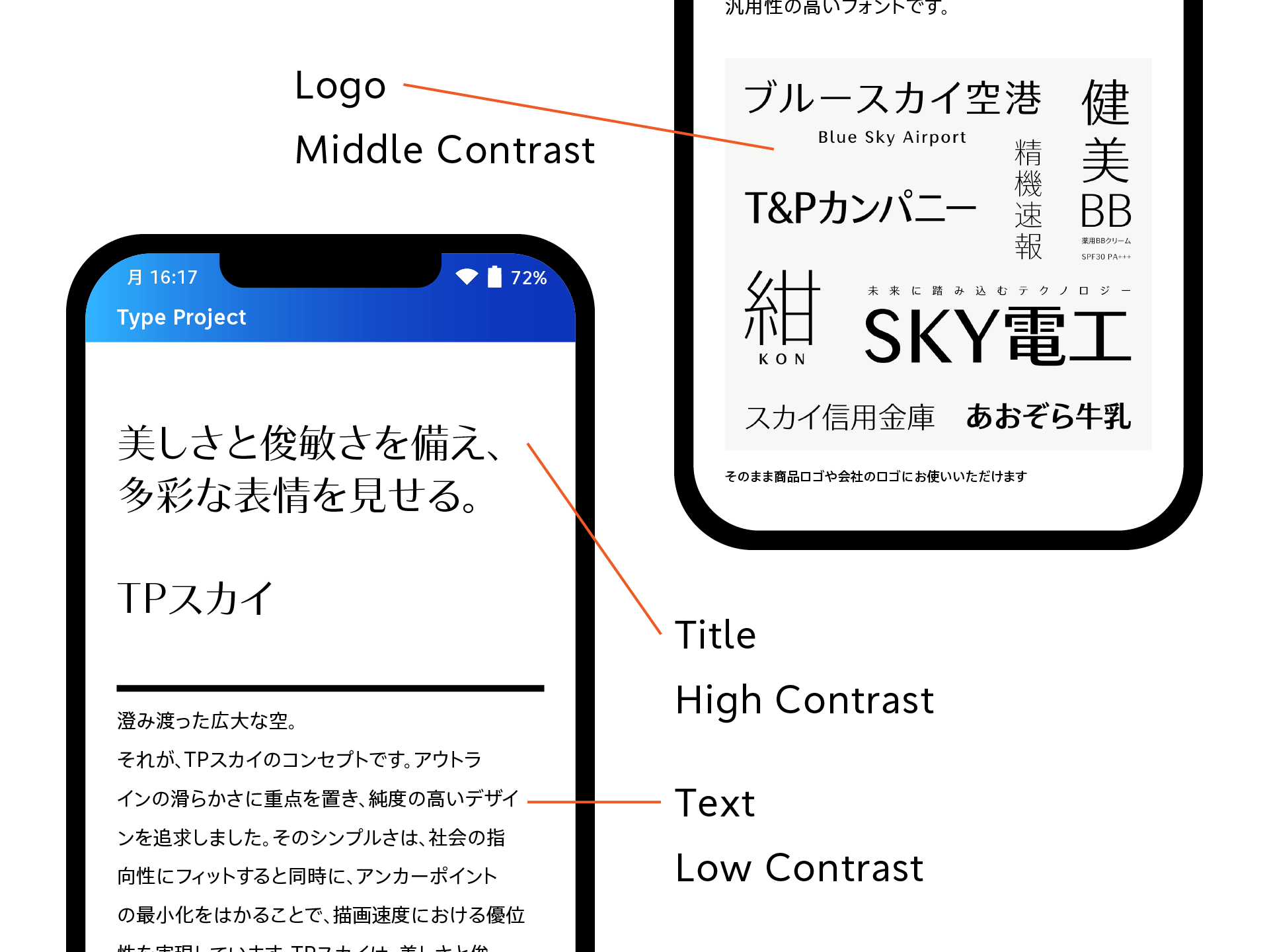
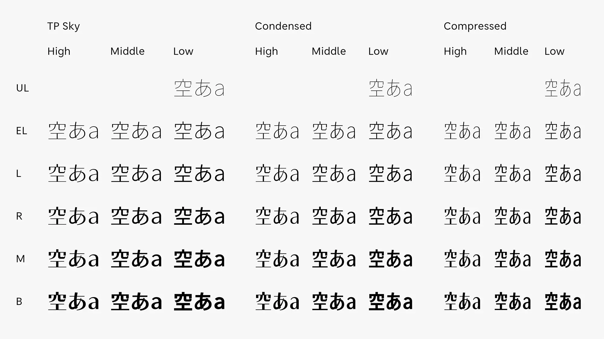
For wide range of applications
TP Sky High Contrast is a font that, while hinting of Mincho-like qualities, is more compact and transparent-feeling. Its clean, bright appearance translates well onto screens, and further demonstrates its effectiveness when text is placed on top of images and videos. Middle Contrast allows for a higher degree of readability while also contributing to the vividness of the screen with the modulation of its forceful-feeling strokes. As modulated sans-serif typefaces are commonly used in logo design, special focus was given to the design of the katakana and Latin characters. Low Contrast, which raises reading stability by making character blackness uniform, is an optimal font for flat and plain user interfaces.
- WHITE MODE
- BLACK MODE
- ALow
Contrast - AMiddle
Contrast - AHigh
Contrast - ACondensed
Low Contrast - ACondensed
Middle Contrast - ACondensed
High Contrast - ACompressed
Low Contrast - ACompressed
Middle Contrast - ACompressed
High Contrast
Family・Specification
Font set
Standard(StdN)
9,498 characters (Adobe-Japan1-3)
*9,499 Characters (TP Sky Modern Blk)
Buy
TP Connect
Subscription service that enables
the use of all of Type Project fonts.
TP Connect is only available in Japanese.