%20--%3e%3cpolygon%20points='24.7%201%200%201%200%207.6%208.5%207.6%208.5%2039.4%2016.1%2039.4%2016.1%207.6%2024.7%207.6%2024.7%201'/%3e%3cpath%20d='M34.1,32.4l-4.9-22.7h-7.9l9.1,33.1c-.4,1.7-1.1,2.9-3.7,2.9h-2.6l1.9,6.6h1.5c4,0,8-1.2,10.3-9.2,1.8-6.4,8.9-33.3,8.9-33.3h-8l-4.6,22.7Z'/%3e%3cpath%20d='M91.7,8.7c-8.7,0-12.7,6.5-12.7,16.1s3.6,15.3,13.8,15.3,7.2-.9,9-1.6l-1.2-6c-2.4.8-4.9,1.2-7,1.2-4.3,0-7-2-7.2-7.3h16v-4.8c0-7.5-2.9-13-10.7-13ZM86.5,21c0-3.3,1.7-6.4,4.7-6.4s4.1,2.7,4.1,6.4h-8.8Z'/%3e%3cpath%20d='M218,8.7c-8.7,0-12.7,6.5-12.7,16.1s3.6,15.3,13.8,15.3,7.2-.9,9-1.6l-1.2-6c-2.5.8-4.9,1.2-7,1.2-4.3,0-7-2-7.2-7.3h16v-4.8c0-7.5-2.9-13-10.7-13ZM212.9,21c0-3.3,1.7-6.4,4.7-6.4s4.1,2.7,4.1,6.4h-8.8Z'/%3e%3cpath%20d='M126,1h-10.7v38.4h7.6v-11.8h5c6,0,11.3-3.8,11.3-14.1s-5.5-12.5-13.1-12.5ZM125.9,20.9h-3.1V7.6h3c3.7,0,5.4,1.8,5.4,6.3s-1.5,7.1-5.3,7.1Z'/%3e%3cpath%20d='M150,12.9c-.2-1-.5-2.4-.8-3.2h-6.9c.5,1.9.7,4.6.7,7.9v21.8h7.4v-20.3c1.1-2.2,4.5-3,7.4-3v-6.8c-3.5,0-6.5,1.7-7.7,3.6Z'/%3e%3cpath%20d='M192.6,40.6c0,3.5-1.6,4-4.7,4h-1.5l1.9,6.6h2.3c6.3,0,9.3-3.2,9.3-9.8V9.7h-7.4v30.9Z'/%3e%3crect%20x='192.2'%20width='8.4'%20height='6.4'/%3e%3cpath%20d='M247.4,33.7c-4.8,0-6.6-2.8-6.6-9.6s1.9-8.9,6.2-8.9,3.4.4,4.9,1l1-6.4c-1.3-.5-3.7-.9-6.2-.9-10.6,0-13.4,6.7-13.4,15.9h0c0,10.7,4.6,15.3,12.4,15.3s5.9-.5,7.4-1l-.9-6.1c-2,.4-3.7.6-4.7.6Z'/%3e%3cpath%20d='M264.7,30.2v-14.2h5.4l1.4-5.8h-6.9V2.1l-7.3,1.9v26.8c0,5.3,2.4,9,8.2,9s4.9-.2,4.9-.2v-5.7h-2c-3,0-3.8-1.3-3.8-3.7Z'/%3e%3cpath%20d='M64.3,8.8c-3.3,0-5.8,1.6-7.3,3.4-.2-1.1-.5-2.1-.8-2.6h-6.6c.5,1.9.6,4.4.6,7.4v34.4h7.3v-13.8c1.5,1.5,3.8,2.4,6.2,2.4,8,0,11.2-6.6,11.2-16s-3.1-15.2-10.4-15.2ZM62.1,33.8c-1.6,0-3.1-.6-4.6-1.8-.3-1.6-.4-3.7-.4-6v-3.3c0-1.8.1-3.8.4-5.1,1.4-1.4,3-2.5,5-2.5,3.2,0,4.6,3.2,4.6,9s-.9,9.6-5,9.6Z'/%3e%3cpath%20d='M173.6,8.6c-9.5,0-13,6.7-13,15.7s3.5,16.1,13,16.1,13-6.8,13-16.2-3.3-15.7-13-15.7ZM173.6,34.2c-3.6,0-5.5-2.9-5.5-9.9s2.2-9.5,5.5-9.5,5.5,2.2,5.5,9.5-1.9,9.9-5.5,9.9Z'/%3e%3c/svg%3e)
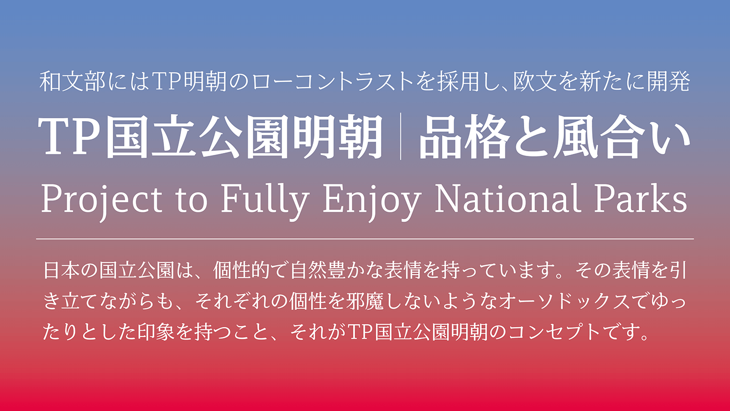
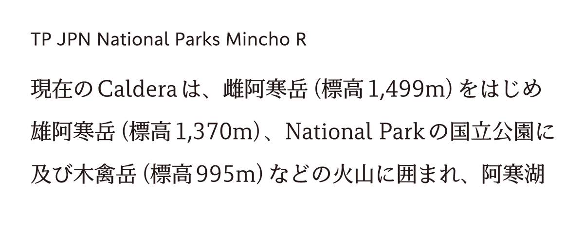
The Latin in TP JPN National Parks Mincho has many elements with straight lines. By restraining the thickness and thinness of the strokes, and maintaining visibility, it finishes with a modern impression. TP Sky Low Contrast is adopted for the Japanese part. It is an orthodox and loose font that does not disturb individuality, while enhancing the expression of a national park full of nature.
Feature
Dignity and character of Japan’s National Parks.
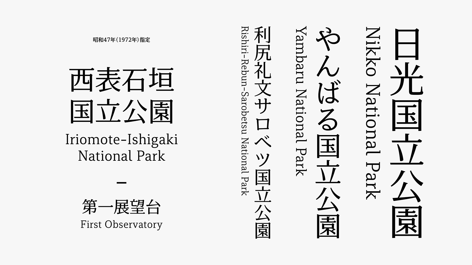
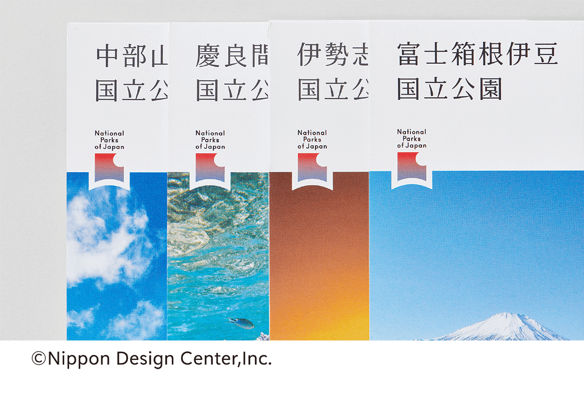
TP JPN National Parks Mincho was developed as part of the Project to Fully Enjoy National Parks, launched in 2016 by the Ministry of the Environment. The purpose is to make consistent the fonts used in National Park information signs and brochures, as well as on the National Parks logo in use nationwide, so as to further reinforce the branding of National Parks.TP JPN National Parks Mincho is a slab serif typeface font based on a contemporary structure, delivered based on a request from the Ministry of the Environment to “ensure legibility of signboard lettering, etc., while conveying the dignity and character of Japan’s National Parks.
Ensure legibility of signboard lettering
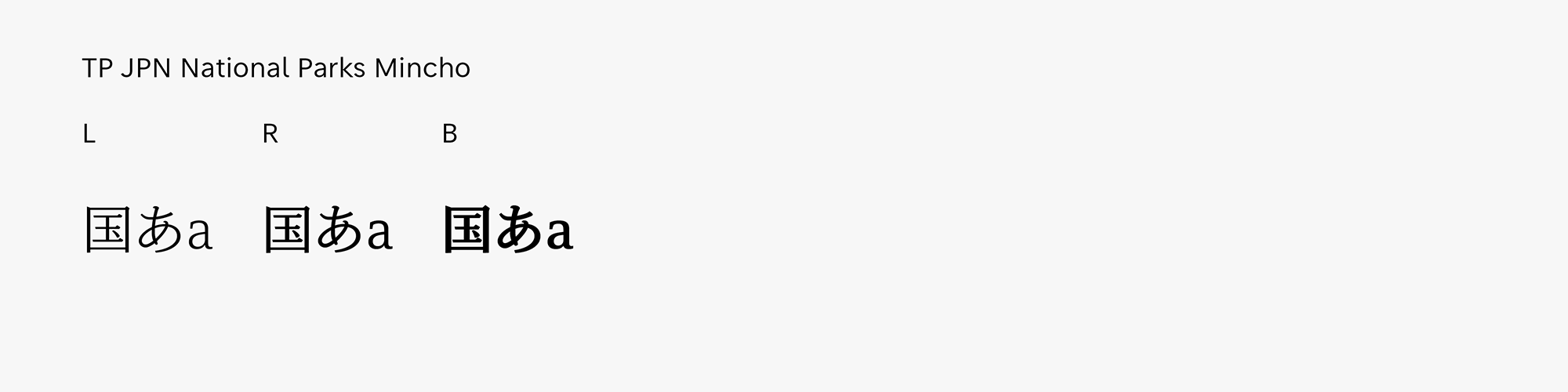
We developed the Japanese TP JPN National Parks Mincho font, adapting TP Mincho’s low contrast and developing a new version for Latin-alphabet languages.TP JPN National Parks Mincho has thicker horizontal lines than serif typefaces in general, it has outstanding legibility from a distance and is optimal for signage systems. Because horizontal strokes’ visibility is not easily lost, the font is also effective at small sizes, such as on brochures and business cards. There is an emphasis on harmony between the Latin-alphabet and Japanese typefaces, and by adjusting weight and contrast. The Latin font was developed through repeated discussions with Yoshiaki Irobe, Art Director, Nippon Design Center, who was in charge of the nationwide National Parks logo, maintenance of signage, brochure design and so forth.
Simplified by using straight lines.
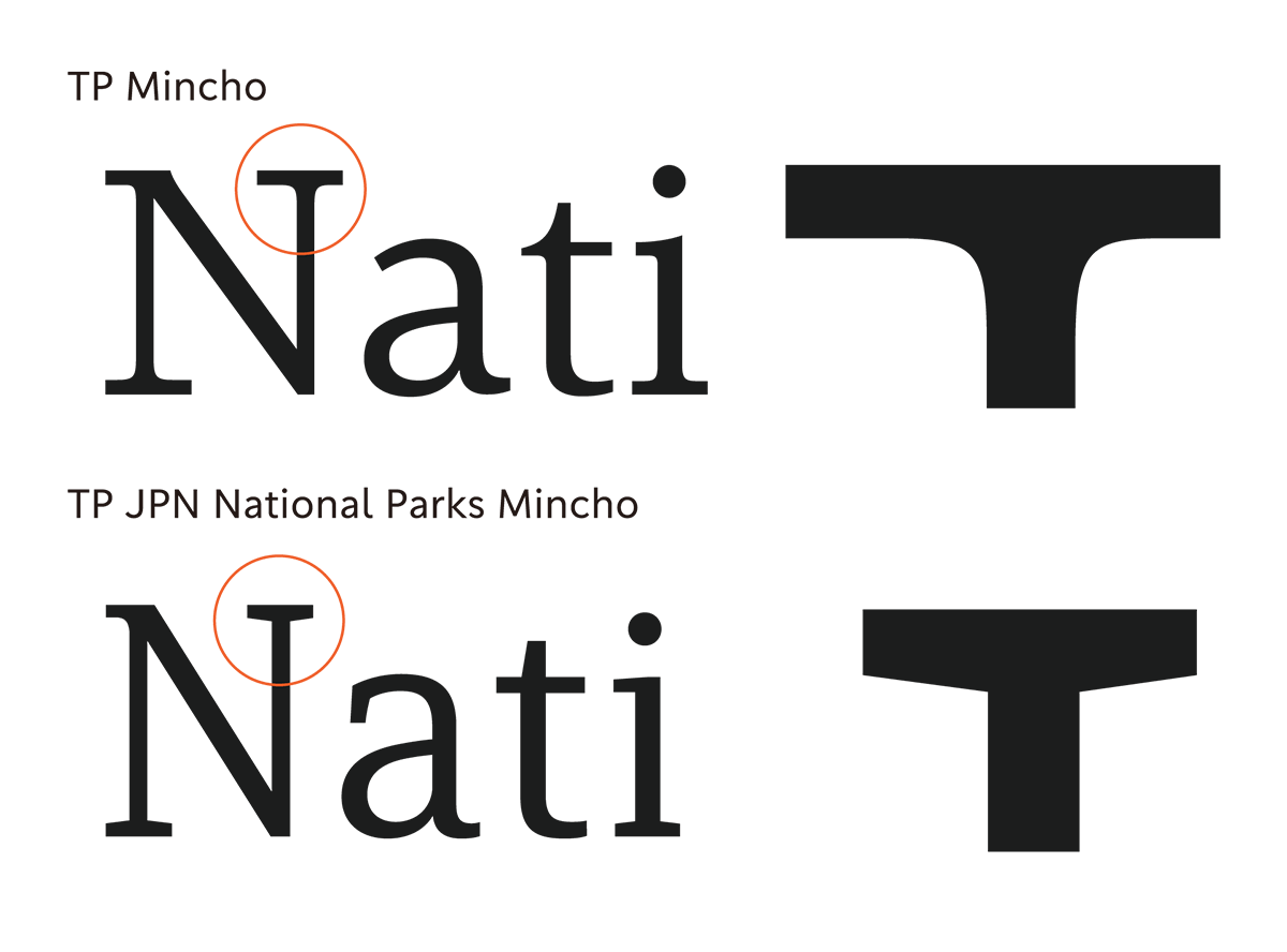
In developing this specialized typeface, it was necessary to create a Latin font that did not look out of place to visitors to Japan from overseas, so as to brand Japan’s National Parks as “world-class national parks” in line with the Vision to Support the Future of Japan Through Tourism initiative being implemented by the entire Japanese government. Therefore, while TP Mincho’s standard Latin font gives a flowing impression reminiscent of handwriting, TP JPN National Parks Mincho comprises many straight elements that give it a more contemporary look. One approach to realizing this concept was the handling of joints between serifs and stems. While the serif sections of the TP Mincho Latin font are accompanied by curves, the TP JPN National Parks Mincho Latin font has been simplified by using straight lines.
- WHITE MODE
- BLACK MODE
- A
- TP JPN National Parks MinchoLあたらしい文字の姿が映されるTypeface
- TP JPN National Parks MinchoRあたらしい文字の姿が映されるTypeface
- TP JPN National Parks MinchoBあたらしい文字の姿が映されるTypeface
Family・Specification
Font set
Standard(StdN)
9,504 characters (Adobe-Japan1-3)
Buy
TP Connect
Subscription service that enables
the use of all of Type Project fonts.
TP Connect is only available in Japanese.