Kinshachi Font

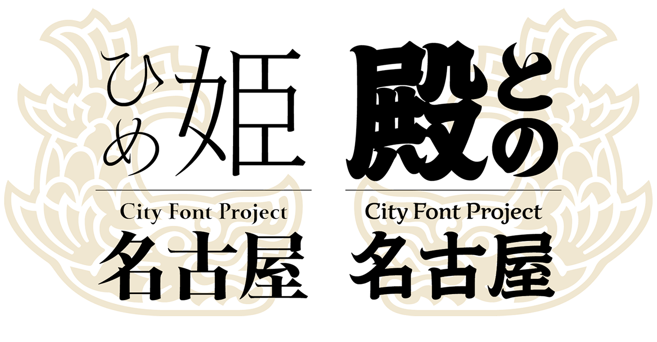
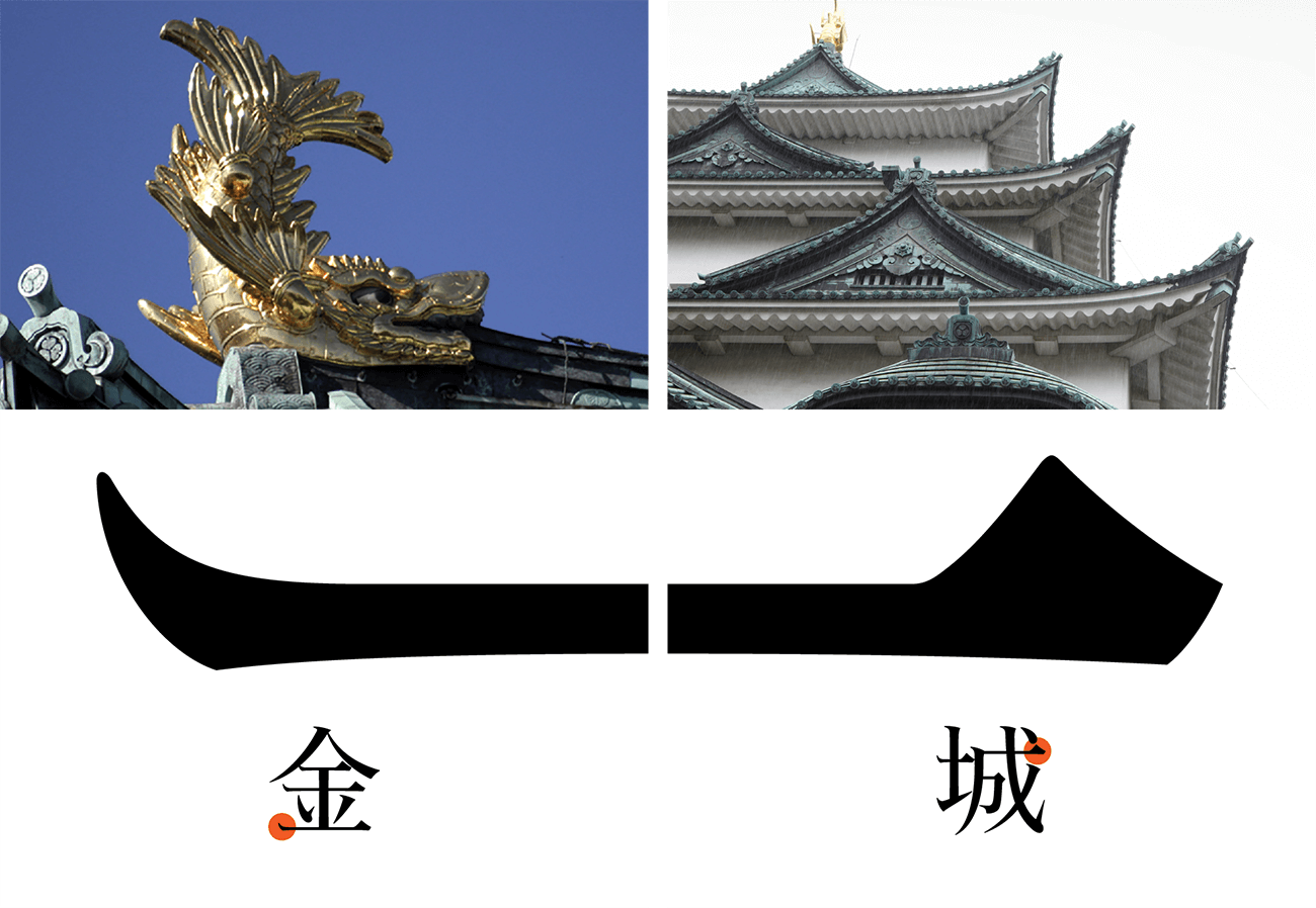
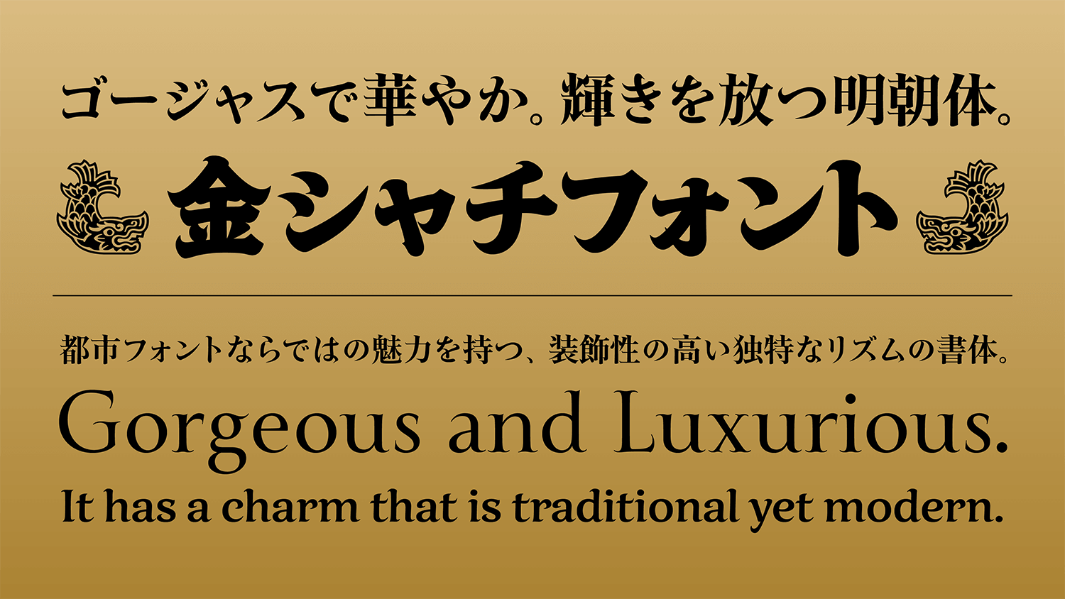
Kinshachi Font aimed at a glamorous Mincho typeface with an unprecedented level of decorativeness Mincho typeface in which symbols of Nagoya culture are incorporated, such as the curved form of the shachihoko tiger-headed carp in the starting point of a stroke, reflecting the shape of the curved gables of the castle in the uroko of the kanji character.

  • A Hime
  • Kinshachi FontHime

    EL

    Buy

    Gorgeousで個性的な輝きの金シャチフォント シャチホコの反りのような独特なかたち、躍動感のある筆画 都市フォントならではの魅力を備えた、装飾性の高い華やかな書体が誕生しました。

  • Kinshachi FontHime

    L

    Buy

    Gorgeousで個性的な輝きの金シャチフォント シャチホコの反りのような独特なかたち、躍動感のある筆画 都市フォントならではの魅力を備えた、装飾性の高い華やかな書体が誕生しました。

  • Kinshachi FontHime

    R

    Buy

    Gorgeousで個性的な輝きの金シャチフォント シャチホコの反りのような独特なかたち、躍動感のある筆画 都市フォントならではの魅力を備えた、装飾性の高い華やかな書体が誕生しました。

  • Kinshachi FontHime

    M

    Buy

    Gorgeousで個性的な輝きの金シャチフォント シャチホコの反りのような独特なかたち、躍動感のある筆画 都市フォントならではの魅力を備えた、装飾性の高い華やかな書体が誕生しました。

  • Kinshachi FontHime

    DB

    Buy

    Gorgeousで個性的な輝きの金シャチフォント シャチホコの反りのような独特なかたち、躍動感のある筆画 都市フォントならではの魅力を備えた、装飾性の高い華やかな書体が誕生しました。

  • Kinshachi FontHime

    B

    Buy

    Gorgeousで個性的な輝きの金シャチフォント シャチホコの反りのような独特なかたち、躍動感のある筆画 都市フォントならではの魅力を備えた、装飾性の高い華やかな書体が誕生しました。

About Product

Overview

As a specific example of the City Font Project plan launched by Type Project in 2009, Kinshachi Font was the first typeface of the font family in which Nagoya culture was reflected in the typeface design. The prototype of Kinshachi Font was introduced in 2010, the year marking 400 years since the founding of the city of Nagoya as a seat of government. By providing required characters for the next 10 years, the font has been adopted by companies and municipalities in Nagoya, as well as by many designers. Kinshachi Font is a Mincho typeface in which symbols of Nagoya culture are incorporated, such as the curved form of the shachihoko tiger-headed carp in the starting point of a stroke, reflecting the shape of the curved gables of the castle in the uroko (fish scale: the triangular shape at the end part of a horizontal stroke) of the kanji character.

Utilizing the originality of kanji, kana, and Latin, respectively, Kinshachi Font Hime is a fresh, challenging, and glamorous font that is harmonized as an overall typeface. Kinshachi Font Hime consists of kanji with elements of unique and gorgeous ornamentation, kana with a classical atmosphere modeling graceful *onnade (characters written by women) from the Heian period, and Latin with ornamental designs similar to curly hair. It brings glittery colors that never existed before in the visual representation of Japanese. In particular, the weights of EL (Extra Light) and L (Light) have superior elegance and delicacy, retaining the image of classical Heian writing; it can be said that they are the most onnade-like among characters in Kinshachi Font Hime. (*The common name “onnade” is said to originate from the fact that women, who were restricted from using kanji, used hiragana in writing songs and diaries in the Heian period.)

Concept

Utilize region-specific cultural resources in the typeface design. This is the basic way of thinking carried out for the City Font Concepts advocated by Type Project. The City Font Concepts are concepts to represent the identity of a city by incorporating the individuality and charm of a city into the font design. While incorporating the cultural resources of Nagoya, Kinshachi Font aimed at a glamorous Mincho typeface with an unprecedented level of decorativeness.

The keywords are set for Kinshachi Font Hime: “curved form / gorgeous” for kanji, “graceful / classical” for kana, and “curly / ornamental” for Latin. While maintaining individuality in each form, the font was developed with the concept of playing a new sound as an overall typeface.

Features

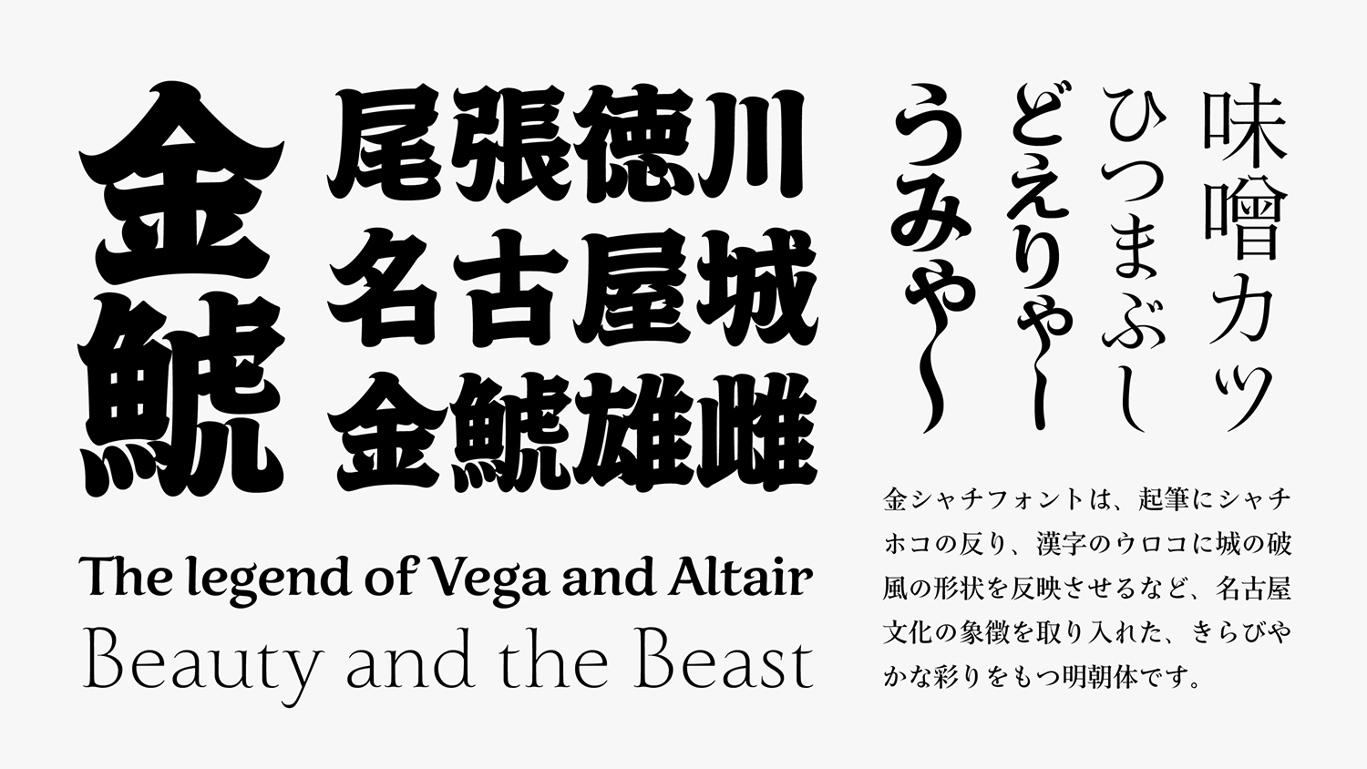
The starting point of a Kinshachi Font stroke has a unique shape that incorporates the curved form of the shachihoko tiger-headed carp. In the character 金 (kin / kane: gold, metal, money), the thread of connection from the sixth stroke to the seventh differs distinctly from that in a customary Mincho typeface. This kind of lively stroke is characteristic of the Kinshachi Font. While in most typical Mincho typeface elements such as the triangles of the “uroko” are composed out of straight lines, the end of a horizontal stroke in Kinshachi Font features the shape of the curved gables and roofs of Nagoya Castle. In this manner, by curving the “uroko” at both the start and end of a horizontal stroke, a unique rhythm and expression are given to this typeface.

Also, other unique expression methods include making a combination of the ending of words with “myaa and ryaa” that are characteristics of Nagoya dialect, in unbroken ligatures. Applying everyday usage of unbroken line text (renmentai) from the Heian period up to the Edo period (mid-1800s) in the dialect is a role special to City Font.

In Kinshachi Font Hime, elegant princess and madam likenesses are expressed in plain, refined characters in kana, in contrast to kanji with their gorgeous feeling. Furthermore, Latin with curled ornamentation like curly hair gives a splendid impression.

Family

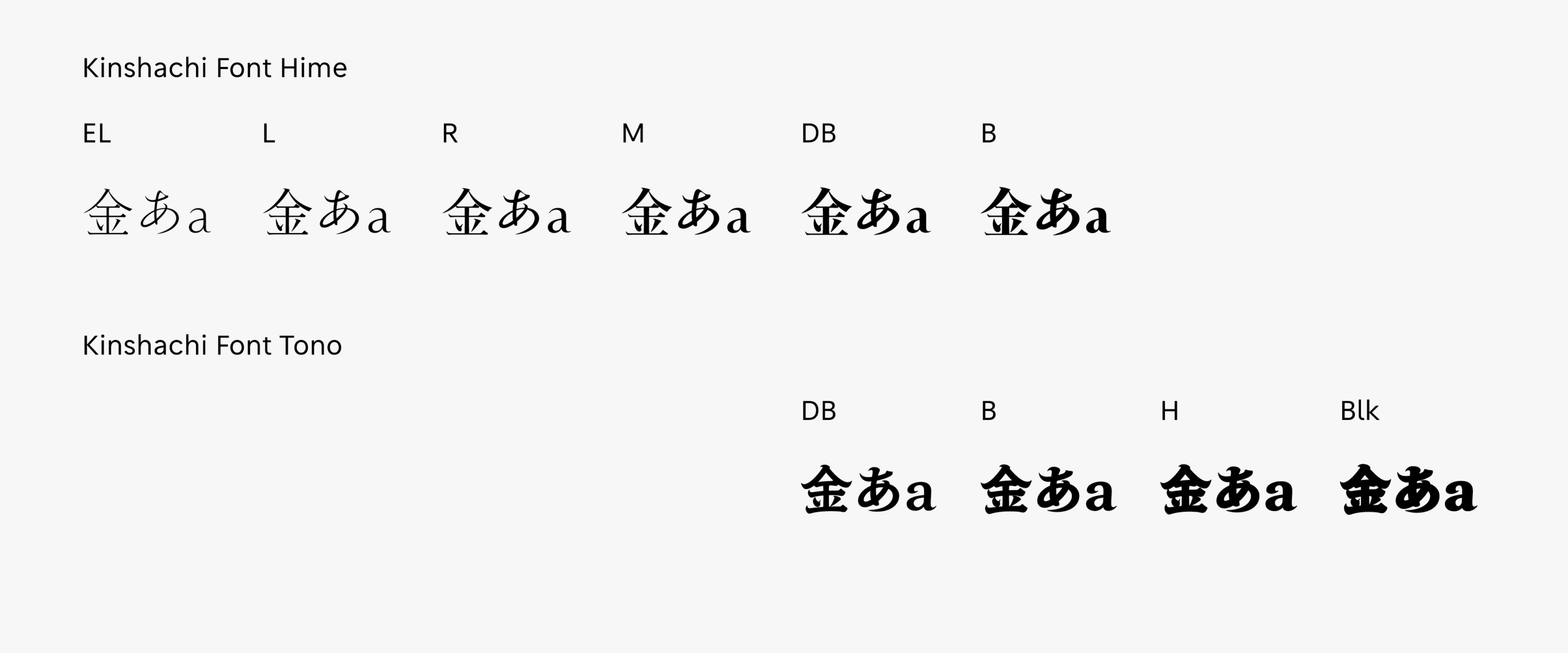
The Kinshachi Font Hime family consists of 6 weights: EL (Extra Light), L (Light), R (Regular), M (Medium), DB (Demibold), and B (Bold). The weight of R is appropriate for text. Although it is a typeset designed with vertical typesetting in mind, the fresh expression different from a customary Mincho typeface is attractive in horizontal typesetting. Among the 6 weights, M has the best balance between thickness and thinness in particular. This weight is effective in titles to give a sense of glamour. DB and B can show their strength when used to give a stronger impression or give a gorgeous feeling.

Specifications

Main feature OpenType font
Cross platform
Extractable outlines
PDF embedded
Kerning information
Dynamic download
No resolution restrictions
Supported operating system macOS
Windows 10/11
Font set Standard(StdN)
9,525 characters (Adobe-Japan1-3, with custom glyphs added)
Languages Japanese font (Std/StdN) almost fully covers 30 languages shown below. Japanese font based on Adobe Japan 1.3 covers all ISO-8859-1 proportional characters and Š, š, Ž, ž, Œ, œ, Ÿ. Then AXIS Font Japanese version can be used as multilingual font when you compose text using proportional characters. However, not all corresponding half-width characters are included, only Latin font is covered by half-width characters.

Japanese (main script and covers JIS X 0208:1997) / English/ Icelandic (íslenska) / Irish (Gaelige) / Afrikaans (Afrikaans) / Albanian (Gjuha Shqipe) / Italian (Italiano) / Indonesian (Bahasa Indonesia) / Estonian (Eesti keel) / Occitan (lenga d’òc) / Dutch (Nederlands : U+0132 “IJ” and U+0133 “ij” shall be divided into I/i and J/j) / Oromo (Oromiffa) / Galician (Galego) / Swedish (Svenska) / Scottish Gaelic (Gàidhlig) / Spanish (Español) / Swahili (Kiswahili) / Danish (Dansk) / German (Deutsch) / Norwegian (Bokmål) / Norwegian (Nynorsk) / Finnish (Suomi) / Faroese (Føroyskt) / French (Française) / Brasilian Portuguese (Português Brasileiro) / Breton (Brezhoneg) / Portuguese (Português) / Latin (Latina : Classical orthography, without vowels with macron) / Luxembourg (Lëtzebuergesch) / Rhaeto-Romance languages (Rhaetian) / Walon (Walloon)

*Full width version of Greek uppercase/lowercase (24 characters for each, excluding ending form of sigma) and Cyrillic (Russian) uppercase/lowercase (33 characters for each) are included as JIS Row6 and Row 7 (These characters are defined as full width in JIS spec)

Related Posts