%20--%3e%3cpolygon%20points='24.7%201%200%201%200%207.6%208.5%207.6%208.5%2039.4%2016.1%2039.4%2016.1%207.6%2024.7%207.6%2024.7%201'/%3e%3cpath%20d='M34.1,32.4l-4.9-22.7h-7.9l9.1,33.1c-.4,1.7-1.1,2.9-3.7,2.9h-2.6l1.9,6.6h1.5c4,0,8-1.2,10.3-9.2,1.8-6.4,8.9-33.3,8.9-33.3h-8l-4.6,22.7Z'/%3e%3cpath%20d='M91.7,8.7c-8.7,0-12.7,6.5-12.7,16.1s3.6,15.3,13.8,15.3,7.2-.9,9-1.6l-1.2-6c-2.4.8-4.9,1.2-7,1.2-4.3,0-7-2-7.2-7.3h16v-4.8c0-7.5-2.9-13-10.7-13ZM86.5,21c0-3.3,1.7-6.4,4.7-6.4s4.1,2.7,4.1,6.4h-8.8Z'/%3e%3cpath%20d='M218,8.7c-8.7,0-12.7,6.5-12.7,16.1s3.6,15.3,13.8,15.3,7.2-.9,9-1.6l-1.2-6c-2.5.8-4.9,1.2-7,1.2-4.3,0-7-2-7.2-7.3h16v-4.8c0-7.5-2.9-13-10.7-13ZM212.9,21c0-3.3,1.7-6.4,4.7-6.4s4.1,2.7,4.1,6.4h-8.8Z'/%3e%3cpath%20d='M126,1h-10.7v38.4h7.6v-11.8h5c6,0,11.3-3.8,11.3-14.1s-5.5-12.5-13.1-12.5ZM125.9,20.9h-3.1V7.6h3c3.7,0,5.4,1.8,5.4,6.3s-1.5,7.1-5.3,7.1Z'/%3e%3cpath%20d='M150,12.9c-.2-1-.5-2.4-.8-3.2h-6.9c.5,1.9.7,4.6.7,7.9v21.8h7.4v-20.3c1.1-2.2,4.5-3,7.4-3v-6.8c-3.5,0-6.5,1.7-7.7,3.6Z'/%3e%3cpath%20d='M192.6,40.6c0,3.5-1.6,4-4.7,4h-1.5l1.9,6.6h2.3c6.3,0,9.3-3.2,9.3-9.8V9.7h-7.4v30.9Z'/%3e%3crect%20x='192.2'%20width='8.4'%20height='6.4'/%3e%3cpath%20d='M247.4,33.7c-4.8,0-6.6-2.8-6.6-9.6s1.9-8.9,6.2-8.9,3.4.4,4.9,1l1-6.4c-1.3-.5-3.7-.9-6.2-.9-10.6,0-13.4,6.7-13.4,15.9h0c0,10.7,4.6,15.3,12.4,15.3s5.9-.5,7.4-1l-.9-6.1c-2,.4-3.7.6-4.7.6Z'/%3e%3cpath%20d='M264.7,30.2v-14.2h5.4l1.4-5.8h-6.9V2.1l-7.3,1.9v26.8c0,5.3,2.4,9,8.2,9s4.9-.2,4.9-.2v-5.7h-2c-3,0-3.8-1.3-3.8-3.7Z'/%3e%3cpath%20d='M64.3,8.8c-3.3,0-5.8,1.6-7.3,3.4-.2-1.1-.5-2.1-.8-2.6h-6.6c.5,1.9.6,4.4.6,7.4v34.4h7.3v-13.8c1.5,1.5,3.8,2.4,6.2,2.4,8,0,11.2-6.6,11.2-16s-3.1-15.2-10.4-15.2ZM62.1,33.8c-1.6,0-3.1-.6-4.6-1.8-.3-1.6-.4-3.7-.4-6v-3.3c0-1.8.1-3.8.4-5.1,1.4-1.4,3-2.5,5-2.5,3.2,0,4.6,3.2,4.6,9s-.9,9.6-5,9.6Z'/%3e%3cpath%20d='M173.6,8.6c-9.5,0-13,6.7-13,15.7s3.5,16.1,13,16.1,13-6.8,13-16.2-3.3-15.7-13-15.7ZM173.6,34.2c-3.6,0-5.5-2.9-5.5-9.9s2.2-9.5,5.5-9.5,5.5,2.2,5.5,9.5-1.9,9.9-5.5,9.9Z'/%3e%3c/svg%3e)
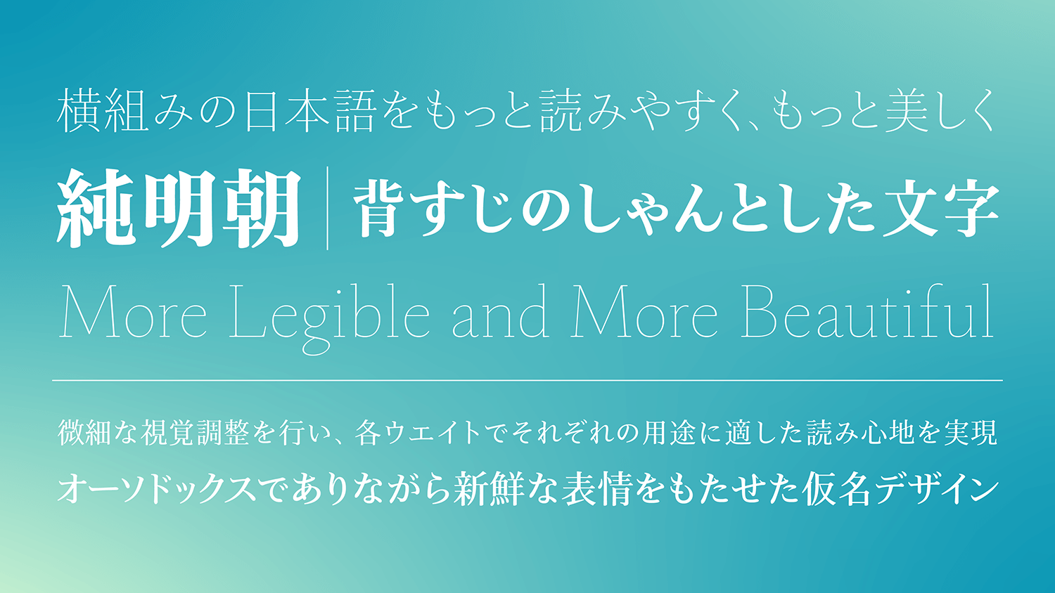
Jun Mincho is a font family with the theme of “making Japanese in horizontal typesetting more legible and more beautiful.” To obtain a stable feeling when reading, an appropriate contrast (ratio of thickness of the vertical strokes and horizontal strokes) is set in each weight. In addition to overcoming weaknesses with the Mincho typeface, which tend to be avoided on screen, the typeface is designed to deliver the full potential of beauty of Mincho typeface that provides a charm on screen.
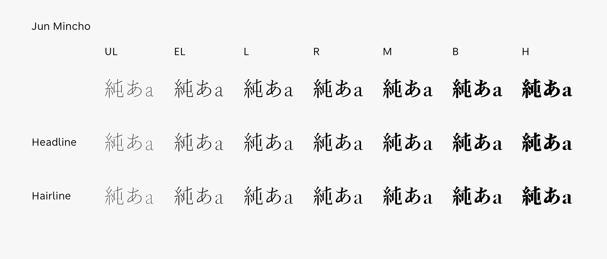
Features
Modern impression and classical appearance
While orthodox in design, a proper and elegant atmosphere produced by kanji with a tightened style is the feature of Jun Mincho. It has taken eight years from the start of prototyping to make detailed visual adjustments to Jun Mincho. In the production of kanji in particular, trial and error were repeated from the details of strokes to the structure design. Kana design with an orthodox but fresh expression is matched in kanji. The kana has graceful strokes while maintaining a relaxed appearance. It provides both comfortable reading and aesthetics. Its Latin gives a modern impression with the combination of beauty and practicality; and a classical appearance that can be used with confidence in mixed typesetting of Japanese and Latin or Latin alone. Jun Mincho is a refreshing and fresh Mincho font family that suits digital environments.
Emphasis on stability
The character arrangement is thoroughly examined in a design policy that specializes in full-width horizontal typesetting. Adjustment is made to change the thickness of the horizontal strokes with three contrasts for vertical strokes with the same thickness. In contrast, the significant difference with Jun Mincho is that the appropriate contrast is set for each weight with the goal of meeting a high standard of balance in vertical typesetting with practicality and aesthetics, while focusing mainly on horizontal typesetting. So as not to overpower with an extremely strong personality, but to emphasize on a sense of stability, adjustment is made to give a similar impression with Jun Mincho in all weights by slightly changing the contrast value of each weight.
Appropriate on screen
Based on the concept of legible and beautiful Japanese, Jun Mincho is a font family that pursued an ideal expression of genuine digital Mincho that is appropriate on screen. Jun Mincho Headline is a typeface with extremely thin horizontal strokes. The thinness of the horizontal strokes in Hairline H is 1/3 or below those of Headline H in comparison. As the name suggests, it is a Mincho typeface with the thinness of hair. In UL and EL, which do not exist in the normal Mincho typeface, for example, having enough thickness in the horizontal strokes and sweep tip part even in the extremely thin weight can avoid difficulty in reading by skipping the stroke lines. Detailed visual adjustments are made, and a feeling of reading appropriate for individual application in each weight is achieved.
- WHITE MODE
- BLACK MODE
- ABasic
- AHeadline
- AHairline
Family・Specification
Font set
Standard(StdN)
9,498 characters (Adobe-Japan1-3)
*9,499 Characters (TP Sky Modern Blk)
Buy
TP Connect
Subscription service that enables
the use of all of Type Project fonts.
TP Connect is only available in Japanese.