%20--%3e%3cpolygon%20points='24.7%201%200%201%200%207.6%208.5%207.6%208.5%2039.4%2016.1%2039.4%2016.1%207.6%2024.7%207.6%2024.7%201'/%3e%3cpath%20d='M34.1,32.4l-4.9-22.7h-7.9l9.1,33.1c-.4,1.7-1.1,2.9-3.7,2.9h-2.6l1.9,6.6h1.5c4,0,8-1.2,10.3-9.2,1.8-6.4,8.9-33.3,8.9-33.3h-8l-4.6,22.7Z'/%3e%3cpath%20d='M91.7,8.7c-8.7,0-12.7,6.5-12.7,16.1s3.6,15.3,13.8,15.3,7.2-.9,9-1.6l-1.2-6c-2.4.8-4.9,1.2-7,1.2-4.3,0-7-2-7.2-7.3h16v-4.8c0-7.5-2.9-13-10.7-13ZM86.5,21c0-3.3,1.7-6.4,4.7-6.4s4.1,2.7,4.1,6.4h-8.8Z'/%3e%3cpath%20d='M218,8.7c-8.7,0-12.7,6.5-12.7,16.1s3.6,15.3,13.8,15.3,7.2-.9,9-1.6l-1.2-6c-2.5.8-4.9,1.2-7,1.2-4.3,0-7-2-7.2-7.3h16v-4.8c0-7.5-2.9-13-10.7-13ZM212.9,21c0-3.3,1.7-6.4,4.7-6.4s4.1,2.7,4.1,6.4h-8.8Z'/%3e%3cpath%20d='M126,1h-10.7v38.4h7.6v-11.8h5c6,0,11.3-3.8,11.3-14.1s-5.5-12.5-13.1-12.5ZM125.9,20.9h-3.1V7.6h3c3.7,0,5.4,1.8,5.4,6.3s-1.5,7.1-5.3,7.1Z'/%3e%3cpath%20d='M150,12.9c-.2-1-.5-2.4-.8-3.2h-6.9c.5,1.9.7,4.6.7,7.9v21.8h7.4v-20.3c1.1-2.2,4.5-3,7.4-3v-6.8c-3.5,0-6.5,1.7-7.7,3.6Z'/%3e%3cpath%20d='M192.6,40.6c0,3.5-1.6,4-4.7,4h-1.5l1.9,6.6h2.3c6.3,0,9.3-3.2,9.3-9.8V9.7h-7.4v30.9Z'/%3e%3crect%20x='192.2'%20width='8.4'%20height='6.4'/%3e%3cpath%20d='M247.4,33.7c-4.8,0-6.6-2.8-6.6-9.6s1.9-8.9,6.2-8.9,3.4.4,4.9,1l1-6.4c-1.3-.5-3.7-.9-6.2-.9-10.6,0-13.4,6.7-13.4,15.9h0c0,10.7,4.6,15.3,12.4,15.3s5.9-.5,7.4-1l-.9-6.1c-2,.4-3.7.6-4.7.6Z'/%3e%3cpath%20d='M264.7,30.2v-14.2h5.4l1.4-5.8h-6.9V2.1l-7.3,1.9v26.8c0,5.3,2.4,9,8.2,9s4.9-.2,4.9-.2v-5.7h-2c-3,0-3.8-1.3-3.8-3.7Z'/%3e%3cpath%20d='M64.3,8.8c-3.3,0-5.8,1.6-7.3,3.4-.2-1.1-.5-2.1-.8-2.6h-6.6c.5,1.9.6,4.4.6,7.4v34.4h7.3v-13.8c1.5,1.5,3.8,2.4,6.2,2.4,8,0,11.2-6.6,11.2-16s-3.1-15.2-10.4-15.2ZM62.1,33.8c-1.6,0-3.1-.6-4.6-1.8-.3-1.6-.4-3.7-.4-6v-3.3c0-1.8.1-3.8.4-5.1,1.4-1.4,3-2.5,5-2.5,3.2,0,4.6,3.2,4.6,9s-.9,9.6-5,9.6Z'/%3e%3cpath%20d='M173.6,8.6c-9.5,0-13,6.7-13,15.7s3.5,16.1,13,16.1,13-6.8,13-16.2-3.3-15.7-13-15.7ZM173.6,34.2c-3.6,0-5.5-2.9-5.5-9.9s2.2-9.5,5.5-9.5,5.5,2.2,5.5,9.5-1.9,9.9-5.5,9.9Z'/%3e%3c/svg%3e)
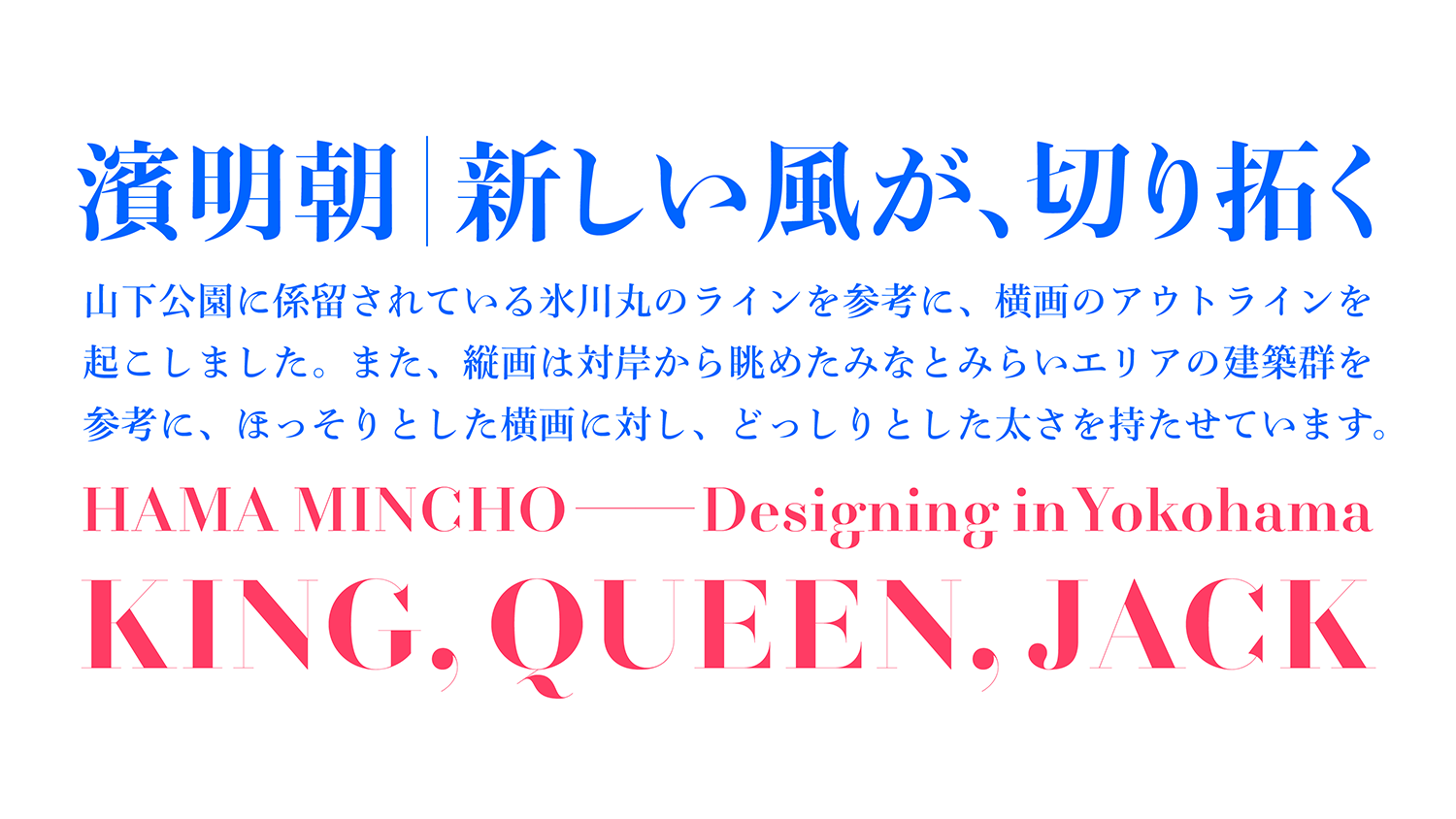
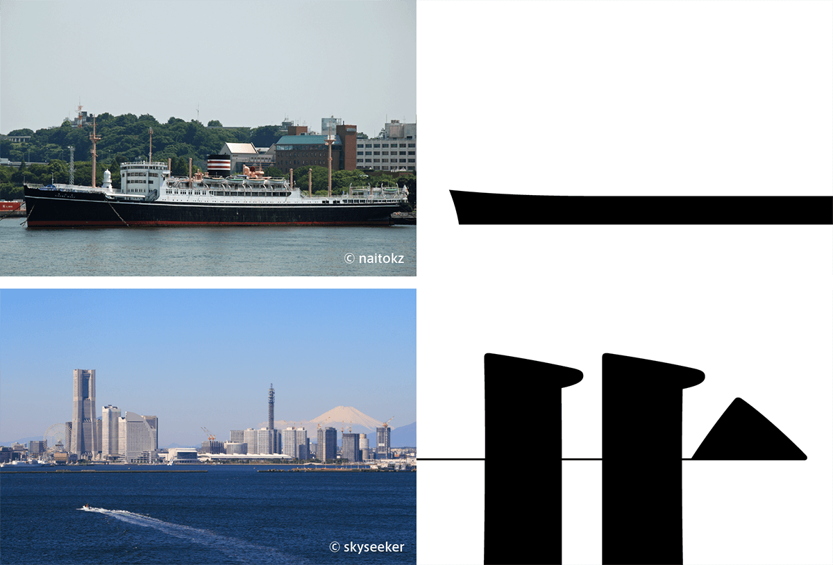
Hama Mincho’s design incorporates the scale and distinctive character of the city of Yokohama, and for styles that accentuate vertical/horizontal stroke contrasts. The font was developed as a part of the CityFont Project. The motif for the horizontal strokes is the ocean liner Hikawa Maru, moored at Yamashita Park. The motif for the vertical strokes is the Minatomirai district building group as seen from the opposite shore.
Features
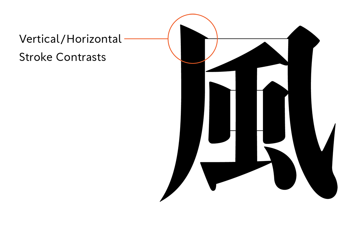
Thickness vertical/horizontal stroke contrasts
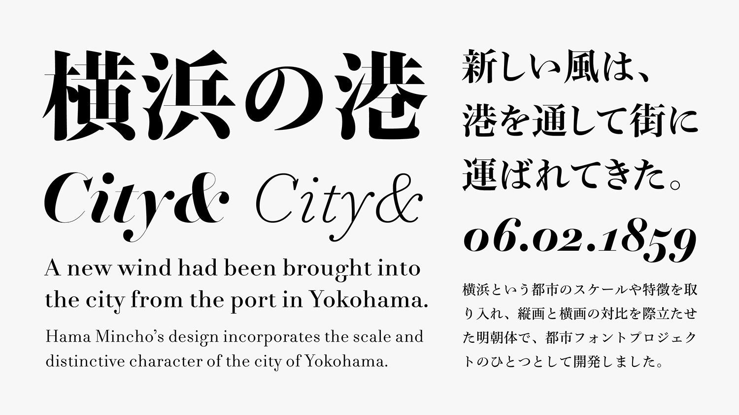
This is a Mincho typeface that accentuates thickness variations and vertical/horizontal stroke contrasts, evokes in its horizontals the ferries that traverse the harbor, and in its verticals the city’s tall buildings seen from the ocean. Since the port opening, we have regarded a climate in which a new wind had been brought into the city from the port, and this is one of the identities of Yokohama that continues to the present age. We have adapted the image of “Port of Town” as seen from the sea, such as Osanbashi Pier, the Red Brick Warehouse, the Landmark Tower and three Yokohama towers which have been given the nicknames the King, the Queen and the Jack, used as landmark by former sailors.
Expressing the city’s broadmindedness
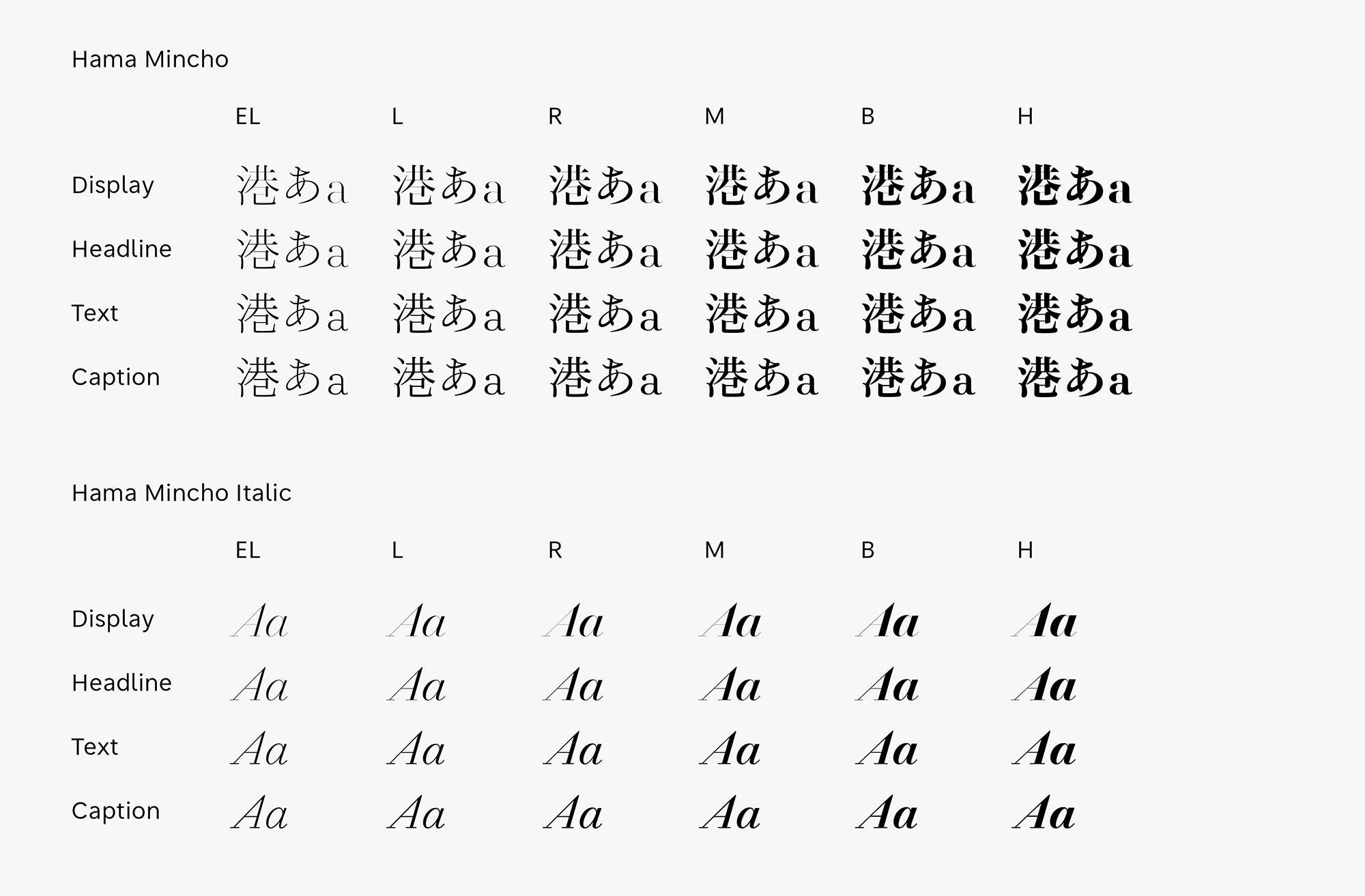
The styles that accentuate vertical/horizontal stroke contrasts, Hama Mincho is created with the aim of expressing the city of Yokohama’s broadmindedness and openness to adopting new things. Hama Mincho is designed as a family series, with the four categories of Caption, Text, Headline and Display, each of which is available in six weights. On the basis of fieldwork, local residents in a branding program held on the occasion of the 150th anniversary of the opening of the city’s port, the following key phrases were chosen: ‘A stylish town’, ‘A port alongside history’, and ‘Coexistence of tradition and new things’. The 24 font family of Hama Mincho is created with the aim of expressing the city of Yokohama’s broadmindedness with these phrases in mind.
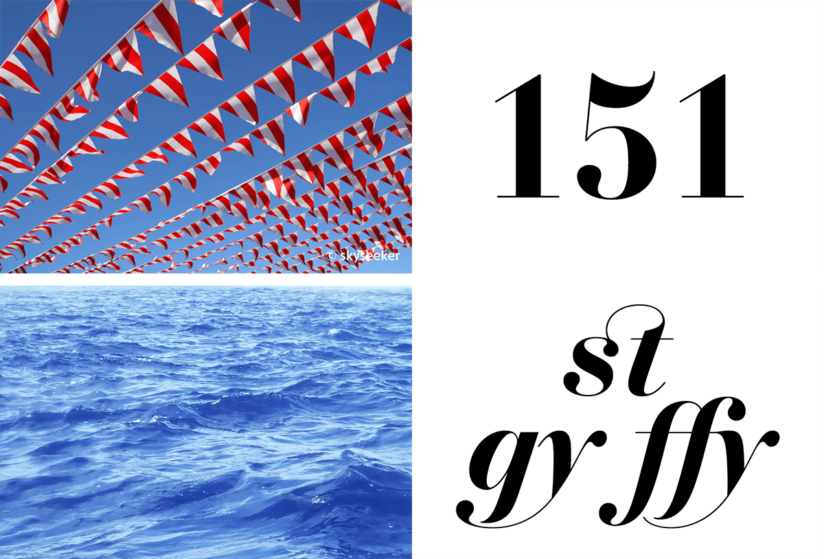
Flags lapping in the wind
Latin that gives a sense of port likeness, such as images of flags lapping in the wind and an anchor, modern Roman typeface is adopted in consideration of harmony with kanji. The letter structure of the newly added Latin italic typeface differs depending on the variation. In high contrast, thick fonts, such as Display H, etc., a soft and rounded modern Roman style design similar to regular is adopted to give a glamorous atmosphere that stands out in large sizes. In ligatures with ornamental design, such as ‘st’, ‘fy’, etc., a bow shape line is adopted in the ascender (the upper part of a lowercase letter) and the descender (the lower part of a lowercase letter). This design, with the impression of a wave form, provides glamour to writing.
- WHITE MODE
- BLACK MODE
- ACaption
- AText
- AHeadline
- ADisplay
Family・Specification
Font set
Standard(StdN)
9,498 characters (Adobe-Japan1-3, with custom glyphs added)
Hama Mincho Italic
301 characters
Buy
TP Connect
Subscription service that enables
the use of all of Type Project fonts.
TP Connect is only available in Japanese.