%20--%3e%3cpolygon%20points='24.7%201%200%201%200%207.6%208.5%207.6%208.5%2039.4%2016.1%2039.4%2016.1%207.6%2024.7%207.6%2024.7%201'/%3e%3cpath%20d='M34.1,32.4l-4.9-22.7h-7.9l9.1,33.1c-.4,1.7-1.1,2.9-3.7,2.9h-2.6l1.9,6.6h1.5c4,0,8-1.2,10.3-9.2,1.8-6.4,8.9-33.3,8.9-33.3h-8l-4.6,22.7Z'/%3e%3cpath%20d='M91.7,8.7c-8.7,0-12.7,6.5-12.7,16.1s3.6,15.3,13.8,15.3,7.2-.9,9-1.6l-1.2-6c-2.4.8-4.9,1.2-7,1.2-4.3,0-7-2-7.2-7.3h16v-4.8c0-7.5-2.9-13-10.7-13ZM86.5,21c0-3.3,1.7-6.4,4.7-6.4s4.1,2.7,4.1,6.4h-8.8Z'/%3e%3cpath%20d='M218,8.7c-8.7,0-12.7,6.5-12.7,16.1s3.6,15.3,13.8,15.3,7.2-.9,9-1.6l-1.2-6c-2.5.8-4.9,1.2-7,1.2-4.3,0-7-2-7.2-7.3h16v-4.8c0-7.5-2.9-13-10.7-13ZM212.9,21c0-3.3,1.7-6.4,4.7-6.4s4.1,2.7,4.1,6.4h-8.8Z'/%3e%3cpath%20d='M126,1h-10.7v38.4h7.6v-11.8h5c6,0,11.3-3.8,11.3-14.1s-5.5-12.5-13.1-12.5ZM125.9,20.9h-3.1V7.6h3c3.7,0,5.4,1.8,5.4,6.3s-1.5,7.1-5.3,7.1Z'/%3e%3cpath%20d='M150,12.9c-.2-1-.5-2.4-.8-3.2h-6.9c.5,1.9.7,4.6.7,7.9v21.8h7.4v-20.3c1.1-2.2,4.5-3,7.4-3v-6.8c-3.5,0-6.5,1.7-7.7,3.6Z'/%3e%3cpath%20d='M192.6,40.6c0,3.5-1.6,4-4.7,4h-1.5l1.9,6.6h2.3c6.3,0,9.3-3.2,9.3-9.8V9.7h-7.4v30.9Z'/%3e%3crect%20x='192.2'%20width='8.4'%20height='6.4'/%3e%3cpath%20d='M247.4,33.7c-4.8,0-6.6-2.8-6.6-9.6s1.9-8.9,6.2-8.9,3.4.4,4.9,1l1-6.4c-1.3-.5-3.7-.9-6.2-.9-10.6,0-13.4,6.7-13.4,15.9h0c0,10.7,4.6,15.3,12.4,15.3s5.9-.5,7.4-1l-.9-6.1c-2,.4-3.7.6-4.7.6Z'/%3e%3cpath%20d='M264.7,30.2v-14.2h5.4l1.4-5.8h-6.9V2.1l-7.3,1.9v26.8c0,5.3,2.4,9,8.2,9s4.9-.2,4.9-.2v-5.7h-2c-3,0-3.8-1.3-3.8-3.7Z'/%3e%3cpath%20d='M64.3,8.8c-3.3,0-5.8,1.6-7.3,3.4-.2-1.1-.5-2.1-.8-2.6h-6.6c.5,1.9.6,4.4.6,7.4v34.4h7.3v-13.8c1.5,1.5,3.8,2.4,6.2,2.4,8,0,11.2-6.6,11.2-16s-3.1-15.2-10.4-15.2ZM62.1,33.8c-1.6,0-3.1-.6-4.6-1.8-.3-1.6-.4-3.7-.4-6v-3.3c0-1.8.1-3.8.4-5.1,1.4-1.4,3-2.5,5-2.5,3.2,0,4.6,3.2,4.6,9s-.9,9.6-5,9.6Z'/%3e%3cpath%20d='M173.6,8.6c-9.5,0-13,6.7-13,15.7s3.5,16.1,13,16.1,13-6.8,13-16.2-3.3-15.7-13-15.7ZM173.6,34.2c-3.6,0-5.5-2.9-5.5-9.9s2.2-9.5,5.5-9.5,5.5,2.2,5.5,9.5-1.9,9.9-5.5,9.9Z'/%3e%3c/svg%3e)

TP Apricot Development Story
In this development story, I will talk about the path behind the design process of TP Apricot from the perspective of the designers involved in the creation.

Design with a “Sizzle Feel”
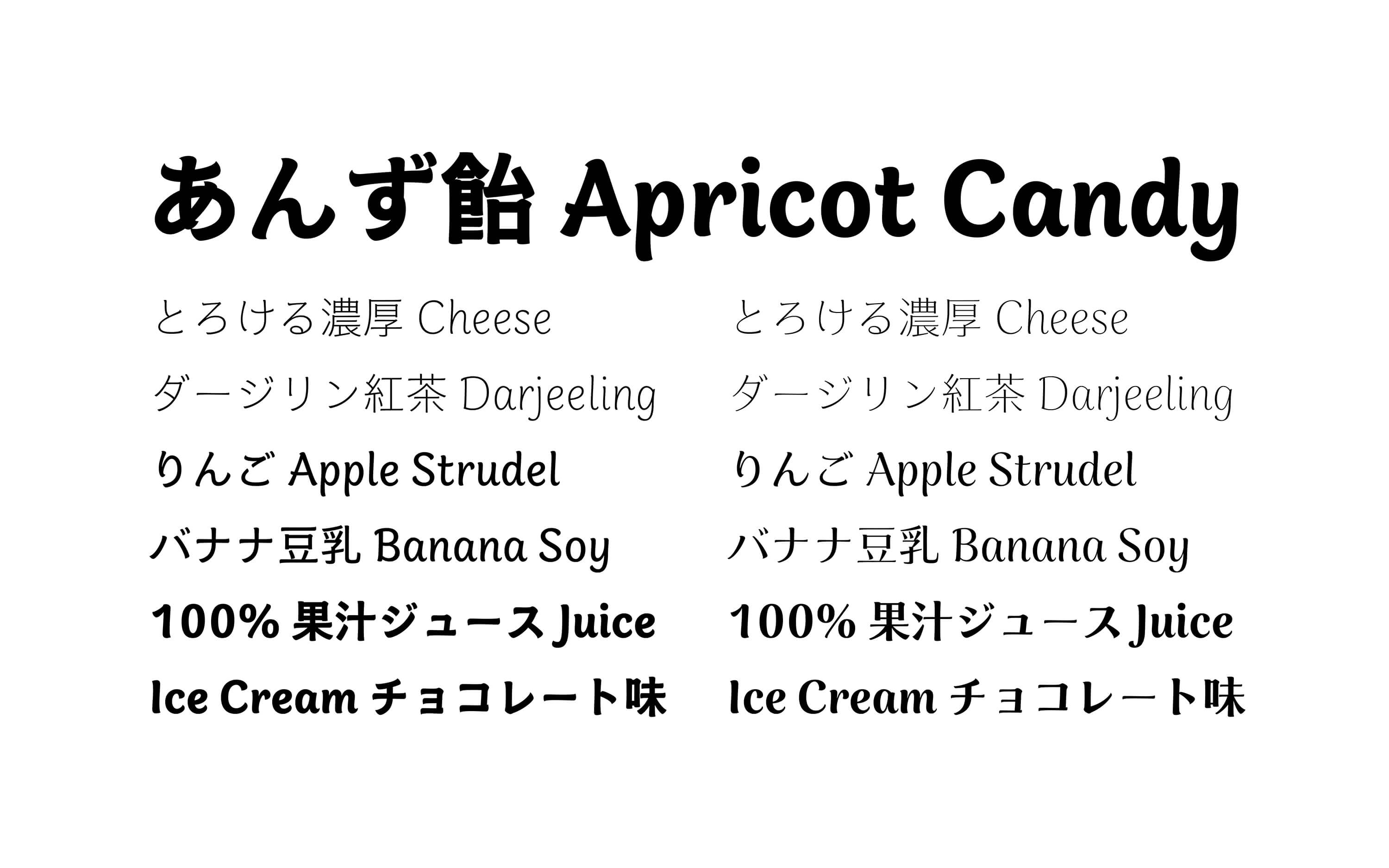
TP Apricot is a typeface developed with the theme of freshly picked fruit, and we aimed for design balancing individuality and ease of reading. From the early stages of development, focusing on the keyword “sizzle feel,” we proceeded with design considerations while being mindful of its use in food and beverage packaging. Aiming for design that evokes a sensation of “deliciousness,” including freshness and juiciness from typesetting, we developed through a process of trial and error to determine what shape the characters should take. When testing typesetting, we prepared typesetting materials with the use of food-related words, such as names of ingredients and dishes, adjectives and onomatopoeia frequently seen on food packaging, etc., to confirm the design direction.
Writing Instruments and Design
The design of TP Apricot incorporates the texture of handwriting. The structure and detailed shape of characters, inspired by lines drawn with writing instruments, such as brushes, markers, and ink give an overall soft and friendly impression.
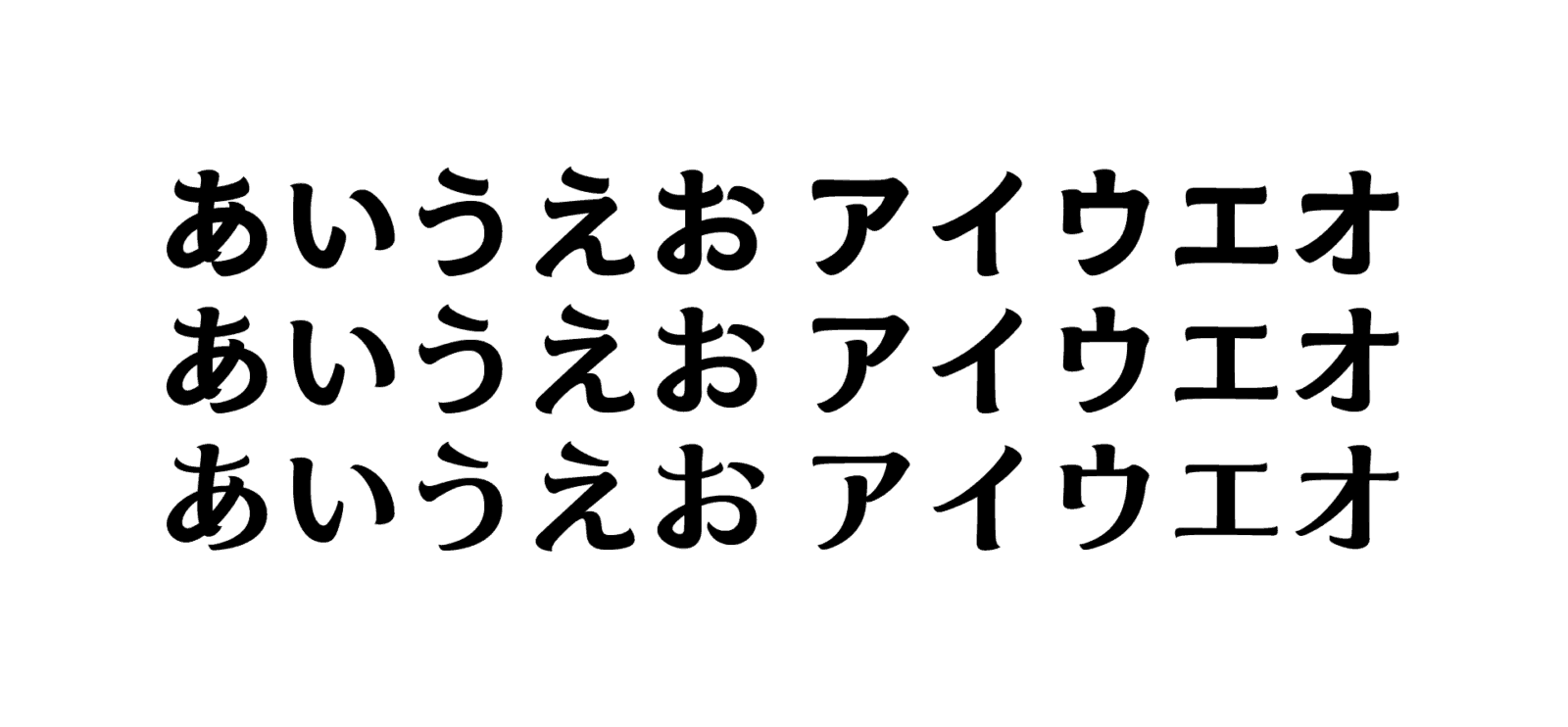
This typeface family has styles with different contrasts; each is modeled after a different writing instrument or form of calligraphy. Additionally, various adjustments have been made in accordance with the structure of each character type, such as kanji, hiragana, katakana, and Latin.
While using the features of handwritten characters as reference, we avoided rigidly adhering to fixed rules, and sometimes incorporated innovative shapes, exploring a shape that would be suitable for expressing the overall theme of “sizzle feel.” After all of this trial and error, we have arrived at the fresh design that is unique to TP Apricot.

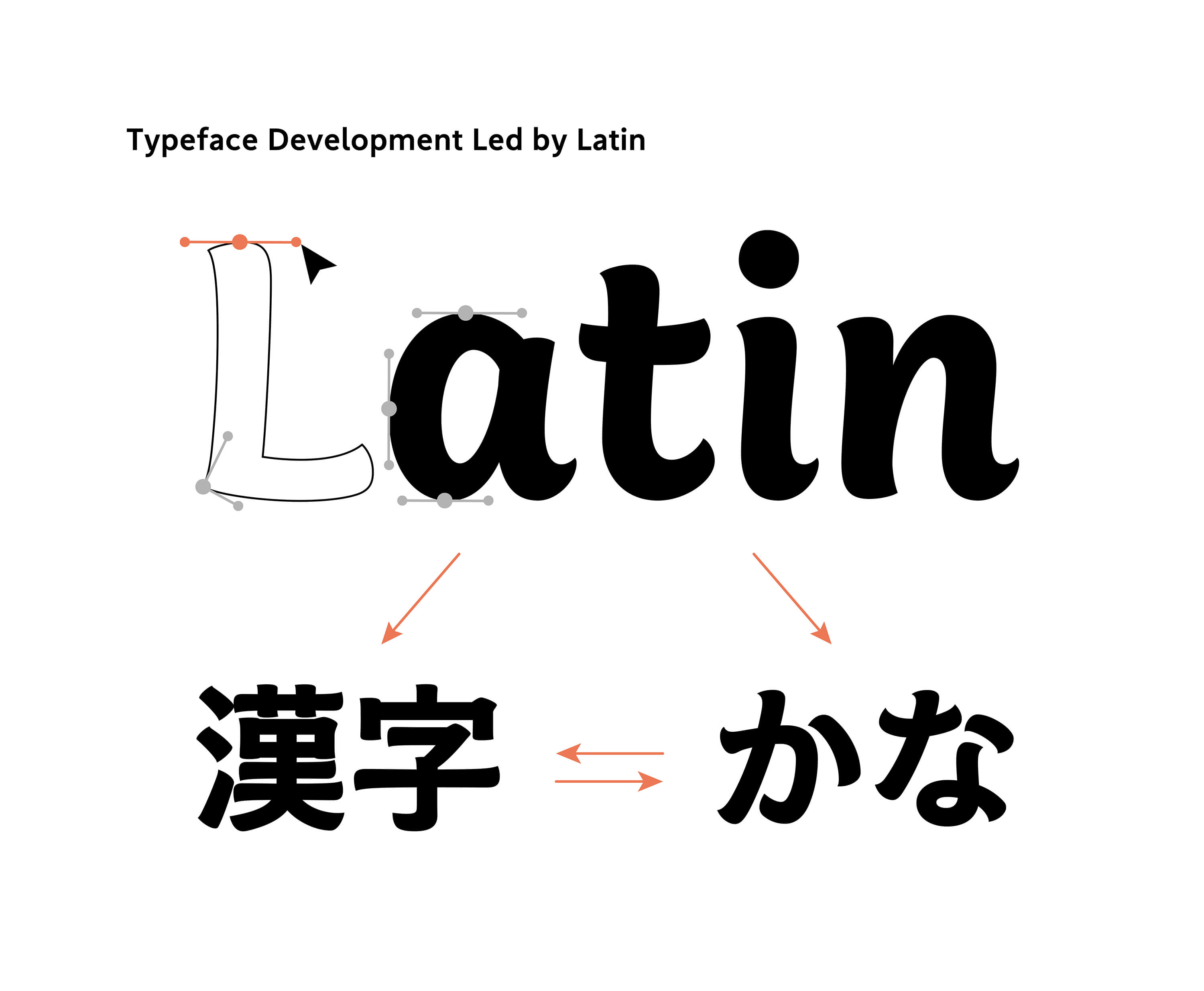
Development Led by Latin
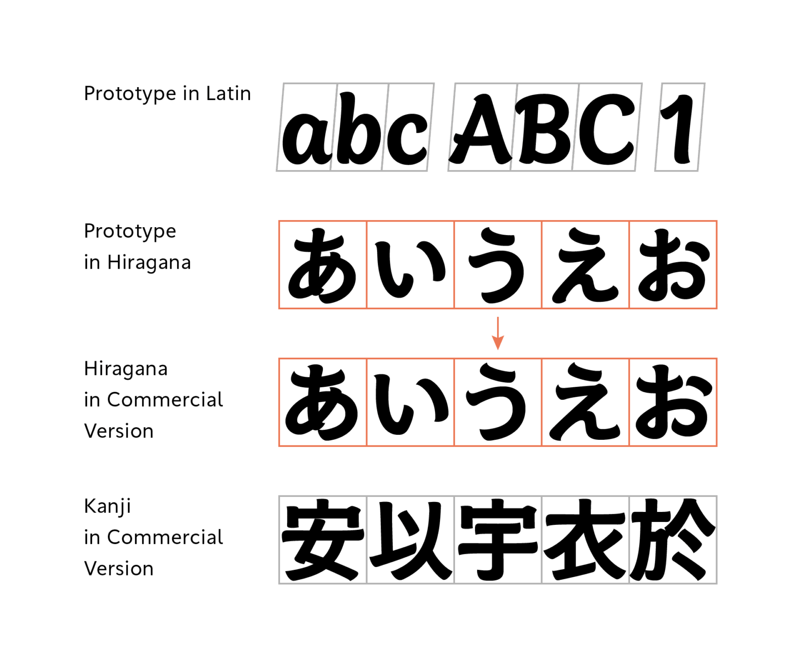
The development of TP Apricot began with the design of Latin. The order is to first establish the direction of Latin to a certain extent, before proceeding to the design of kanji and kana. In the development of Japanese typefaces, the design starts with kanji and kana in many cases, so beginning with Latin first may be a somewhat unusual approach.
In the case of designing Latin to match kanji and kana, certain standard elements, such as the overall tone, shape, etc. are provided beforehand. On the other hand, for the Latin in TP Apricot, we started to think about design using only the keyword “sizzle feel” as a clue. In the end, typesetting in a Japanese typeface along with kanji and kana was decided, but we wanted to create a typeface that would be interesting on its own in Latin alone. Therefore, rather than adopting a subordinate Latin approach, we went through repeated prototyping, aiming for an expression unique to script-style Latin.
Consideration of Slanted Variations
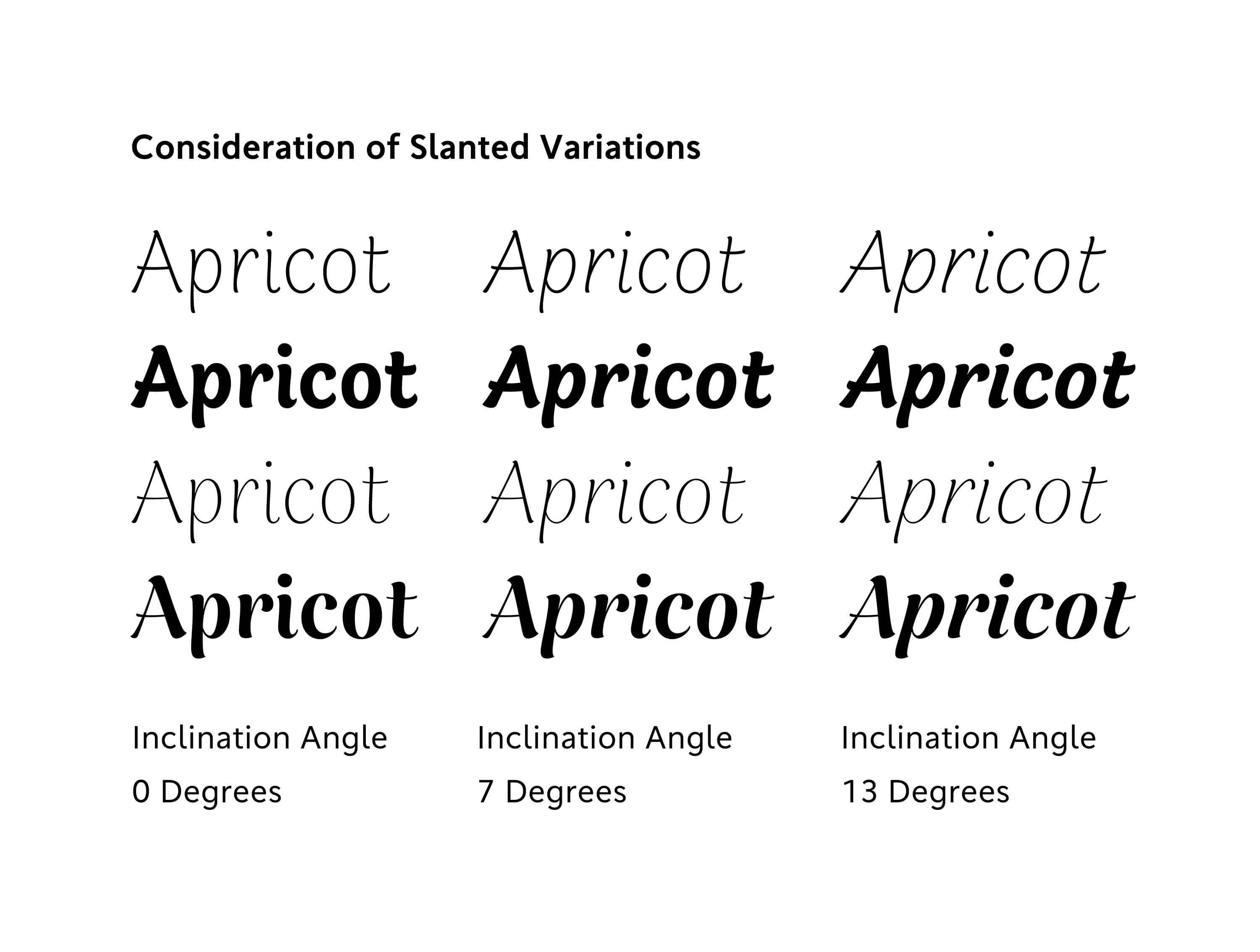
As an idea to enhance the appeal of the Latin typeface, we explored a design with a slight incline in the early stages of development. The “inclination of the characters” in Latin typefaces is one of the major elements at the time of incorporating the handwriting texture, and the degree of inclination can express the sense of speed at which the characters are written. Designs with inclination to the right side are commonly seen even in italic and cursive script, etc. modeled after handwritten styles of calligraphy.
TP Apricot is not a typeface aimed to be a highly-inclined calligraphic cursive script with a fast-writing style. In order to capture the nuances of handwriting, we thought that a slight inclination would give more of a natural impression. Therefore, in the early stages, we adopted a design with a gentle inclination of about 2 to 3 degrees.
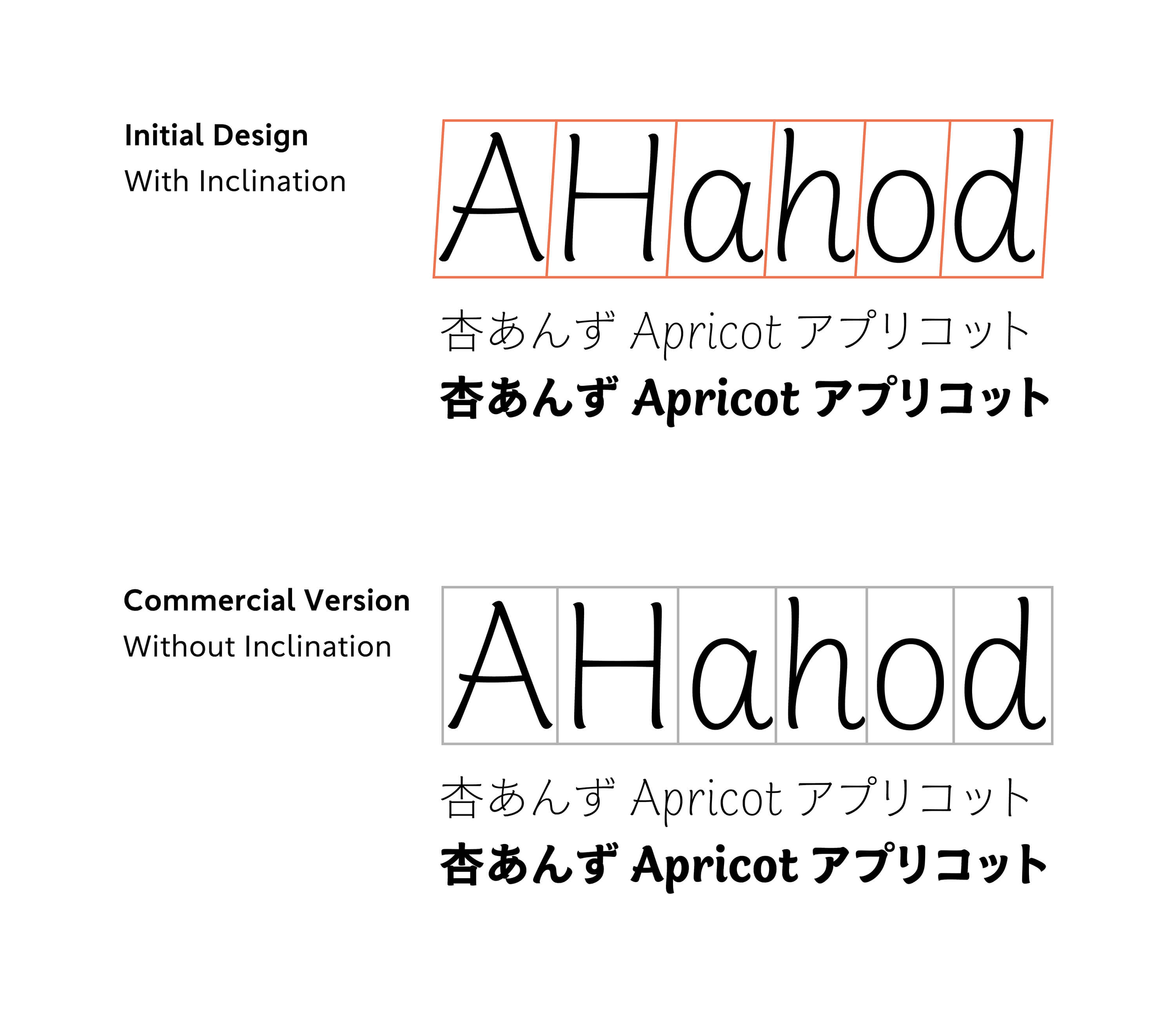
After that, as the development of kanji and kana progressed, we felt the need to reconsider the inclination angle of Latin, and we prototyped several variations, ranging from upright to significantly inclined. Among these, upright was selected as the final Latin design in consideration of ease of reading as a Japanese typeface and overall balance.
Design Incorporating the Features of Writing Instruments
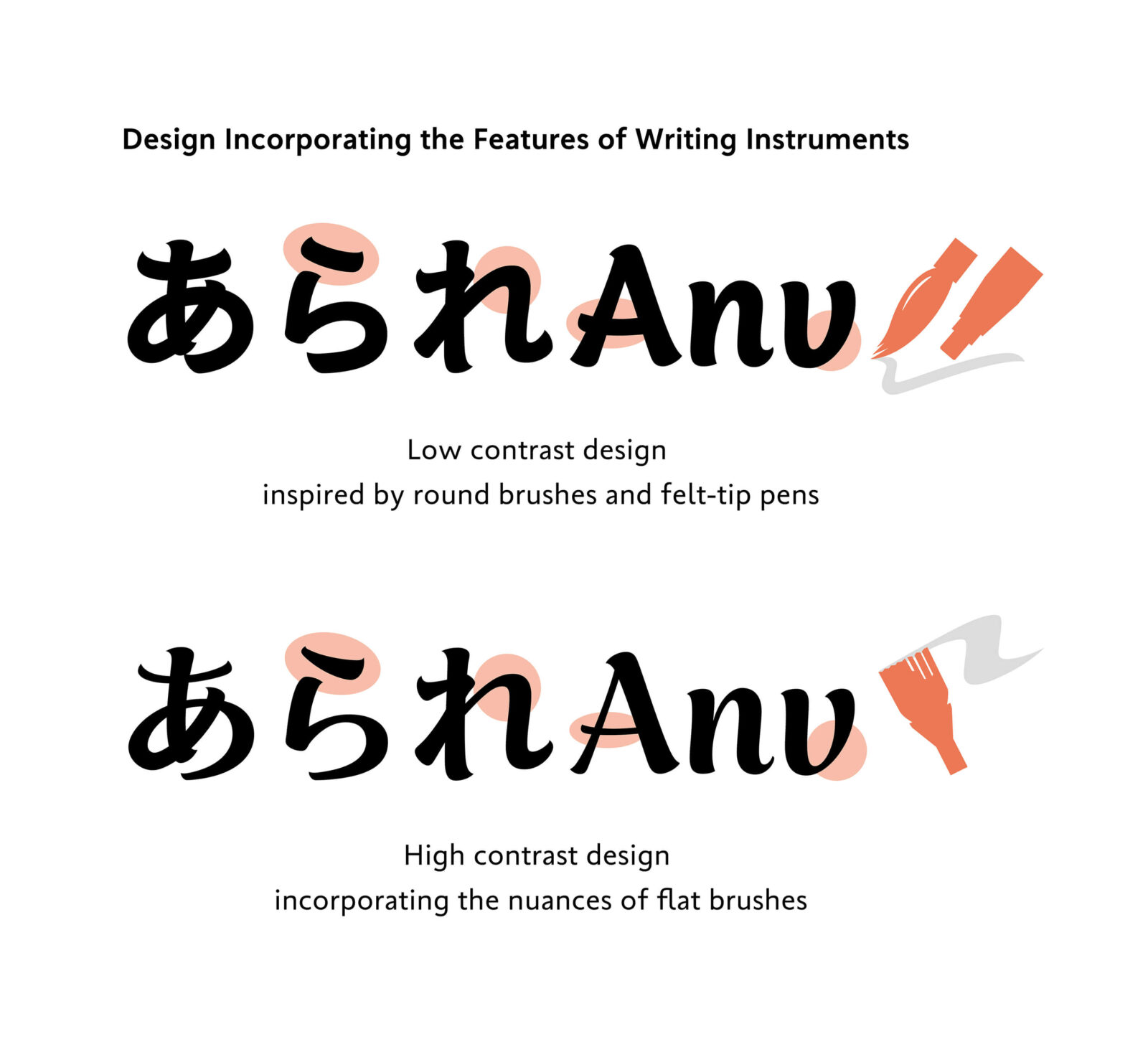
In aiming for a design that evokes the feel of handwritten brushwork, we assumed several specific writing instruments and used the shapes of the lines drawn with each writing instrument as reference for the detailed expression of the characters.
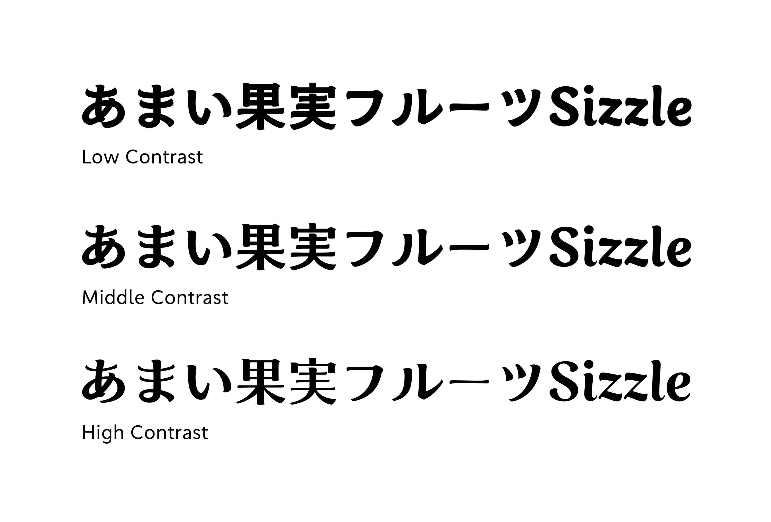
TP Apricot is a family with a wide range of weights and contrasts. To utilize the special quality of each style and maximize its appeal, each style is modeled after a different writing instrument. For low contrast, lighter weights weight, we assumed a marker or felt-tip pen that can express the texture of ink or pen pressure at key points while restraining modulation of thickness. For heavier weights, we imagined a round brush that can create softness and flexibility with thicker lines. For high contrast, we incorporated the nuances of a flat brush that can maintain thick and thin contrasts without compromising the soft atmosphere in low contrast.
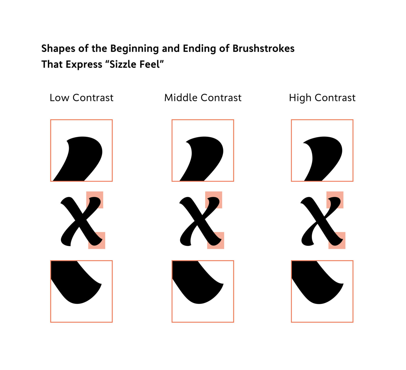
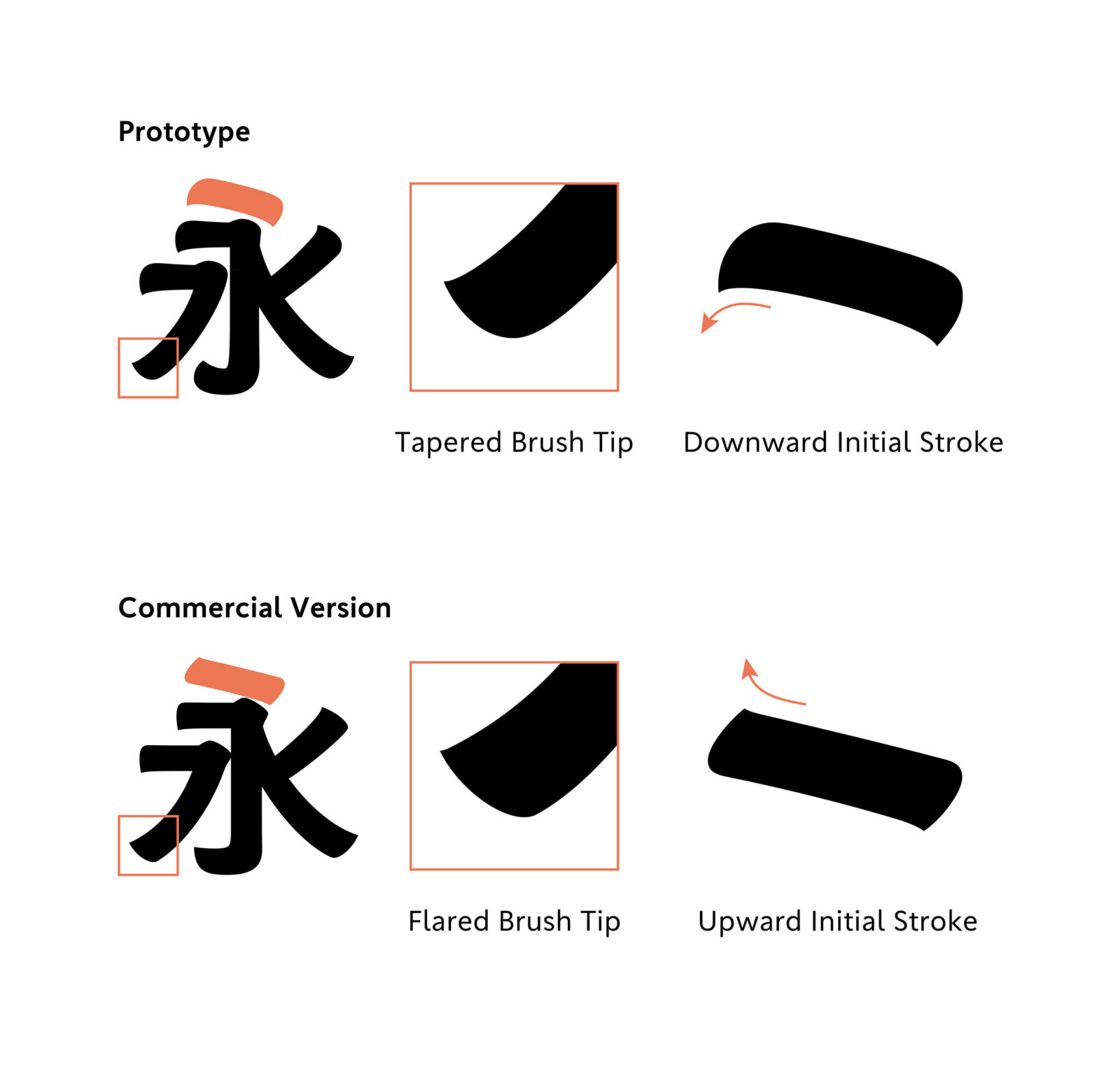
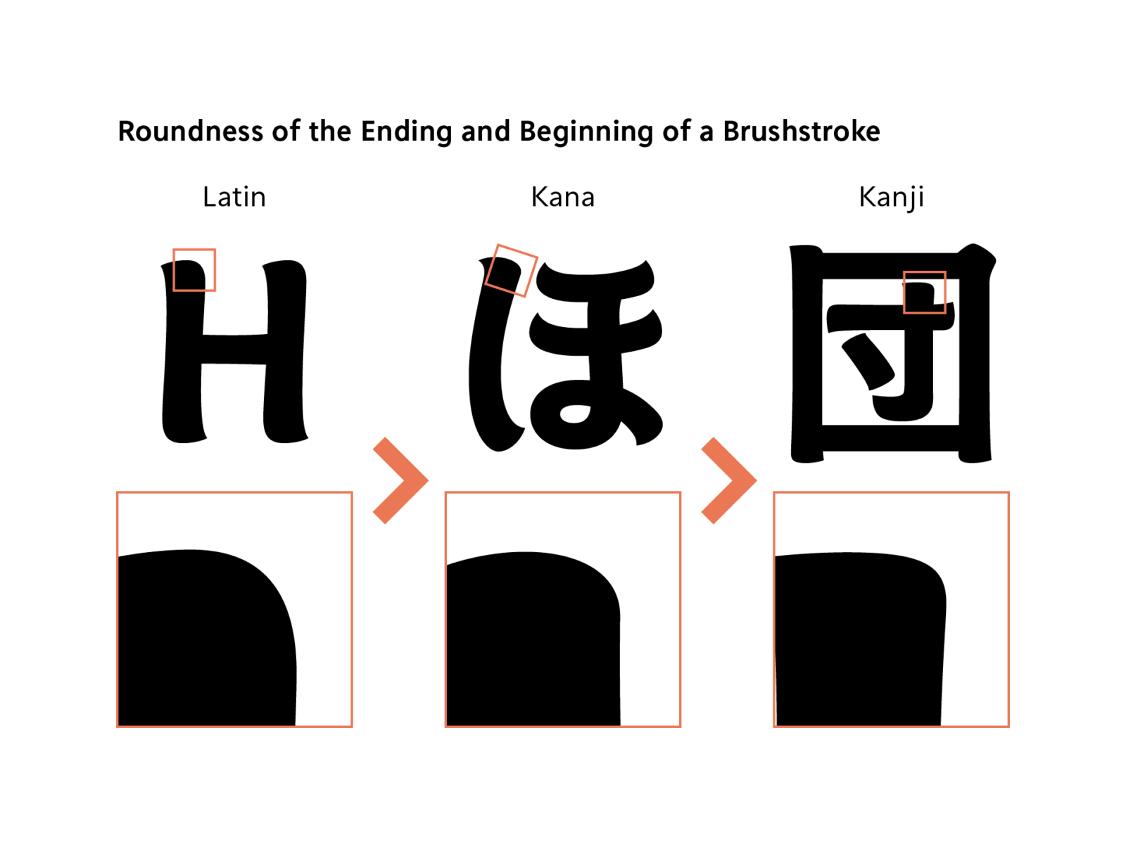
A distinctive feature is the shape of the beginning and ending of each brushstroke. By combining the tapered shape reminiscent of brush writing and the rounded shape in the motif of a drip of fruit juice, it expresses the bouncy texture of fresh fruit and the “sizzle feel” like dripping of fresh fruit juice.
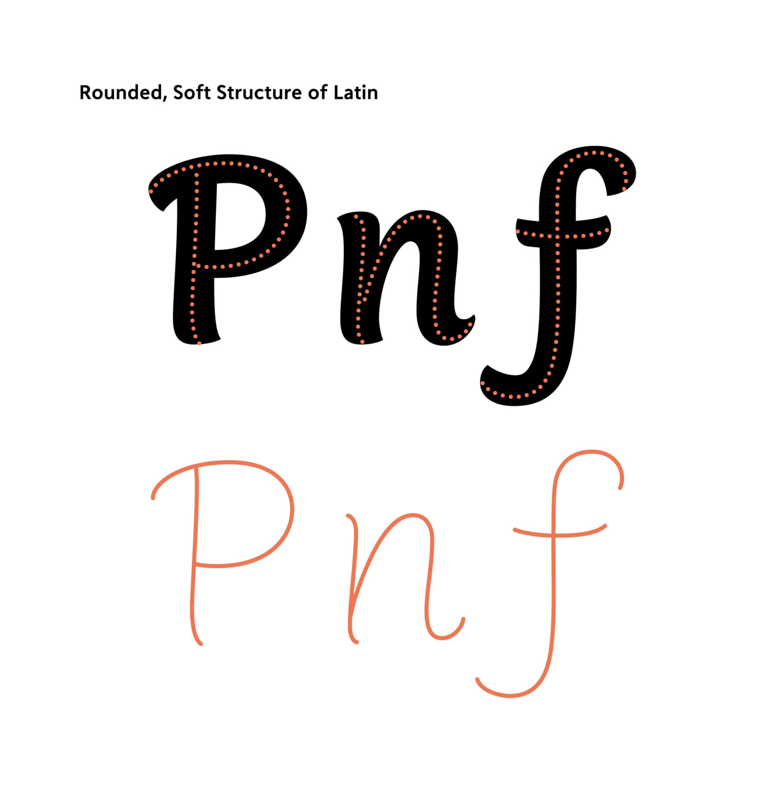
The overall structure of the characters adopts a rounded shape reminiscent of a cute and round fruit. By incorporating gentle curves into straight lines, a softness unique to handwriting is expressed. While each style has differences in line modulation and detailed shapes, we tried not to change the structure significantly in any styles to maintain a sense of unity within the family.
Although it was not an easy task to bring together a wide range of diverse styles in the motif of different writing instruments into one family, we repeatedly adjusted the character structure and detailed parts to achieve a unified design while keeping in mind the nuances of each writing instrument and the overall theme of “sizzle feel.” We would be delighted if you too could feel the fresh and soft atmosphere unique to this typeface.

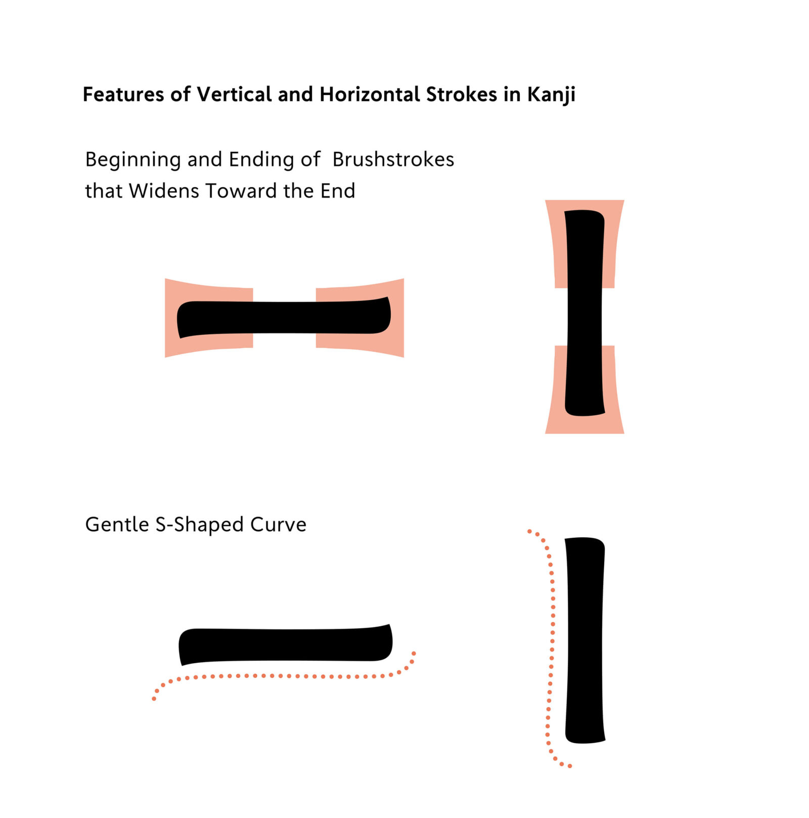
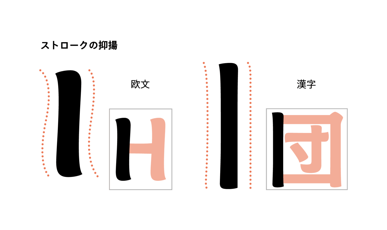
Modulation in Thickness and S-shaped Curves in Vertical and Horizontal Strokes
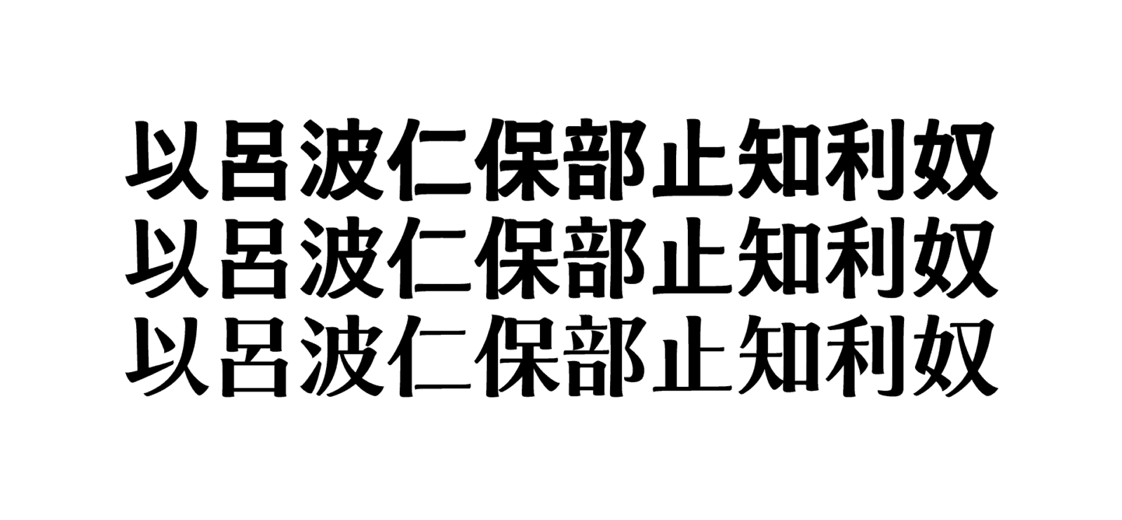
Once the design of Latin was finalized to a certain extent, we started creating the corresponding kanji. Among the character sets of Japanese typefaces, kanji characters have a stronger linear impression compared to Latin and kana. Therefore, a major challenge was how to express the “softness” of Latin design within kanji. For the beginning and ending of a brushstroke, plump, rounded shapes are incorporated to create a sense of unity with Latin. However, rigidity inevitably remains in straight horizontal and vertical lines. So, similar to Latin, we added modulation in thickness and gentle S-shaped curves to the vertical and horizontal strokes for adjustment to achieve a softer impression.
Challenges Unique to Latin-Led Development
The process of incorporating the features of Latin, such as the beginning and ending of brushstrokes, modulation of lines, etc., into the design of kanji was more time-consuming than we had imagined. In the stages of prototyping, we experimented with a design that was soft and had a strong modulation, while still retaining the impression of Latin. However, compared to Latin, kanji characters have a higher number of strokes per character. Therefore, if you apply the modulation patterns of Latin directly to kanji, while the shape of individual strokes may appear beautiful, the impression of the character as a whole becomes overly tedious.
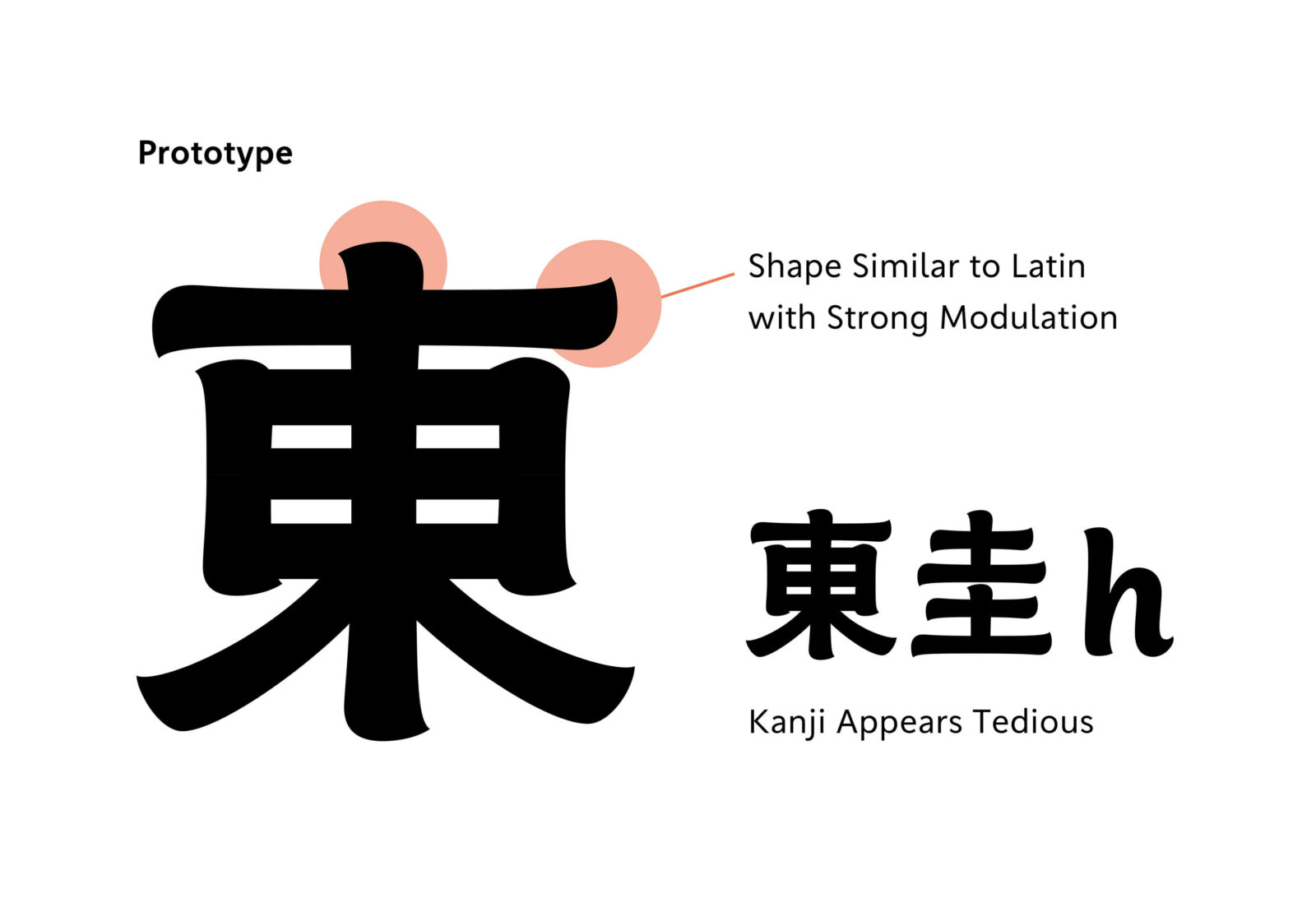
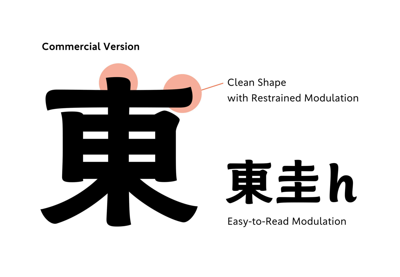
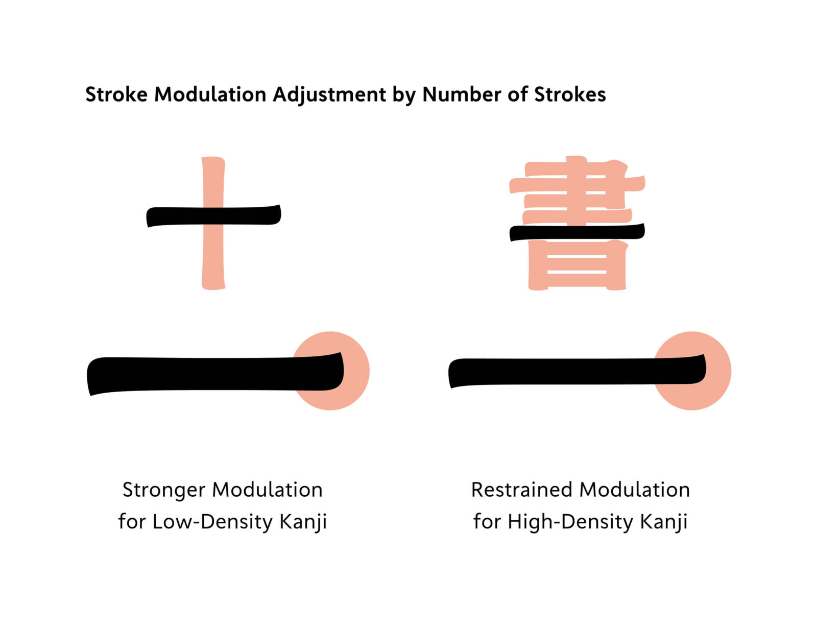
Furthermore, the appearance of kanji varies depending on whether or not they have many or few strokes, and the density of the characters is also significantly affected by variations in weight. In the early stages of prototyping, we believed it would be easier to consider the design if we aligned the density with the Latin, so we proceeded with prototyping using characters with fewer strokes. When we tried using kanji with many strokes a while later, we were surprised to find that it looked less balanced than we had imagined. We went through a process of repeated trial and error to find the best balance and the adjustment methods for how to adjust stroke thickness and curve modulation to match the varying density of characters based on number of strokes and weight.
Design of Sweep and Dot
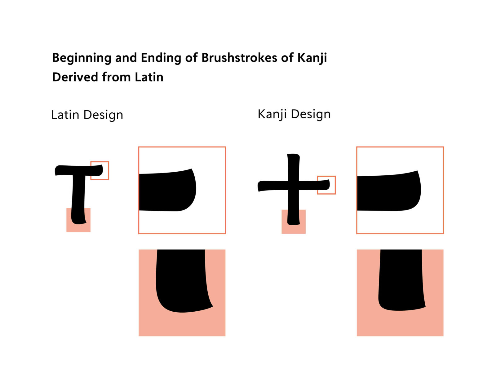
In the process of reflecting Latin design into kanji, the shape of parts unique to kanji was another issue where we went through trial and error extensively. TP Apricot’s Latin adopts a unique design that gives the impression of being handwritten, while avoiding the rigid application of specific calligraphy styles or rules. While these stroke shapes do not exist in Latin, we had to consider the detailed expression of stroke shapes unique to kanji from the scratch.
An easy-to-understand example is the design of dots and sweeps. We tried several variations, such as the direction of the beginning of a brushstroke in the dots and the degree of modulation in the sweeps (mainly in low contrast). As a result, the beginning of a brushstroke that enters from above for the dots, the ending of a brushstroke that widens toward the end for the sweeps, and the shape settled into the corners giving tension to convey the brush’s resilience.
For the other parts, we carefully considered each of the directions at the beginning and ending of a brushstroke, the strength and weakness of modulation, etc. to search for an appropriate shape for each and established new standards specifically for kanji.
Structure Where the Size of Inside Space Between Strokes Varies by Weight
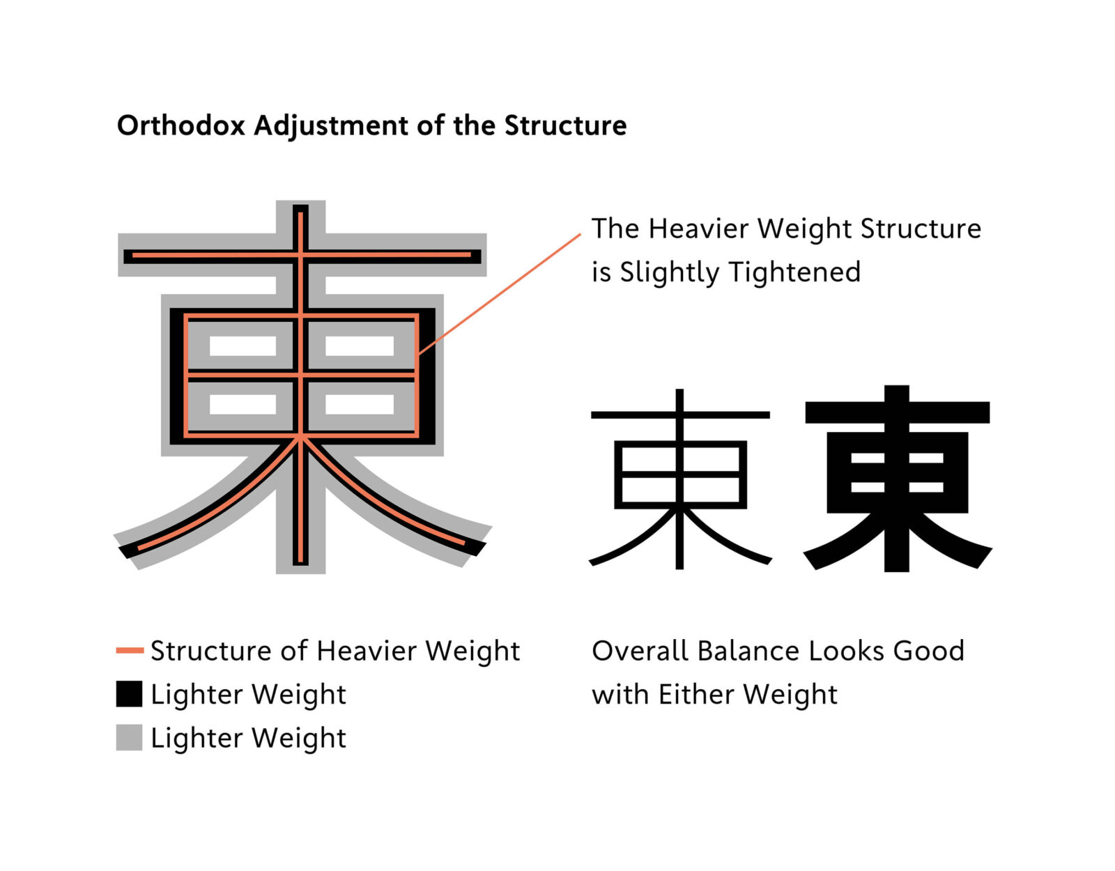
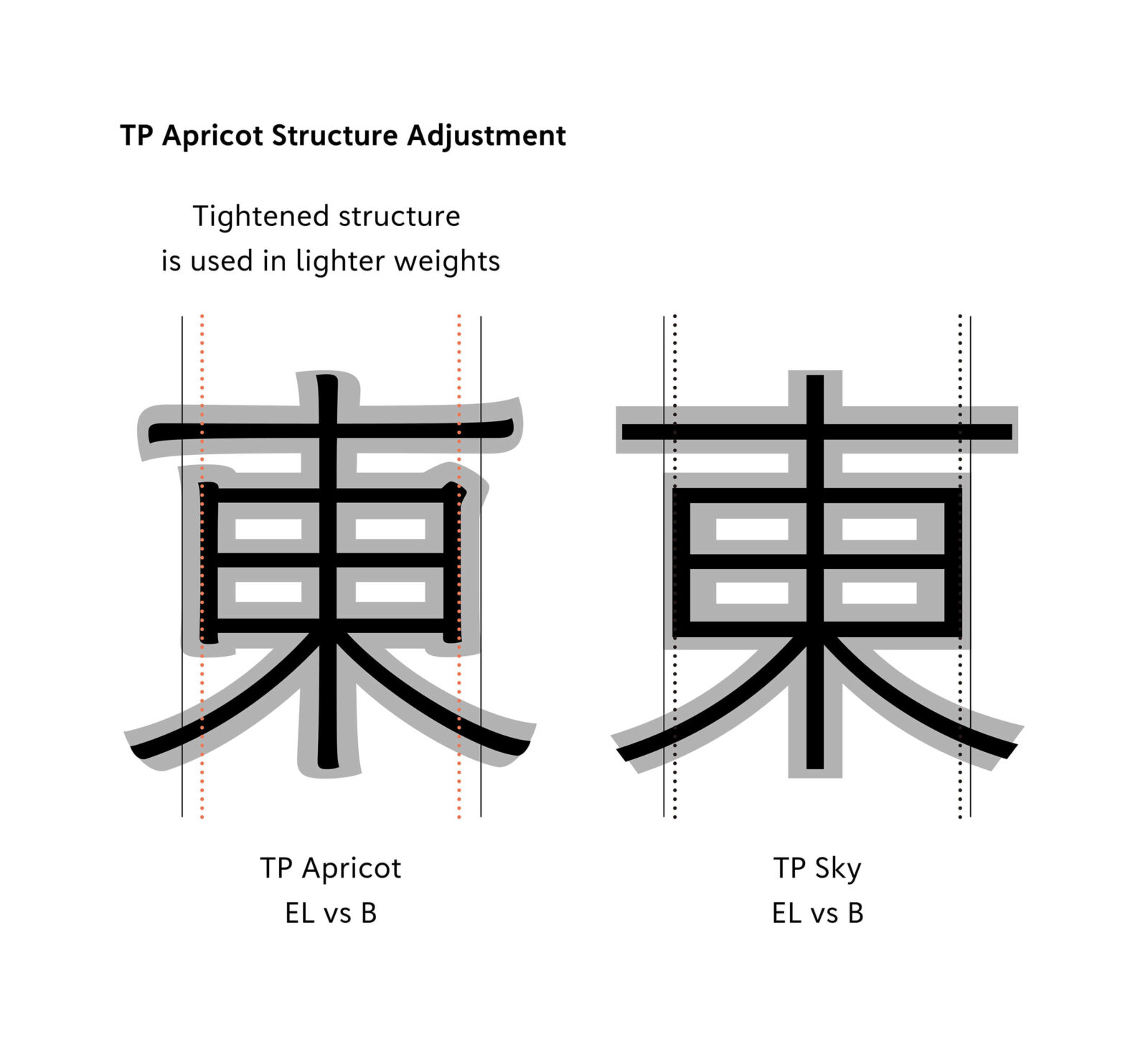
In the TP Apricot kanji, we have undertaken our own initiatives: in addition to adjusting strokes and parts, we gradually changed the tightness of the structure in accordance with the weight variation. In typical kanji design, counters are kept at an appropriate size in all weights, and the characters are designed so that there is no significant difference in overall size or in the balance of inside space between strokes. When the weight is increased while keeping the same structure, the width of each stroke will increase, and the space between closely spaced strokes will also become narrower. In addition, the character size increases, making the entire display appear to spread out. For that reason, an orthodox approach to the structure adjustment method is slightly tightening the structure of thicker weights rather than lighter weights.
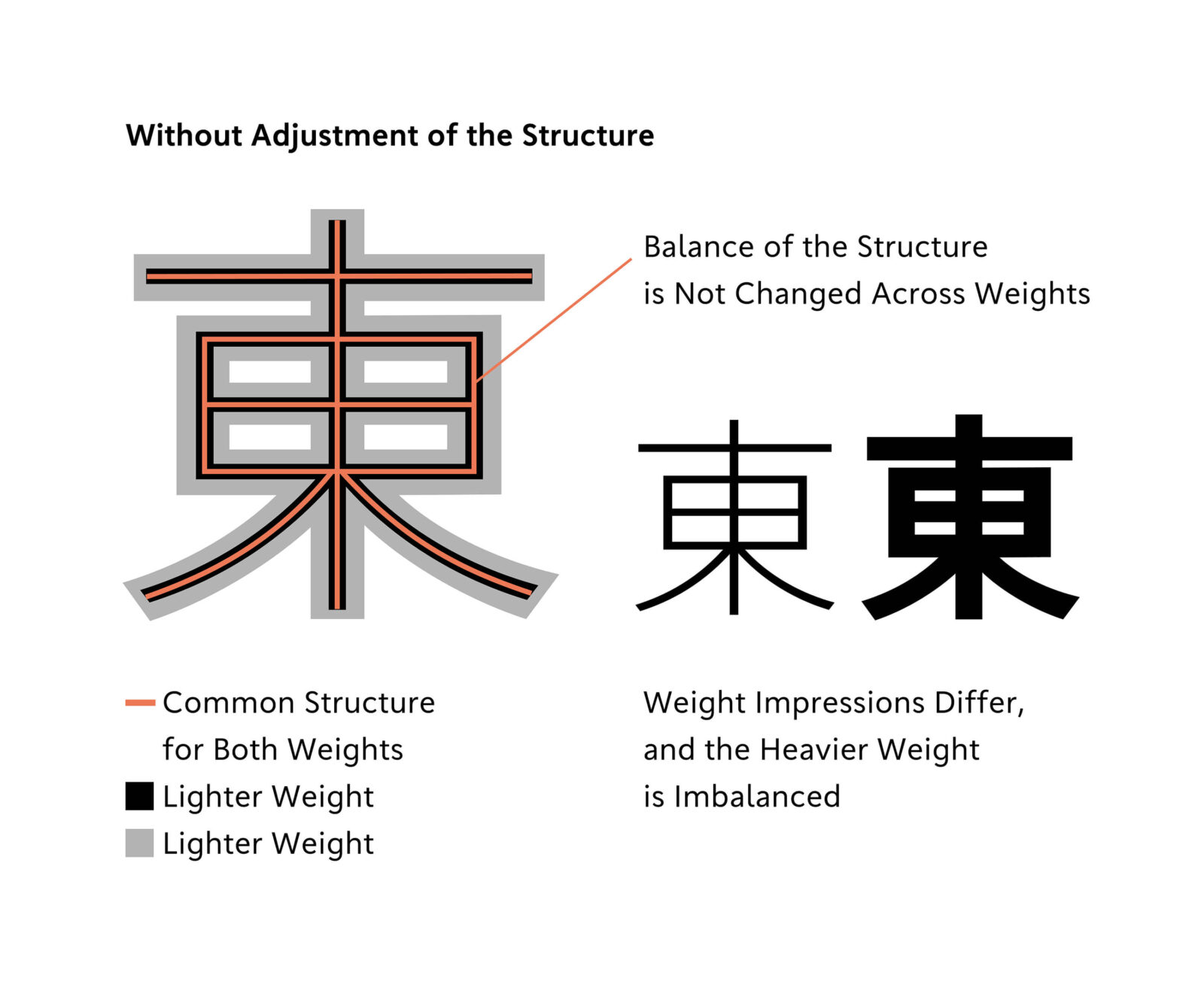
When we tried this method with TP Apricot, there was a difference in the impression between the lighter weights and heavier weights. In particular, the inside space between strokes in the lighter weight appeared too large, giving a more solid impression than the image we wanted to express. Therefore, to achieve a lighter feel, we adopted an adjustment method that tightens the structure of the lighter weight slightly rather than the heavier weight.
It’s difficult to put into words the exact reason for the difference in impression, but by adjusting the structure, we were able to create a design that looks stable at any weight.

Design Aligned with Latin and Kanji
After the designs for the Latin and kanji were more or less finalized, the creation of hiragana and katakana began. TP Apricot has different designers for hiragana and katakana, but here we will introduce the twists and turns of design using the creation of hiragana as an example.
When we began creating hiragana, the design was based on Latin. However, in the end, the design was decided to be closer to kanji.
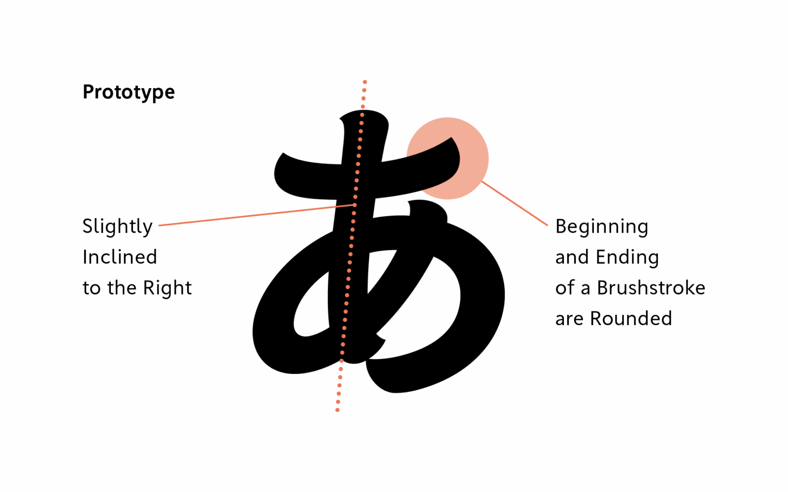
In the early stages, the hiragana was based on Latin, with a particular focus on italic Latin. As a Latin element, line modulation is fairly strong and the beginning and ending of brushstrokes are rounded. Another feature is that it has a slight inclination to the right to match the italic.
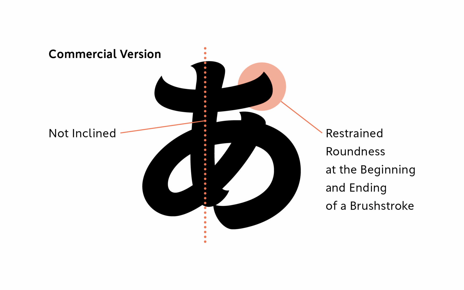
In the final design, the line modulation and the rounding of the part of the beginning and ending of each brushstroke were restrained, with balance with the kanji in mind. We also considered the overall design policy for the font, and decided to adopt uplight Latin in that process, and from here hiragana became the design without inclination.
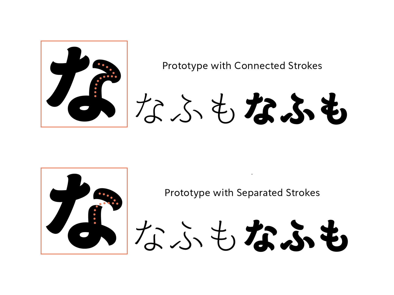
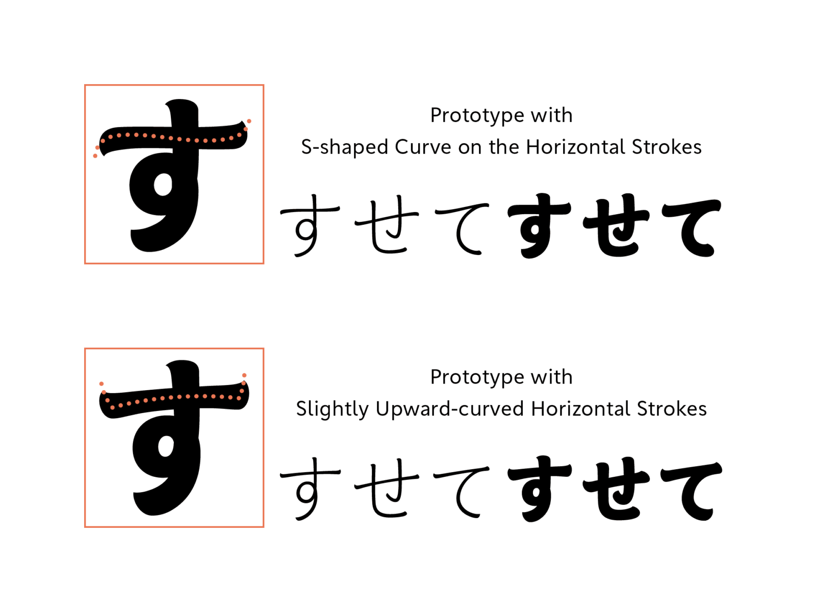
When creating the hiragana, we tried connecting and separating strokes, adding S-shaped curves to longer horizontal strokes, and comparing various prototypes before arriving at the final design.

Design Harmony of Three Different Scripts
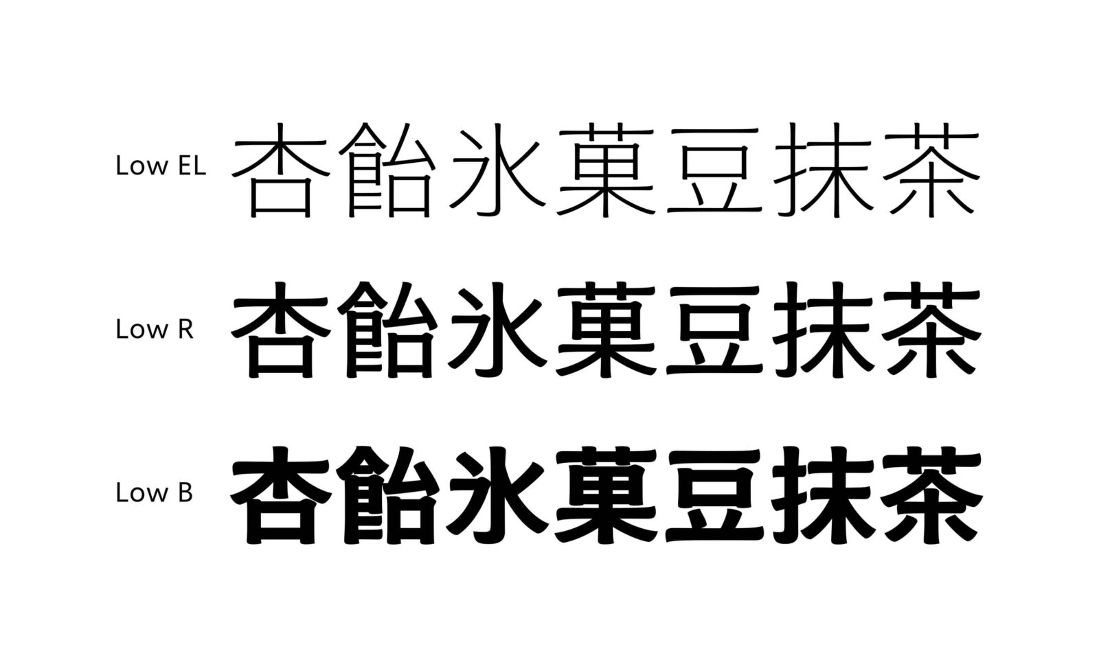
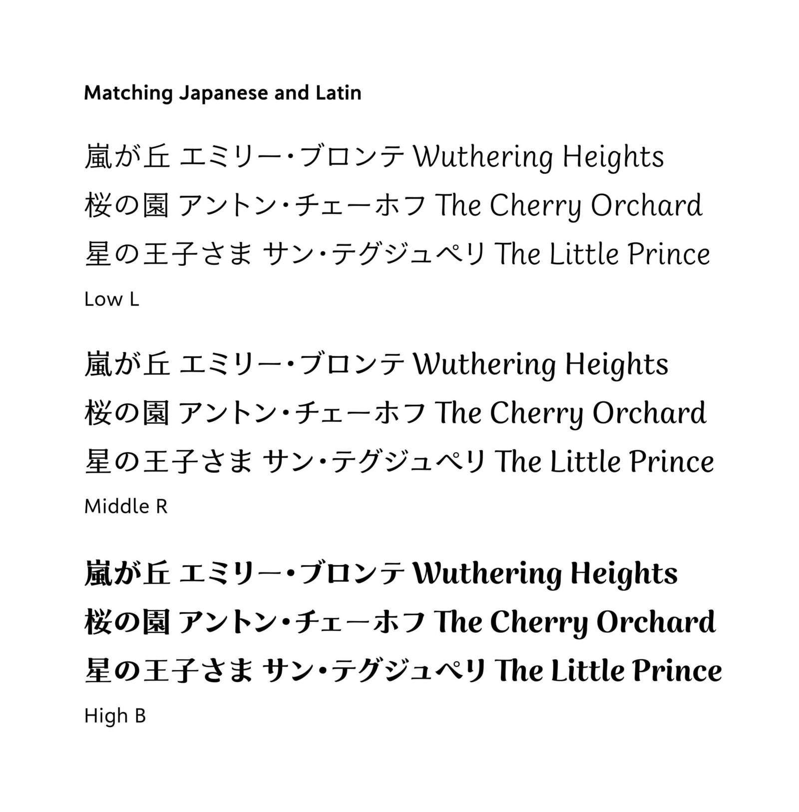
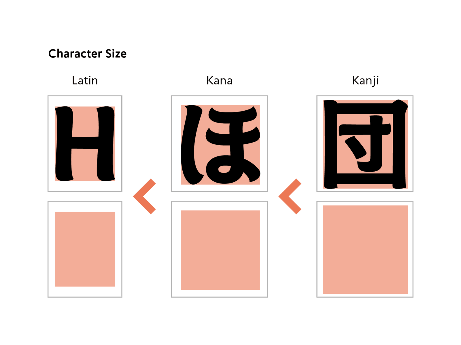
First, let’s check the basics of how to harmonize the designs of three different scripts: Latin, kana, and kanji. Increase the size gradually in the order of Latin, kana, and kanji, while decreasing the stroke thickness gradually in the same order of Latin, kana, and kanji. This makes the overall blackness appear consistent, from Latin with its few strokes to kanji with many strokes.
It’s impossible to know what size and weight are just right without actually trying them out. With TP Apricot, we also prepared materials in increments of a few percent at a time to find the best appearance.
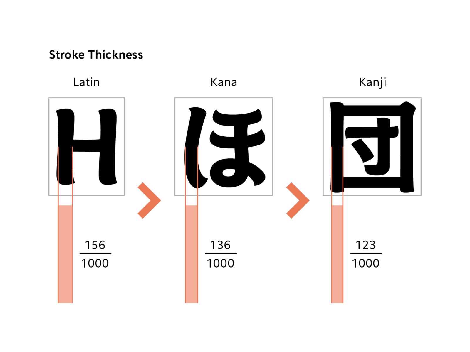
As mentioned in the kanji design challenge, TP Apricot also required careful consideration of design harmony with detailed shapes. The rounding of the beginning and ending of brushstrokes is gradually restrained from Latin to kana to kanji, and the stroke modulation is likewise greater for Latin and more subdued for kanji. Since the strokes in Latin are not crowded together, each stroke is given rich expression, while for kanji, even if the strokes are crowded together, each stroke is restrained to keep them from sticking together or becoming overly assertive, and the font as a whole is adjusted to be balanced.

TP Apricot began with the keyword “sizzle feel” and went through a process of trial and error while considering how to express this in the shape of characters. After a long period of dedicated work, this typeface has finally been released.
On the Type Project website, it is categorized as a “Calligraphic Brushstroke,” but as its creators, we see it as something with its own unique individuality, rather than something that can be assigned to any particular genre. Throughout the development process, we prioritized pursuing the unique image and expression of this typeface over conforming to existing frameworks. There were many moments when we wondered, “Is this really the right choice?”, but after its release, hearing people describe the typeface as “delicious-looking,” “cute,” “easy to read,” etc. made us genuinely happy.
As creators, we are very much looking forward to seeing how TP Apricot will be used in various applications in the future. We hope that this typeface, with its many different expressions, will be loved by a lot of people for years to come.
In this development story, we have introduced the various ideas and trial-and-error processes involved in creation from the designer’s perspective. There is still a lot more we would like to share. We plan to introduce the content that we were unable to cover here as behind the scenes development stories on our staff blog in the future, so please check it out.