%20--%3e%3cpolygon%20points='24.7%201%200%201%200%207.6%208.5%207.6%208.5%2039.4%2016.1%2039.4%2016.1%207.6%2024.7%207.6%2024.7%201'/%3e%3cpath%20d='M34.1,32.4l-4.9-22.7h-7.9l9.1,33.1c-.4,1.7-1.1,2.9-3.7,2.9h-2.6l1.9,6.6h1.5c4,0,8-1.2,10.3-9.2,1.8-6.4,8.9-33.3,8.9-33.3h-8l-4.6,22.7Z'/%3e%3cpath%20d='M91.7,8.7c-8.7,0-12.7,6.5-12.7,16.1s3.6,15.3,13.8,15.3,7.2-.9,9-1.6l-1.2-6c-2.4.8-4.9,1.2-7,1.2-4.3,0-7-2-7.2-7.3h16v-4.8c0-7.5-2.9-13-10.7-13ZM86.5,21c0-3.3,1.7-6.4,4.7-6.4s4.1,2.7,4.1,6.4h-8.8Z'/%3e%3cpath%20d='M218,8.7c-8.7,0-12.7,6.5-12.7,16.1s3.6,15.3,13.8,15.3,7.2-.9,9-1.6l-1.2-6c-2.5.8-4.9,1.2-7,1.2-4.3,0-7-2-7.2-7.3h16v-4.8c0-7.5-2.9-13-10.7-13ZM212.9,21c0-3.3,1.7-6.4,4.7-6.4s4.1,2.7,4.1,6.4h-8.8Z'/%3e%3cpath%20d='M126,1h-10.7v38.4h7.6v-11.8h5c6,0,11.3-3.8,11.3-14.1s-5.5-12.5-13.1-12.5ZM125.9,20.9h-3.1V7.6h3c3.7,0,5.4,1.8,5.4,6.3s-1.5,7.1-5.3,7.1Z'/%3e%3cpath%20d='M150,12.9c-.2-1-.5-2.4-.8-3.2h-6.9c.5,1.9.7,4.6.7,7.9v21.8h7.4v-20.3c1.1-2.2,4.5-3,7.4-3v-6.8c-3.5,0-6.5,1.7-7.7,3.6Z'/%3e%3cpath%20d='M192.6,40.6c0,3.5-1.6,4-4.7,4h-1.5l1.9,6.6h2.3c6.3,0,9.3-3.2,9.3-9.8V9.7h-7.4v30.9Z'/%3e%3crect%20x='192.2'%20width='8.4'%20height='6.4'/%3e%3cpath%20d='M247.4,33.7c-4.8,0-6.6-2.8-6.6-9.6s1.9-8.9,6.2-8.9,3.4.4,4.9,1l1-6.4c-1.3-.5-3.7-.9-6.2-.9-10.6,0-13.4,6.7-13.4,15.9h0c0,10.7,4.6,15.3,12.4,15.3s5.9-.5,7.4-1l-.9-6.1c-2,.4-3.7.6-4.7.6Z'/%3e%3cpath%20d='M264.7,30.2v-14.2h5.4l1.4-5.8h-6.9V2.1l-7.3,1.9v26.8c0,5.3,2.4,9,8.2,9s4.9-.2,4.9-.2v-5.7h-2c-3,0-3.8-1.3-3.8-3.7Z'/%3e%3cpath%20d='M64.3,8.8c-3.3,0-5.8,1.6-7.3,3.4-.2-1.1-.5-2.1-.8-2.6h-6.6c.5,1.9.6,4.4.6,7.4v34.4h7.3v-13.8c1.5,1.5,3.8,2.4,6.2,2.4,8,0,11.2-6.6,11.2-16s-3.1-15.2-10.4-15.2ZM62.1,33.8c-1.6,0-3.1-.6-4.6-1.8-.3-1.6-.4-3.7-.4-6v-3.3c0-1.8.1-3.8.4-5.1,1.4-1.4,3-2.5,5-2.5,3.2,0,4.6,3.2,4.6,9s-.9,9.6-5,9.6Z'/%3e%3cpath%20d='M173.6,8.6c-9.5,0-13,6.7-13,15.7s3.5,16.1,13,16.1,13-6.8,13-16.2-3.3-15.7-13-15.7ZM173.6,34.2c-3.6,0-5.5-2.9-5.5-9.9s2.2-9.5,5.5-9.5,5.5,2.2,5.5,9.5-1.9,9.9-5.5,9.9Z'/%3e%3c/svg%3e)
AaCurrent Font
The Decidedly Non-Digital Selection of a Font with a Sense of Spaciousness
Tamotsu Yagi Design
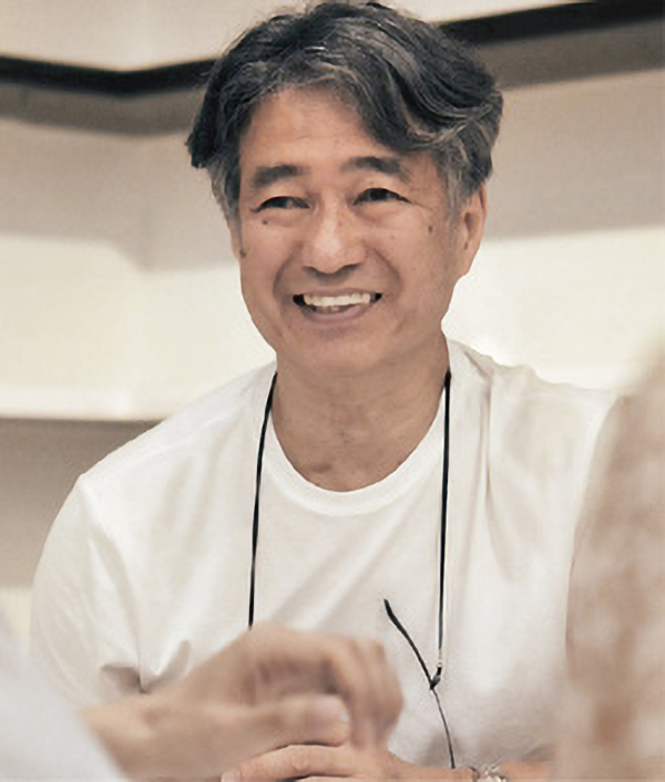
Tamotsu Yagi/Art Director
Tamotsu Yagi moved to America in 1984 and became the art director of the clothing company Esprit. Through his work in advertising and visual communication, he developed an outstanding reputation internationally, producing innovative designs for packaging, products and retail shops, and later winning the AIGA Leadership Award. In 1991, he founded Tamotsu Yagi Design in San Francisco. Yagi won the Clio Award in 1994 with his bottle design for Benetton’s “Tribu” perfume, and in 1995 received recognition from the U.S.A. government for his contributions as an Asian working in the artistic field. In 2000, upon receiving a request from Steve Jobs, who had just returned to the helm of Apple, Yagi assumed the role of project director for the world’s first Apple Store. The concepts realized in creating this original store continue to be developed in Apple Stores throughout the world.
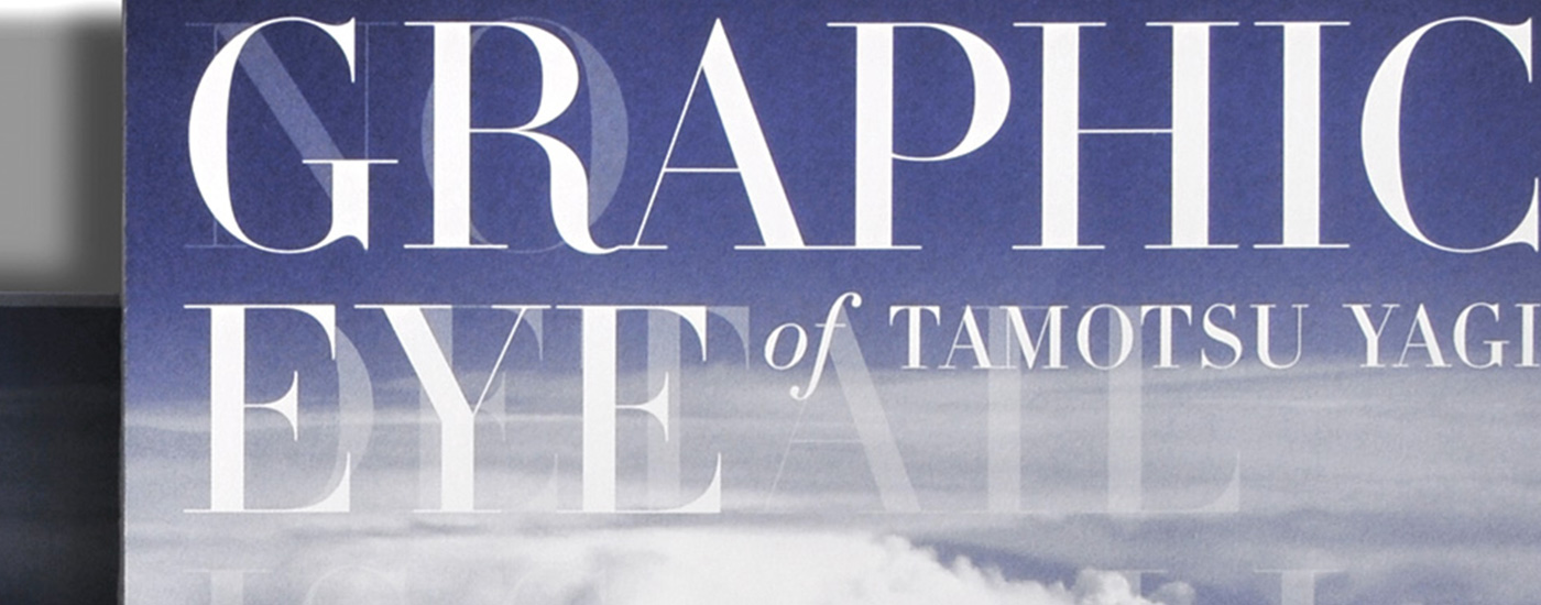
In Yagi’s first book in Japan in twenty years, The Graphic Eye of Tamotsu Yagi, AXIS Font was chosen for the entire sans-serif main text, for both the Japanese and the Latin characters.
“I’ve been using AXIS Font ever since it first came out. When I saw it being used in AXIS Magazine, I was impressed by the new sense of spaciousness it afforded and I ordered it right away. Whenever I use it now, I am aware of the great care that has been put into each and every character.”
Tamotsu Yagi is steadfast about working actual-size, and continues today to design without relying on computers, even when setting type.
“My staff members digitize everything in the final stages, but I never use computers myself. I arrange the characters, which are cut out actual-size, and I scan them. Selecting characters just comes down to personal preference because your preference is your style. Personally, what I like to see is evolution, not just change. AXIS Font was the perfect fit for the taste and style I was looking for.”
Yagi talks about the difference between the training he received in Japan for setting type, and the kind of requests he has had since working in America.
“In America, I’m always thinking about what characters are original and appropriate for smartphones and touch panels. Fitting the characters in isn’t what is important; rather, it’s the sense of spaciousness. This is not an era in which characters are arranged together as a clean line for printing or visual media. With AXIS Font, you can have a large number of characters without it looking too dark – that’s another reason I like this typeface. And it’s good to see that the font family is continuing to grow.”
I mostly collect printed material and printed material with good design is usually printed on matching quality paper.
Related Contents